
Field Note · Color & Furnishing
Multi-colored furniture works in exactly two scenarios — controlled, designer-led; or accidental, impulse-led. The first creates a room you photograph for ten years. The second creates a room that gets reupholstered in 18 months. The difference is not budget. It is whether the color decisions are made together, in order, with a hierarchy.
By Amy Kunst, M.A. (CSUS), NKBA Committee Member.
The Rule That Actually Works — Commitment Hierarchy
The classic 60-30-10 rule (60% dominant, 30% secondary, 10% accent) is correct but incomplete. It does not tell you which pieces should carry which percentage. The designer move underneath the rule is commitment hierarchy: more saturated color goes on the more reversible pieces.
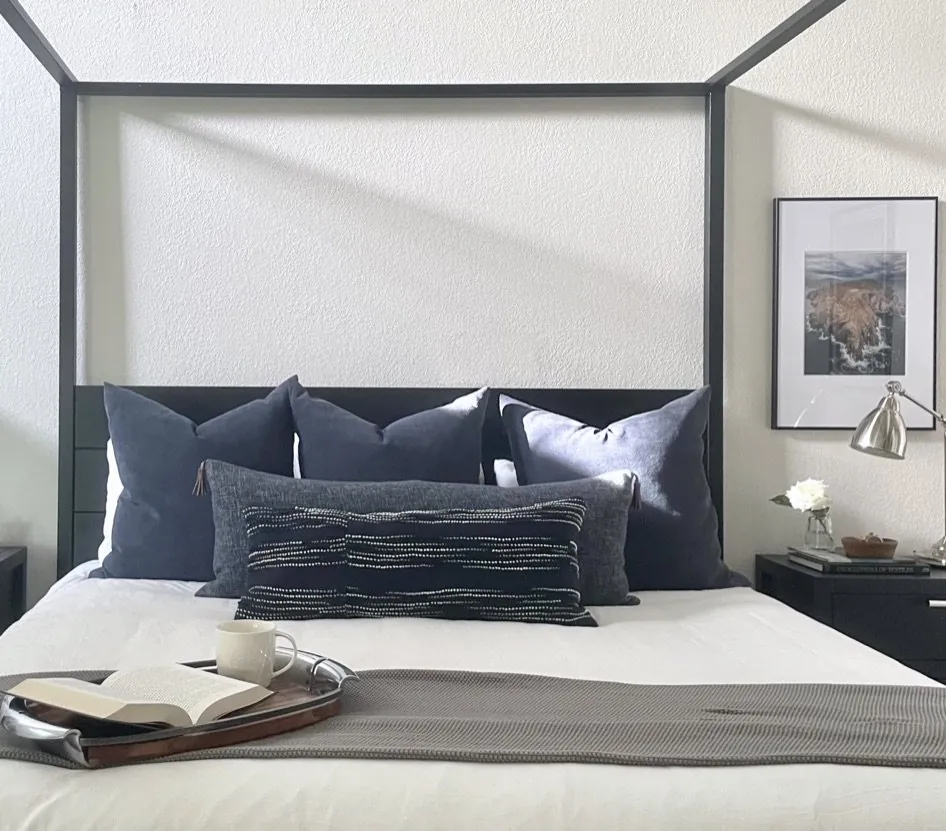
Reversible (high color OK): throw pillows (replaceable in 20 minutes for $200), table lamps, art, decorative objects, a small reading chair, a runner rug. These can be loud. If you tire of them, you swap them.
Semi-committed (medium color): the area rug, the dining chairs, side tables, ottomans, smaller upholstered pieces. Two to five years of life before swap-out. Bolder color is defensible here but should harmonize with the high-commitment pieces underneath.
Committed (neutral or muted color): the sofa, the primary bed, the dining table, the upholstered headboard, the built-ins, the cabinetry. Eight-to-fifteen-year decisions. Saturated color on these reads as a personal moment in 2026 and looks dated in 2030. Off-whites, ivories, sage, charcoal, ochre, and warm browns survive design cycles. Cobalt, magenta, and lime do not.
A room with a deep ochre velvet sofa, three pillows in different blues, a soft Persian rug, a brass-and-glass coffee table, and two chairs in faded olive linen is multi-colored furniture. It reads as designed because the highest-saturation pieces are also the highest-commitment-distance pieces.
Light Temperature Changes Color — Test Before You Buy
A swatch in the showroom under 4000K LED reads completely differently from the same fabric in a residential 2700K lamp-lit room. The fabric you order is the fabric you saw on the showroom floor — the fabric you receive is the fabric under your light. The Illuminating Engineering Society recommends 90+ CRI bulbs for residential because anything below that under-renders saturated color and turns rich pigments grey or muddy.
The discipline: request swatches from every vendor in the spec, view them under the lamp you plan to live with, at the time of day you most use the room. Daylight only is a trap — a north-facing room at noon and the same room at 8pm under 2700K reads differently enough that orange cushions can look apricot or rust depending on hour.
Where Multi-Colored Furniture Goes Wrong
Buying pieces individually over months. Each piece chosen alone, in a different lighting condition, against a different reference. Six months in there are seven items in the room and no two of them speak to each other. The fix is to design the room on paper first — rug + sofa + chairs + accent table + pillows + art — all reviewed together, with all swatches together, before any single piece is ordered.
Letting the kids vote. A multi-colored furniture room designed for children reads as a kindergarten in five years when the kids are eight. Plan for the room those kids grow up in, with reversible color (pillows, art, throws) for the year-to-year personality.
Skipping the rug. The rug is the underwriter for the rest of the palette. A neutral oversized rug holds a multi-colored room together; a busy patterned rug under a multi-colored furniture set is competing palettes and the room reads as visual noise. Size the rug to seat the front legs of every major piece — under-sizing is a more common failure than over-sizing.
Saturated color on the sofa, neutral everywhere else. The opposite of commitment hierarchy. The sofa locks the room into a single hue for ten years; every subsequent decorating cycle has to negotiate with it. Better: neutral sofa, multi-colored pillows, multi-colored chairs, art with the color you love.
A Working Three-Color Scheme You Can Actually Live With
Take any room. Pick three colors. Anchor (60%): a warm neutral — oatmeal, taupe, soft greige, ivory. Goes on the walls, the largest upholstery piece, the area rug. Body (30%): a mid-tone color you love and will love in ten years — muted sage, faded denim, terracotta, ochre, soft navy. Goes on chairs, side pieces, drapery, secondary upholstery. Accent (10%): a high-saturation color or pattern — coral, plum, deep teal, mustard, a botanical print. Goes on pillows, an ottoman, art, a single feature lamp.
Three colors. Hierarchy of commitment. Reviewed under your actual light. That is the entire designer move. Everything else is just execution.
How We Handle This on Projects
Every furniture-and-finishes spec goes through a swatch-review session under the actual room’s lighting before any piece is ordered — sofa fabric, rug, drapery, dining seat, pillow set, art reference, all on the table together. The session takes 90 minutes and prevents the most common decorating regret: pieces that looked right alone and wrong together. See our Remodels hub for how we sequence FF&E.