Completed client project. The owners of the two-story home on Hunters Terrace in Magee Ranch, Danville, came to us wanting the kitchen and family room to feel connected, while keeping the home’s other rooms distinct. Built in 1991, the 5,107-square-foot house had five bedrooms and four and a half baths, brick veneer, a shingle roof, and a raised foundation. They wanted the whole home to feel more cohesive without losing its traditional character or turning its defined rooms into one undifferentiated space. I based our decisions on this house’s rooms, structure, and site, rather than applying a generic open-plan solution.
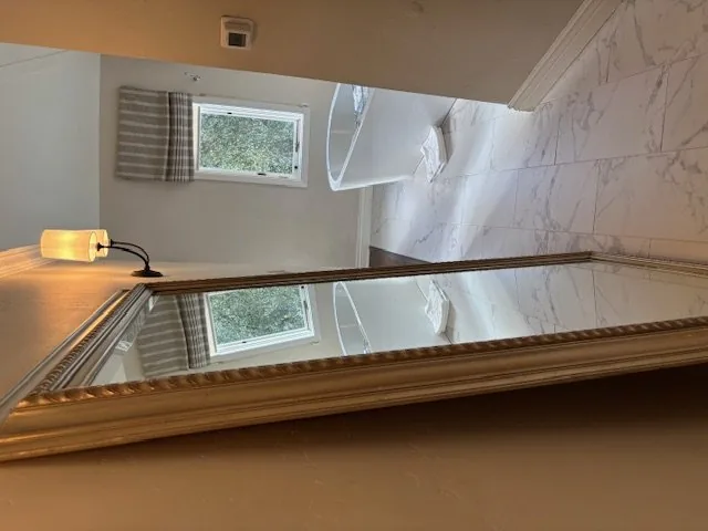
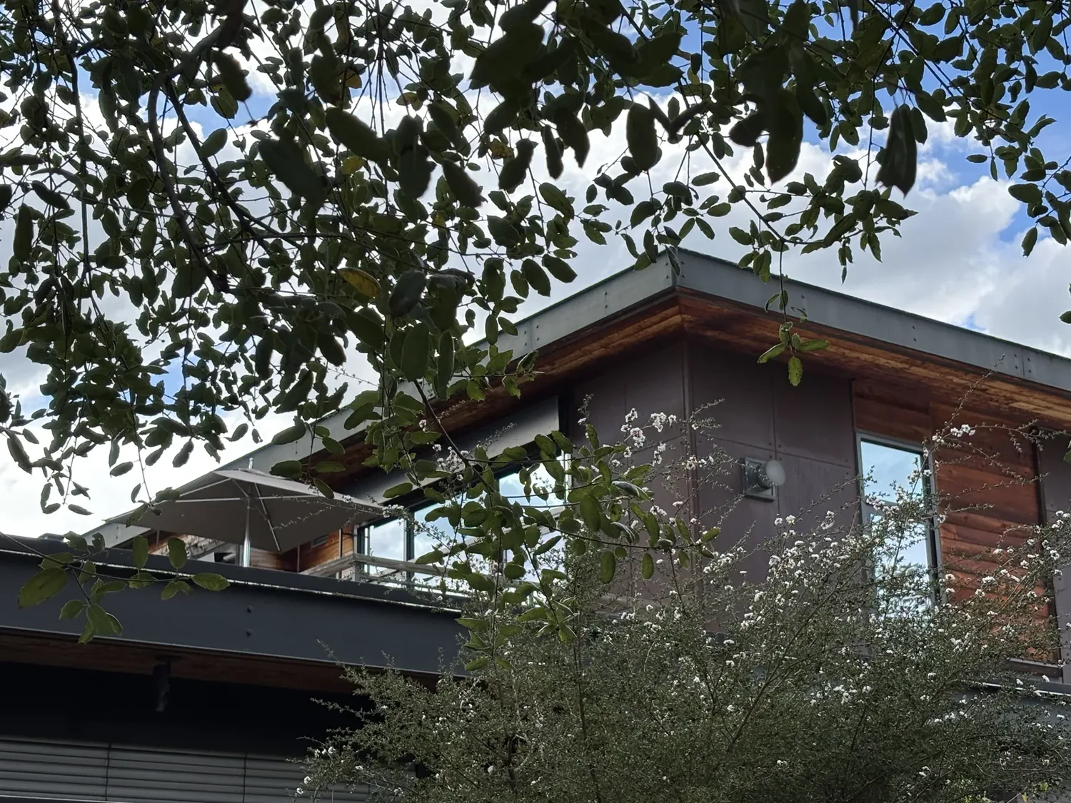
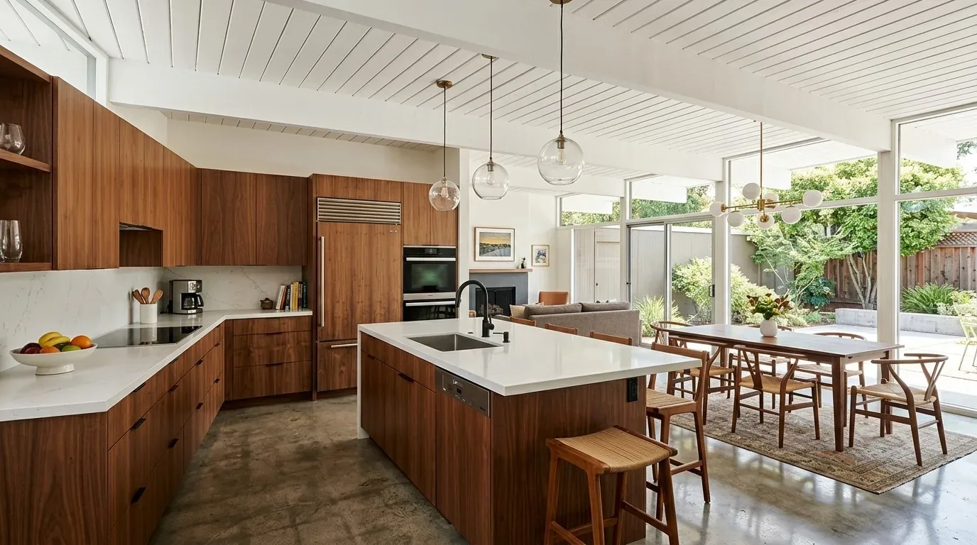
The photographs on this page are from the Designed & Curated portfolio and show finishes we have used on other projects. They are not photographs of this house.
My first question was which rooms they most wanted to connect, and what they wanted that connection to change in daily use. Their answer centered on the kitchen and family room: the wall between them made the cooking area feel separate from the home’s main gathering room. We kept the dining area, living room, and office legible as separate spaces, and focused the main structural change on that dividing wall.
The kitchen and family-room wall
On site, we found that the wall carried framing for the floor above, which made sense in a two-story house. We traced the load path through the wall and the raised-foundation structure before deciding how much of it could come out. The crawl space gave us a way to understand the structure below the opening, while the framing above confirmed that this was not simply a partition to remove without support.
We removed the wall between the kitchen and family room and installed a supporting beam over the new opening. We finished the beam as a deliberate ceiling line, rather than trying to disguise the structural change with an awkward patch. The opening gave the kitchen a direct connection to the family room while leaving the dining area and the more formal living room separate. The kitchen’s breakfast bar and island remained useful parts of the work area; the new opening, not another island, made the rooms feel joined.
The house had engineered wood flooring, so we measured floor heights at the opening before the wall came out and continued the finish across the former wall line. We kept the transition level and visually quiet, which helped the connected rooms read as a single shared area. The raised foundation and crawl space also helped us address the floor beneath that transition without introducing a step between the rooms.
Light and comfort across the opening
The home’s forced-air heating was zoned, and it also had central air conditioning. We reviewed the supply and return locations in both rooms as part of the wall work, then balanced the system after the opening was complete. That mattered because the connected kitchen and family room now shared a larger space, but the home still relied on its existing heating and cooling arrangement. We kept the double-pane windows and used the new opening to carry their daylight farther into the interior.
We kept the solid-surface counters and gas range in the kitchen, and coordinated the room finishes around the existing engineered wood. We updated the lighting so the kitchen work surfaces had clear task light and the family room had softer light for relaxing. The ceiling treatment around the beam and the lighting layout worked together, so the structural support looked intentional and the opening felt finished rather than like a hole left by demolition.
Across the rest of the house, we carried the same restrained finish choices through the defined living areas, office, bedrooms, and baths. We kept the room boundaries and circulation intact, so the kitchen and family room gained a stronger connection without requiring the other parts of the home to lose their separate purposes. The result suited the house’s traditional form while making its central shared rooms work together more naturally.
The brick entry and exterior review
At the front, the centered brick steps and planter walls, white entry door with sidelights, and trimmed windows gave the house a formal, symmetrical approach. We retained the brick and the entry’s balanced character, then refreshed the lighting and door so the arrival felt simpler and more current. We did not add a porch or portico, and we kept the exterior changes focused on the entry rather than altering the home’s overall form.
Before finalizing that exterior scope, we checked the Town of Danville’s Design Review Board role. The Board reviewed site design, architecture, signs, and landscaping for consistency with Town plans, ordinances, and design standards, so we kept the entry decisions aligned with that local review (Town of Danville Design Review Board).
If you are considering a similar change, get in touch.