Completed client project. The family came to us wanting their four-bedroom, four-bathroom house to work better for the children’s everyday routines. Built in 1967, the two-story, approximately 4,020-square-foot home had stucco walls, a raised concrete-perimeter foundation, a low-pitched shingle roof, a kitchen, a library, and a separate laundry room. Homework, snacks, and the dog’s route through the house all crowded the kitchen, while the family wanted a better view from the stove and a quieter place for the children to focus. Redfin’s record of Hillsborough single-family closings showed a city where many houses were older, but those citywide figures did not tell us how this particular house was framed. We used that context as background, not as a substitute for what we found in the home (Redfin’s Hillsborough sold-home data).
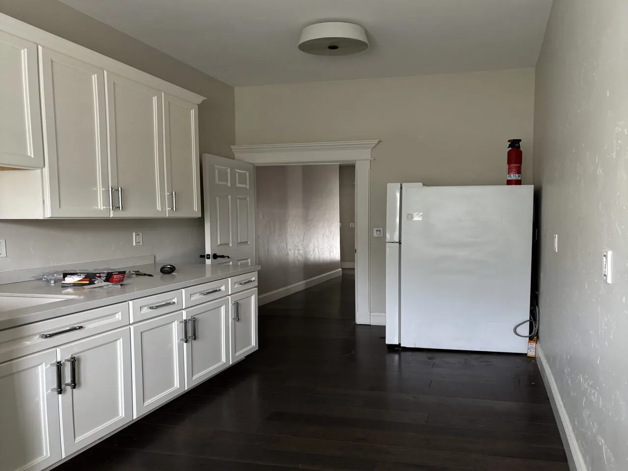
The photographs on this page are from the Designed & Curated portfolio and show finishes we have used on other projects. They are not photographs of this house.
My first question was where the children needed to move, sit, and be seen while someone was cooking. The owners’ answer centered on the kitchen and library: they wanted the children to work and read without losing connection to the rest of the family, and they wanted snacks and dog traffic to stay out of the cook’s path. On site, we found that the existing library already offered a distinct room, and that the route between it and the kitchen passed through the family’s busiest shared area. We measured the doorway and the wall between the rooms, then considered the view from the stove alongside the sound that traveled toward the library. That gave us a specific intervention, rather than a reason to make the whole main floor one open room.
The kitchen and library opening
We opened the connection between the kitchen and library enough to create a useful sightline from the stove, while keeping the library legible as its own room. The two-story framing made the wall more than a finish decision, so we shaped the opening around the structure we found instead of treating the entire wall as removable. We kept a way to close off the library when the children needed quiet. When it was open, an adult in the kitchen could see into the room, and the children could move between reading, work, and the kitchen without crossing the cooking work area to find a place to sit.
The children’s route also helped us decide what not to add. We did not turn the kitchen into the family’s only landing place or fill the circulation path with another destination. We kept the movement between the kitchen, library, and laundry room clear, so the dog could pass through without cutting across the area where someone was preparing food. The library’s separate identity mattered: it gave the children a quieter room without taking them out of sight entirely.
The raised floor and the shared-room finishes
The raised concrete-perimeter foundation affected how we handled the flooring. We measured the transitions between the kitchen and library before choosing where a continuous finish made sense. Where the levels allowed, we carried the same flooring through the connected rooms; where the existing floor changed height, we kept a clear, intentional transition rather than forcing a surface across it. That made the connection feel related without creating an awkward edge underfoot.
We kept the kitchen’s tile countertop and exhaust fan in the design, and selected surrounding finishes that made the long, narrow footprint feel calmer. The house’s large horizontal windows brought in natural light, and the metal frames and smooth, light-colored stucco already gave the rooms and exterior a strong horizontal character. We used warm, restrained tones and wood details to soften the interior without competing with that light. The tall chimney and the house’s single wood-burning fireplace with a gas starter remained the visual anchor for the family area. We did not add another focal point that pulled attention away from the view between the kitchen and library.
A published Hillsborough project showed that expressive color and pattern had a place in local residential design (LUXE Interiors + Design’s Hillsborough project). We used that as a reference for the range of possibilities, then concentrated stronger color in the library and smaller details rather than spreading it across the connected rooms. The finished palette let the family see across the opening without making the kitchen and library feel indistinguishable.
The central heating and the everyday sightline
The house had central forced-air gas heating, so we accounted for the shared room as a space served by an existing system, not just a newly opened view. We kept the room arrangement and built-ins from blocking the air paths we found, and coordinated the opening and finishes with the existing heating layout. The kitchen remained the working center, while the library held a separate place for concentration. In daily use, the family could stay connected across the two rooms, and kitchen activity did not have to take over every seat or conversation.
Before the opening was built, we checked the permit path for the structural work in this two-story house and kept the interior finish decisions distinct from that scope. We also used the local housing record as context, not as a substitute for checking the actual house: Redfin’s Hillsborough closing data described the city’s housing stock, while the opening and its relationship to this home’s structure guided our work.
Get in touch with Amy to talk about making your home work better for your family.