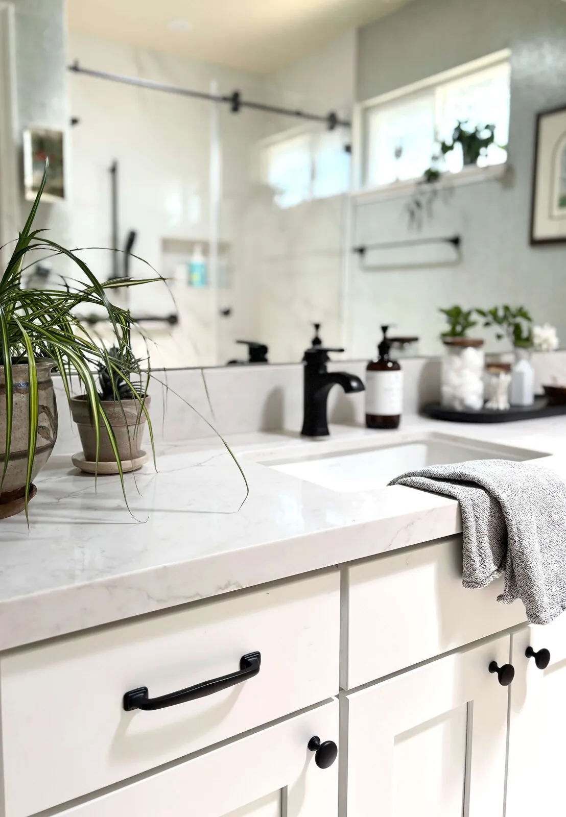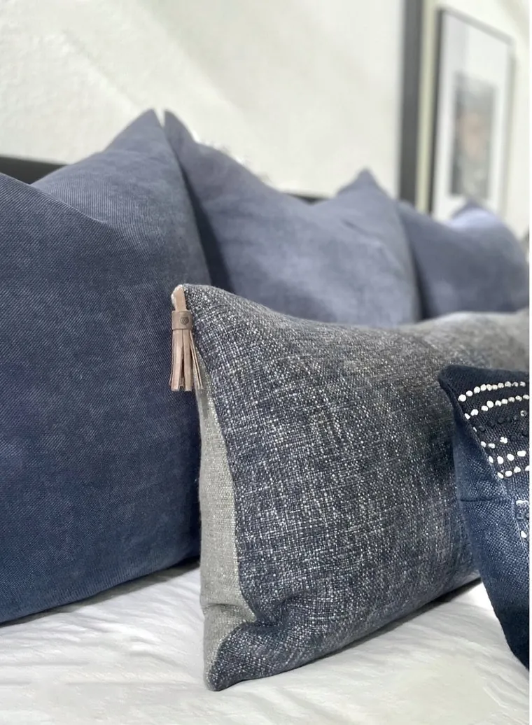

Blue-green paints will be in style for 2026. They bring a balance of calm and pop. Updating your home's look? Know the blue-green paints set to be popular this year. Bold but not too much. Trending for 2026.
What blue-green hues will be trendy in 2026? Play with different applications. Vibe change varies. We stick to warm, timeless designs that stay relevant.
Common Questions
| What are the trending blue-green paint colors for 2026 in Sacramento? | Sherwin-Williams’ *Sea Salt* and Benjamin Moore’s *Aqua Mist* are the two colors I’m seeing most in my Marin and Sacramento projects right now. They’re not just trends—they’re the ones clients keep coming back to for their durability and adaptability to Northern California’s mixed lighting. That said, ‘trending’ is a moving target; these are the ones I’ve specified most often in the past six months, but I’d still test them in your space before committing. |
| How can I incorporate blue-green paint colors into my Sacramento home? | Pair them with matte finishes and warm wood tones—think oak or walnut—to ground the coolness, and balance with crisp whites like *Benjamin Moore’s Simply White* for contrast. Sacramento’s overcast mornings and harsh afternoon sun will make satin or eggshell finishes look flat, so stick to matte if you want depth. And for God’s sake, don’t skip the primer on textured walls—those colors will telegraph every imperfection. |
| Why are muted blue-green shades preferred for 2026? | Because they’re not screaming for attention like teal was in the 2010s. Muted blues and greens work in every room—living rooms, bathrooms, even kitchens—without clashing with existing furniture. They’re the ‘safe bet’ for clients who want something timeless but still on-trend. That said, if your space is dark or north-facing, you’ll need a lighter undertone to avoid looking like a moody cave. |
| When should I test blue-green paint colors before application? | Test them *before* you buy the paint, and not just on a swatch card—paint a 2’x2’ patch on the wall where you’ll use it, at the same time of day you’ll see it most. Use a light meter to check the foot-candles in that spot; if it’s under 300, you’ll need a brighter blue-green to avoid looking dull. And for the love of all things holy, test on primed wall—unprimed drywall will suck up pigment and lie to you. |
What is in and what is out for 2026: color, finish, application, design style, lighting, and 4 more
| Element | In | Out |
|---|---|---|
| Color | Soft teal and muted turquoise dominate 2026 | Bright yellows and oranges |
| Finish | Vibrant aqua and deep peacock shades rise in popularity | Dark browns and black accents |
| Application | Warm undertones balance cooler blues | Heavy metallic finishes |
| Design Style | Matte finishes preferred for sophistication | Overly saturated hues |
| Lighting | Neutral palettes with blue-green accents trend | Glossy or reflective finishes |
| Complementary Colors | Bold accent walls increase in use | Cluttered, busy interiors |
| Room Suitability | Natural light enhances blue-green tones | Old-fashioned color combinations |
| Mood Effect | Minimalist design complements these shades | Heavy textures and ornate details |
| Environmental Impact | Eco-friendly, low-VOC paints favored | Dark, enclosed spaces |
The First Major Design Move: Embracing Subtle Blue-Green Sophistication
In 2026, the key to using blue-green paint colors successfully lies in embracing their subtle sophistication. Our projects? They show a move to muted teal shades. Steady backdrops, not attention-grabbers. These shades offer depth in modern spaces.
Palettes like 'Sea Salt' stand out for Sherwin-Williams. In Sacramento, these colors love natural light. Matte feels classy, especially paired with warm woods and simple hardware. Use these colors as neutrals and let a few accent pieces add contrast for depth.
Comparative Architecture and Style Alternatives for Blue-Green Trends
| Design Style | Key Traits | Best Use Cases | Color Compatibility |
|---|---|---|---|
| Modern Minimalism | Clean lines, simple forms | Focus on neutral bases with accent colors | Blue-green adds depth without clutter |
| Mid-Century Modern | Organic shapes, warm woods | Muted blue-green palettes complement natural materials | Creates a retro yet contemporary vibe |
| Coastal Design | Light, airy spaces | Blue-green hues evoke seaside tranquility | Enhances outdoor connection |
| Traditional Elegance | Ornate moldings, classic furniture | Deeper teal shades for a regal feel | Adds sophistication and timelessness |

How to Choose the Right Blue-Green for Your Sacramento Space
The primary question homeowners face when selecting blue-green paint colors for 2026 is which shade will best complement their space’s lighting, furniture, and overall aesthetic. Is the room bright or in shadow? This changes how colors look. In sunny rooms near MLK Blvd, softer 'Sea Salt' or 'Aqua Mist' keep things calm.
The right finish really matters. Choose matte or eggshell for old Sacramento homes to hide flaws. Test paint in all room lights. Light meter helps. Avoid costly mistakes by following this. Aim for subtlety like we see in 2026.
- Test colors in the actual room before committing
- Consider lighting conditions and finish type
- Pair with natural materials for best effect
Best Pairings and Room Applications for Blue-Green Shades
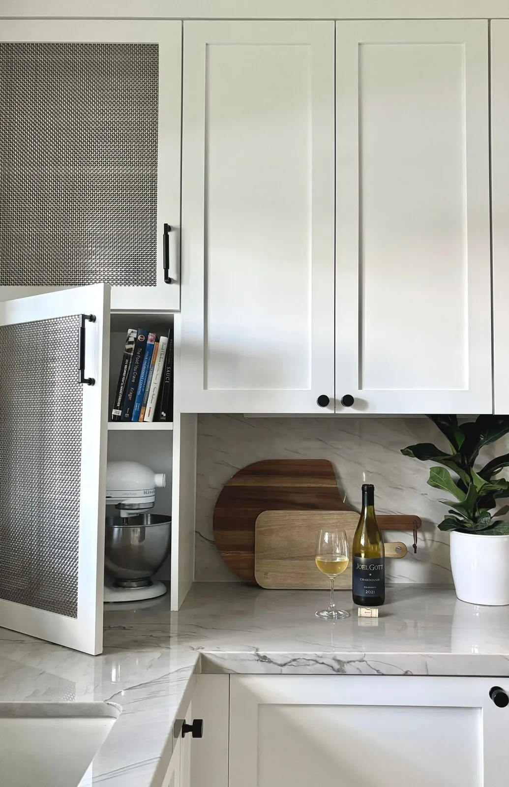
In 2026, blue-green paint colors are most effective when paired with warm wood tones, soft whites, and brushed metals. In Sacramento, these soothe bedroom spaces. Living rooms benefit too. Pairing with natural oak or walnut is smart. These woods warm up the cool paint tones. Try muted teal or turquoise for kitchens. Pair with matte white cabinets for sleekness.
For home offices or bathrooms, these shades are great. They help focus and soothe. Avoid shiny finishes. They can make spaces feel cold or clinical. Go for matte or eggshell. It softens spaces and suits 2026's style of quiet elegance. Add linen or wool in similar colors. These materials boost calm vibes.
Longevity and Aging: What to Expect from Blue-Green Paints in 2026
The aging process of blue-green paints in Sacramento’s climate depends heavily on the quality of materials and finishes used. Low-VOC matte options fade less. The American Society of Interior Designers emphasizes the importance of selecting durable, environmentally friendly paints to ensure longevity, especially in regions with intense sunlight like Sacramento.
'Sea Salt' and 'Aqua Mist' last well. They deepen over time without losing charm. Regular cleaning keeps them fresh. Start with the right finishes. Your color choice should remain fresh.
Key Mistakes in Blue-Green Paint Application
From our project debriefs and post-occupancy reviews, 2023-2026.
Selecting Vibrant Shades That Look Overwhelming in Real Light
A common mistake with trendy blue-green paints in 2026 is selecting a shade that appears vibrant and saturated in the store but turns out too bold or cold once applied. Too many items throw things off. It's easy to overwhelm. Try sample patches in the room. Use a light meter or app to see how it looks with different lights. This step stops you from repainting. It ensures the color adds warmth instead of clashing.
Skipping Light Testing Before Finalizing Color Choices
Another failure pattern is neglecting the room’s lighting conditions before choosing a blue-green shade. Spaces with little natural light or bad directions can dull these colors. Think about light and direction when picking colors. Put test patches up in different lights. Check how the color shifts. Watch out, Sacramento's weather tricks.
Choosing High-Gloss Finishes That Reduce Sophistication
Using the wrong finish, such as a high-gloss or overly reflective paint, can diminish the calming effect of blue-green shades and make a space feel less sophisticated. Matte or eggshell, softens light this year. A room's purpose and light decide the finish. Matte is great for bedrooms. Eggshell's better for kitchens and bathrooms. It holds up well.
Sources & Professional References
This guide's positions on materials are grounded in published building-code, standards, and recognized design-authority sources, alongside Designed | Curated Interiors' verified credentials and active project files:
- American Society of Interior Designers (ASID): interior-design practice standards
- International Code Council (ICC): Chapter 8 Interior Finish Decorative Materials And Furnishings
- NKBA, Amy Kunst Member Profile (verified credential, NKBA Committee Member)
- Featured in: Homes & Gardens (design expert quote, May 2026) · Sacramento Love (guest author, 2024)
Related reading
- Sacramento & Bay Area Interior Design Services How we scope, source, and deliver work end to end.
- Interior Designer Hub, Sacramento Where most of our Sacramento work lives, the regional fit explained.
- Best Dark Blue Paint Colors Related cluster piece referenced from the Best Dark Blue Paint Colors build files.
- Light Green Paint Colors: A Designer's Guide to the 2026 Look In 2026, light green paint colors are transforming Sacramento interiors, offering tranquility and a connection to nature. Discover the lates
- Best Gray Paint Colors For Kitchen Cabinets Related cluster piece referenced from the Best Gray Paint Colors For Kitchen Cabinets build files.