Direct Answers (Bold Color Home Decor)
| How do you use bold color in home decor? | Keep the big pieces quiet first. Then bring in one strong color, maybe two if the room can handle it. |
| What bold colors work well together in home decor? | Deep green looks great against cobalt blue, especially with warm wood nearby. Terracotta or burgundy can pull the room warmer without making every surface colorful. |
| How much bold color should I use in a room? | Anchor your paint where the natural light hits hardest. Throw down a wool flatweave if you hate commitment. |
| How can I use bold color without making my home decor feel chaotic? | Let one bold piece do the talking. Keep everything else neutral. |
Mastering the Art of Bold Color: A Designer's Perspective
Bold color works best with some restraint. Stop painting every single wall. Leave some of the room alone. One strong choice can be enough, especially in a smaller room. Here's how we approach bold color at Designed | Curated Interiors.I'd start with the quieter finishes first. They give you room to push the color later. Try Swiss Coffee on the trim. That creamy off-white saves a dark East Sacramento Craftsman living room from looking muddy. Buy the terracotta you keep staring at. Carry that same olive tone from the Land Park kitchen into the hallway bath. That burgundy sofa is already doing plenty. I wouldn't put another large saturated piece right beside it. I'd put it with a quieter rug and warm oak rather than adding another saturated fabric nearby.
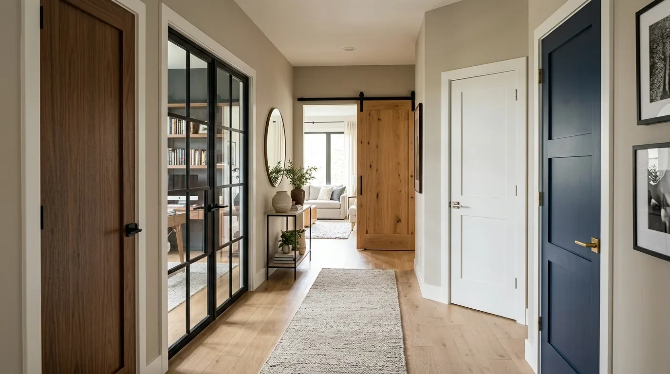
Bold color should feel like it belongs to the house. That last bit is what makes the room feel like yours. Look at the architecture first. A color that works in a clean-lined room can feel heavy against detailed trim or older millwork. Your favorite color still has to work with the house. We look at the trim, flooring, light, and pieces that are staying before choosing where to use it. A Sacramento bungalow can handle a strong dining-room color, but I'd test the paint beside the trim first. Natural wood nearby can warm up a pink more than you expect.
Materials That Hold Bold Color Well
Authenticity-grade materials
- White oak (rift-sawn) - Floors and slat details shine with this wood's calm grain, adding a refined touch to bold color schemes.
- Granite slabs in a Land Park kitchen handle heavy red wine splashes while grounding bright cabinets.
- Brass pulls catch afternoon sun in west facing East Sac bungalows without looking too bright.
- Dimensional grasscloth on one wall stops you from feeling trapped in a cave.
- Aged leather chairs soften harsh corners in modern Midtown lofts.
- Terrazzo floors hide Sacramento dust while tying together wild wall colors.
- Iron stair railings anchor bright walls.
- Velvet drapes block harsh summer heat in Tahoe Park homes.
Generic-grade tells we refuse to spec
- Cheap, imitation wood veneers - These lack the character and authenticity of real wood, and can appear dated over time.
- Plastic pulls ruin custom millwork.
- Cheap flat paint won't hold up under bright light.
- Shiny polyester catches bad overhead lighting glare.
- Vintage oak chests beat flat-pack dressers every single time.
- Plain plastic blinds kill expensive paint jobs.
Designer Decision Matrix: Which Bold Color Home Decor Approach Fits Your Home
How we actually decide: match your situation to what we would specify, and the reasoning behind it.
| Your Goal | Best Solution | Why We Recommend It |
|---|---|---|
| Creating a timeless, sophisticated space | Bold color schemes with a curated mix of saturated hues and neutrals | Bold colors, when carefully selected and balanced, can create a unique and memorable space that stands the test of time. |
| Maximizing natural light in a dark room | A combination of bold colors and reflective materials | Saturated colors, especially when paired with mirrors or light-colored accents, can enhance the perception of light and space. |
| Adding personality to a rental without permanent changes | Bold, removable accessories and artwork | Temporary decor allows for creativity and expression without committing to long-term changes. |
| Updating a historic home with modern touches | A blend of bold colors and period-appropriate details | Bold colors can bring a fresh, contemporary feel while respecting the architectural integrity of older homes. |
| Creating a cohesive, flowing home | A considered color palette carried throughout, with subtle variations | A consistent color scheme unifies spaces, creating a seamless and intentional flow. |
The Art of Combining Bold Colors
When it comes to using bold colors in the same room, the key is to create a harmonious balance. Cool gray trim kills warm terracotta. Pairing pine green with cobalt blue works if your south facing windows pull in bright natural light all afternoon long. Terracotta and burgundy bring serious warmth to north facing living rooms. Roll sample patches directly onto your drywall. Match the saturation levels so nothing fights.
How Much Bold Color is Enough?
The amount of bold color you use in a room depends on your personal preference and the overall design scheme. A painted wall is one place to start. Start with the sofa. If you still love that upholstery, pull the wall or rug color from it before committing to cabinetry, which is far harder to change. Let one thing be loud. Dark paint can carry plenty of weight on its own, so I’d usually keep the rug quieter and let the upholstery breathe. Try the rug first. It's easier to move. A rug can leave the room tomorrow. Repainting a kitchen ceiling means covering counters, protecting cabinets, then doing the prep again. Art is an easy place to take a color risk. Try the color on a pillow first. A small ceramic lamp works too, and you can move either one if the shade starts wearing on you.
Starting with Color: Paint or Furnishings?
Before buying paint, check the rug, sofa, wood tones, and anything else that's staying. A walnut dining table may push you toward one paint color, while a bright sofa can send the whole scheme somewhere else. Paint can set the direction. Paint a sample on the wall. Sacramento's afternoon light can make a saturated color look much brighter than it did on the swatch. Got a piece you really want noticed? Pick the wall color around it. A strong textile or painting usually gives you a better starting point than a paint chip. That cobalt blue sofa doesn't need much help. Put it against a quiet wall and the upholstery does the talking. Love the sofa color already? Start there. I’d sample the wall color against the fabric first. Paint is easier to adjust than forcing a sofa to work with a color chip.
Balancing Saturated Colors with Neutrals
While bold colors can make a statement, it's essential to create visual relief in a room. Quiet finishes give your eye somewhere to rest. Walnut, brushed metal, or a stone surface can give a saturated wall somewhere to rest. Saturated paint needs some breathing room. A natural wood surface can break up a strong color without making the room feel washed out. Deep green walls pair nicely with walnut. A warm wood floor can do the same thing, especially if the room gets cooler northern light. Pink gets easier to live with beside quieter pieces. Try a neutral pillow on the sofa and a coffee table with a simple metal base. Let one color carry the room. Use a calmer surface nearby, such as warm white plaster or plain oak, so the saturated color has some breathing room.
Bold Color in Different Spaces
The impact of bold color can vary depending on the room. A deep wall color can make a living room feel smaller in a good way. Upholstery works too, especially on a substantial sofa where the color has enough surface area to register. A few colorful accessories are easy to miss. Cabinet color covers most of the kitchen, so it sets the tone before the smaller pieces even enter the room. A deep blue island can carry the drama while a simple backsplash keeps the room from getting busy. Bedrooms, being more intimate spaces, can handle bolder colors on walls or bedding, creating a unique and relaxing ambiance. Bathrooms beg for color risks. Drop a rich blue vanity or patterned cement tile into an East Sacramento half bath and skip painting the entire house. Check morning light in the space. A quiet bedroom can take a deeper wall color, while a busy kitchen may need the stronger color on one surface.
Observed Failure Modes, How Bold Color Home Decor Goes Wrong
From our project debriefs and post-occupancy reviews, 2023-2026.
Failure to Balance Bold Colors
One common pitfall is when homeowners lean too heavily on bold colors, creating a space that feels overwhelming and chaotic. Bright pigments hurt eyes without calm corners. The cure? Cobalt gets plenty of support from white oak shelving. Unlacquered brass hardware warms it up without adding another strong color. Terracotta can stay on one wall. Four walls of it may be too much, especially in a smaller room with limited daylight.Clashing Color Combinations
Another failure mode arises when bold colors are paired without consideration for their compatibility. Bad undertones fight each other. Mixing a dirty olive with a neon lemon looks terrible in Land Park bungalows. Before you buy gallons, spend a few minutes with a color wheel and see what actually sits opposite your paint choice. Keep the wheel beside your samples. It makes complementary colors easier to check before you commit to paint.Overlooking Existing Architecture
In their enthusiasm for bold colors, homeowners sometimes forget to consider the existing architecture and furnishings. A 1950s ranch has a different visual starting point than a Victorian room. I’d test the jewel tones against the low rooflines and simpler trim before using them heavily. Paint original redwood trim instead of ripping it out for drywall. Those 1950s floor plans can handle color, but I’d place it with the room proportions in mind rather than forcing a period palette onto the house.Lack of Visual Interest
While bold colors can create a statement, using them sparingly or in a monotonous way can result in a lack of visual interest. Flat walls feel dead. Heavy linen drapery softens emerald paint, especially where afternoon light throws shadows across the fabric. Velvet pillows bring a little sheen against matte plaster, which helps a deep pigment read as a color instead of a flat block.What's Going Out for 2026
- Avoid using bold colors solely on walls; incorporate them through upholstery, cabinetry, and accessories for a more layered look.
- Vary shades room by room instead of repeating identical teal paint.
- Mustard cabinetry needs a steady countertop. Concrete can do that job, giving the bright doors a rougher, quieter surface underneath.
- Try the odd pairing. Put a sample beside the flooring and countertop first, because two strong colors can look fine alone and fight once the whole room is in view.
- Keep the pieces that still work. A bold wall color can make an older chair or wood table feel intentional without sending you out to replace the room.
- Small rooms need light before they need color. In a tight hallway or a north-facing powder room, a deep paint color can swallow what little light the room gets, so I'd test the color at different times of day before committing.
- Color combinations date quickly. If you still like them after a few years, great, but I wouldn't put a short-lived pairing on expensive tile or custom millwork. Paint is harder to change than a rug. Pick a wall color you can live with, then use the trend on a lamp or rug that can be swapped out without repainting the room.
What Bold Color Home Decor Costs in 2026
| Scope | Typical range |
|---|---|
| Refresh: Painting walls and adding bold color accents | $2000-$4000 |
| Mid-tier: Replacing cabinetry and incorporating bold color | $12,000-$20,000 |
| Estate-scale: Full-scale renovation with bold color design | $60,000-$90,000 |
Working Notes
What We Have Learned Doing This: bold color home decor
“Trend cycles burn through palettes before the paint even cures. Magazines chase novelty. Your walls deserve better endurance. Anchor your spaces in tones that have held their ground for decades. Classic earth neutrals and muted historic pigments bypass the fatigue of seasonal hype.”
These notes come from our own bold color home decor project debriefs. Most were learned the expensive way the first time.
Sources & Professional References
This guide's positions on materials are grounded in published building-code, standards, and recognized design-authority sources, alongside Designed | Curated Interiors' verified credentials and active project files:
- American Society of Interior Designers (ASID): interior-design practice standards
- International Code Council (ICC): Chapter 8 Interior Finishes
- NKBA, Amy Kunst Member Profile (verified credential, NKBA Committee Member)
- Featured in: Good Housekeeping (storage and space-planning expert quotes, July 2026) · Homes & Gardens (design expert quote, May 2026) · Sacramento Love (guest author, 2024)
Frequently Asked
How do you use bold color in home decor?
What bold colors work well together in home decor?
How much bold color should I use in a room?
How can I use bold color without making my home decor feel chaotic?
Can bold color work with my home's architecture?
How can I add bold color without hurting resale appeal?
What is a good way to create a whole-house bold color palette?
From Bold Color Home Decor to a Real Room
A trend piece is the briefing document, not the deliverable. The pages below show how we translate these principles into finished rooms across Sacramento and the rest of Northern California.
- Sacramento & Bay Area Interior Design Services How we scope, source, and deliver work end to end.
- Interior Designer Hub, Sacramento Where most of our Sacramento work lives, the regional fit explained.
- Modern Tudor Homes Heritage-architecture renovation patterns from our project files.