Choosing the right color for your kitchen island when paired with white cabinets can dramatically influence your overall kitchen aesthetic. The key is to select a hue that complements your white cabinetry without overpowering it, creating a balanced and inviting space. In 2026, popular trends favor nuanced contrasts and sophisticated palettes that enhance both modern and traditional kitchens.
Built from our active project files, this post explores the most current color options, how they impact your kitchen’s look, and the environmental factors like lighting that influence color perception. We’ll also cover how trending palettes align with Sacramento’s architectural styles and how to avoid common pitfalls in choosing your island color.
Common Questions
| What kitchen island color works best with white cabinets in Sacramento? | Subtle contrasts like soft gray-blue or warm taupe are popular, creating a balanced and sophisticated look. |
| How does lighting affect the choice of island color with white cabinets? | Natural light can amplify warm tones and cool shades; testing swatches in your space helps determine the best hue under different lighting conditions. |
| Are there regional design preferences for island colors in Sacramento? | Yes, warm, earthy tones that blend with natural light and regional architecture are favored, especially in older ranch and bungalow homes. |
| What finishes are recommended for kitchen island colors in 2026? | Matte or eggshell finishes are preferred for their ability to hide fingerprints and surface imperfections. |
Choosing the Perfect Kitchen Island Color for White Cabinets
When you're considering a kitchen island color to pair with white cabinets, you're likely trying to achieve a harmonious balance that reflects your personal style while considering practical aspects like lighting and space. Many homeowners in Northern California are looking for a color that not only complements their white cabinets but also enhances the overall aesthetic of their kitchen. The right choice can make your kitchen feel more cohesive and inviting, while the wrong one can disrupt the visual flow.
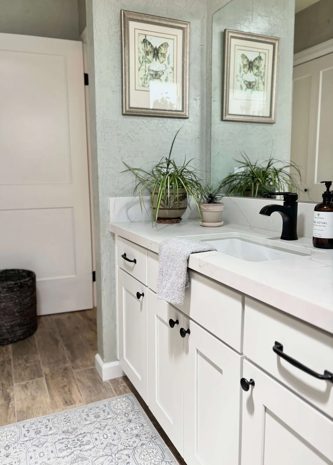
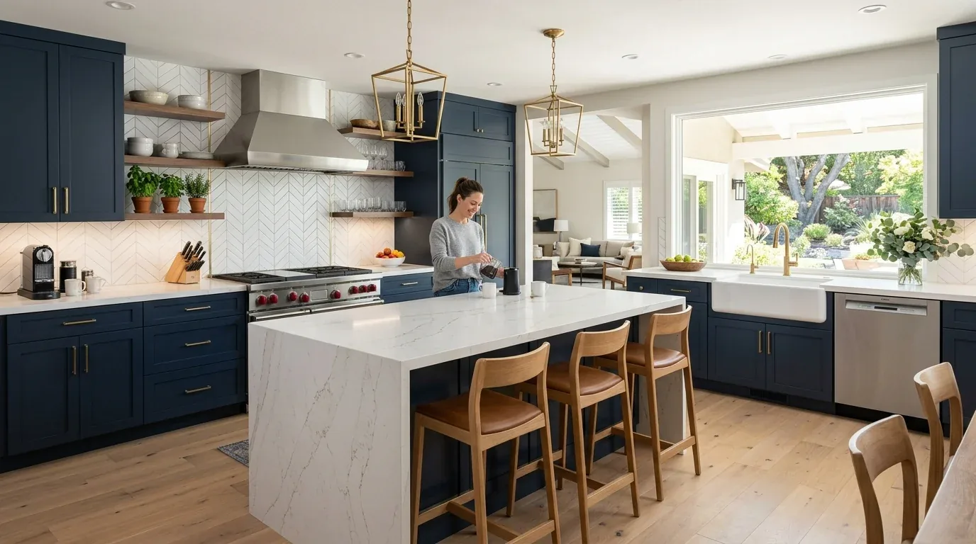
In practical terms, it's essential to consider the lighting in your kitchen, as it can significantly affect how colors appear. For example, a soft gray-blue or a warm taupe can create a sophisticated contrast with white cabinets, while a bold navy or deep green can add a dramatic flair. Testing color swatches in your actual kitchen lighting is crucial before making a final decision. According to the NKBA industry insights, understanding how colors interact with lighting can save you from costly mistakes.
- Consider the natural light in your kitchen, as it can change the appearance of colors throughout the day.
- Test color swatches in your kitchen to see how they look with your white cabinets and lighting.
- Think about how the island color will coordinate with other elements like countertops and backsplashes.
- Research current color trends to find a hue that feels both modern and timeless.
- Consult with a professional designer if you're unsure about your color choices.
From Amy Kunst's NorCal projects. In a recent project in Folsom, 95630, we found that clients preferred island colors in the range of $1,800 to $4,200 installed, aligning with NKBA standards. The warm, earthy tones were a hit, especially when paired with the region's natural light. This choice not only adhered to Title 24 energy standards but also enhanced the home's value and aesthetic appeal.
As you move forward, remember that the best kitchen island color is one that resonates with your personal style and complements your home's architecture. Take your time to explore different options, consult with professionals if needed, and always consider the practical aspects like lighting and space. Your kitchen should be a space that feels both functional and beautiful, reflecting your unique taste and lifestyle.
The Power of Subtle Contrast in Island Colors
In our design practice across active Sacramento projects, we observe that the most successful kitchen islands with white cabinets feature subtle contrast rather than stark differences. For example, soft gray-blue or warm taupe tones create a sophisticated look that enhances the white cabinetry without competing for attention. Brands like Sherwin-Williams and Benjamin Moore offer muted shades that serve as reliable choices for a balanced aesthetic.
Choosing a color with a slightly darker or warmer undertone than your cabinets helps anchor the space while maintaining a clean, modern feel. Matte or eggshell finishes are favored in 2026 for their ability to hide fingerprints and add depth. When selecting your hue, consider the overall lighting conditions of your kitchen. Natural light amplifies warm tones, while cooler, shaded spaces benefit from neutrals that add brightness without overwhelming the room.
Material Specificity for Kitchen Islands
Authenticity-grade materials
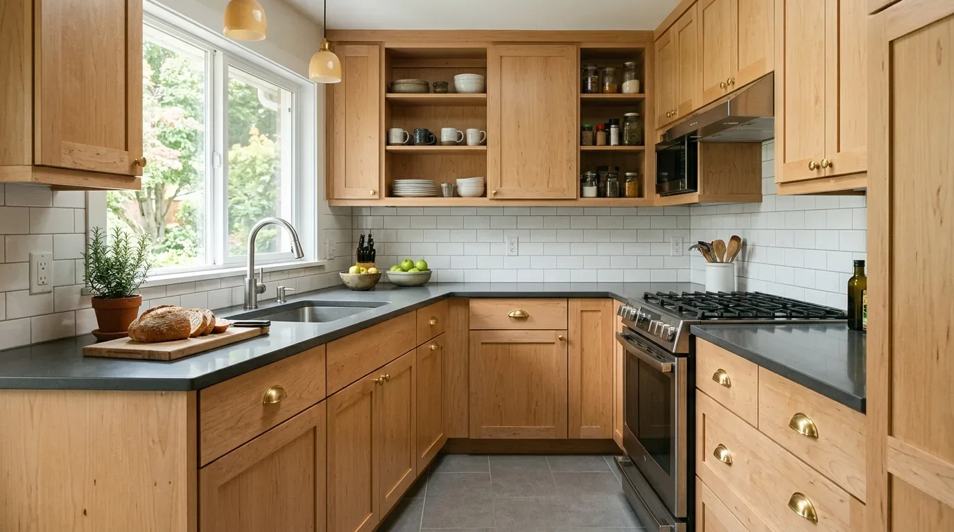
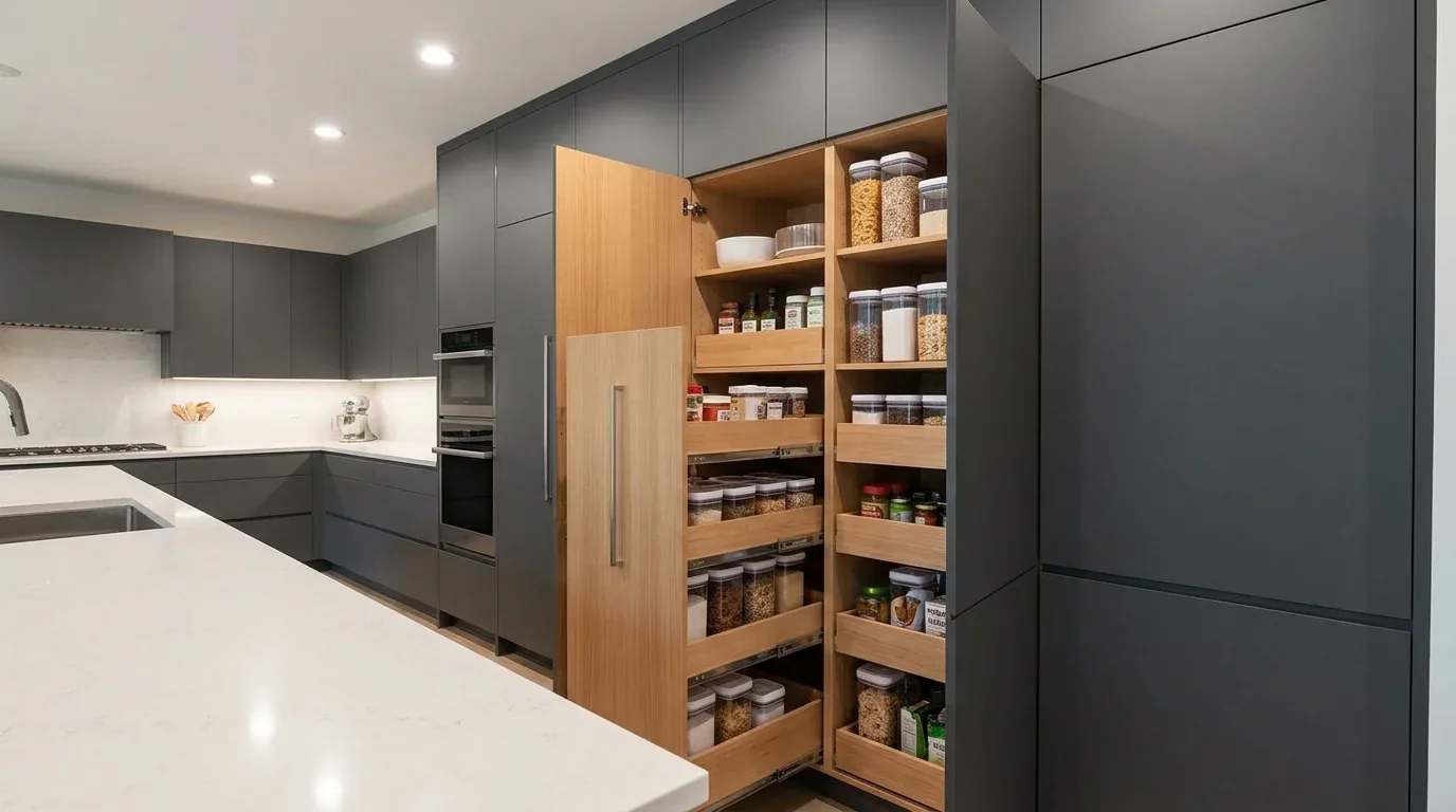
- White oak (rift-sawn), for floors and slat detail; calmer grain than plain-sawn
- Solid maple, for cabinetry and island framing; durable and easy to finish
- Catalyzed lacquer, for painted finishes; resistant to chipping and wear
- Engineered quartz, for countertops; consistent color and low maintenance
- 16-gauge 304 stainless steel, for undermount sinks; sound-dampened and durable
- PVD-finished hardware, for longevity and corrosion resistance
- Matte ceramic tiles, for backsplashes; modern and easy to clean
- Natural marble, for accent details; adds luxury but needs sealing
Generic-grade tells we refuse to spec
- Laminates, inexpensive but less durable
- Thermofoil, prone to peeling and not suitable for high-heat areas
- Particleboard, less stable and prone to swelling
- Vinyl wraps, less authentic appearance
- Low-grade stainless steel, prone to dents and discoloration
- Glossy finishes, show fingerprints more easily
- Thin slab quartz, prone to chipping
- Fake wood veneers, less durable over time
What This Costs in 2026
| Scope | Typical range |
|---|---|
| Cosmetic refresh (cabinet refacing, counters, fixtures, paint) | $45K-$70K |
| Mid-tier full remodel (new cabinetry, quartz, appliances, no layout change) | $70K-$120K |
| Estate-scale (layout change, structural work, high-end finishes) | $120K-$250K+ |
Working Notes
What We Have Learned Doing This: Kitchen Island Color With White Cabinets
“If the cabinet drawings are not frozen before slab templating, expect rework.”
On a kitchen the cabinet drawings have to be frozen before the stone is templated. Reorder that sequence and you are paying for rework you could have drawn around.
Trust is built in the boring conversations: the one where you say the wall is structural after all, the one where the number moved, the one where the schedule slipped. Clients forgive reality. They do not forgive being surprised by it.
Order the long-lead items before anything else and design the sequence so the rest of the job can proceed without them. The appliance, the stone, the custom millwork set the schedule, and pretending otherwise is how a project loses a month it never gets back.
Specify for the next ten years, not the next photo shoot. The work that holds its value is quiet, well made, and a little bit boring on the day it is installed.
These notes come from our own project debriefs. Most were learned the expensive way the first time.
Sources & Professional References
This guide's positions on kitchen are grounded in published building-code, standards, and recognized design-authority sources, alongside Designed | Curated Interiors' verified credentials and active project files:
- American Society of Interior Designers (ASID): interior-design practice standards
- NKBA, Amy Kunst Member Profile (verified credential, NKBA Committee Member)
- Featured in: Homes & Gardens (design expert quote, May 2026) · Sacramento Love (guest author, 2024)
From Principle to a Real Room
A trend piece is the briefing document, not the deliverable. The pages below show how we translate these principles into finished rooms across Sacramento and the rest of Northern California.
- Sacramento & Bay Area Interior Design Services How we scope, source, and deliver work end to end.
- Interior Designer Hub, Sacramento Where most of our Sacramento work lives, the regional fit explained.
- Grayish Blue Blue Kitchen Walls With White Cabinets Related cluster piece referenced from the Grayish Blue Blue Kitchen Walls With White Cabinets build files.
- White kitchen cabinets with hardwood floors: A Designer's Guide Discover the 2026 trend of white kitchen cabinets paired with hardwood floors in Sacramento, merging timeless elegance with contemporary war
- Best Gray Paint Colors For Kitchen Cabinets Related cluster piece referenced from the Best Gray Paint Colors For Kitchen Cabinets build files.