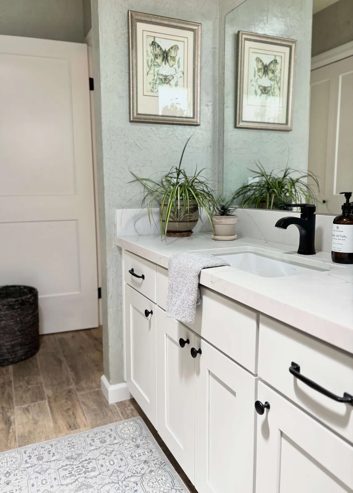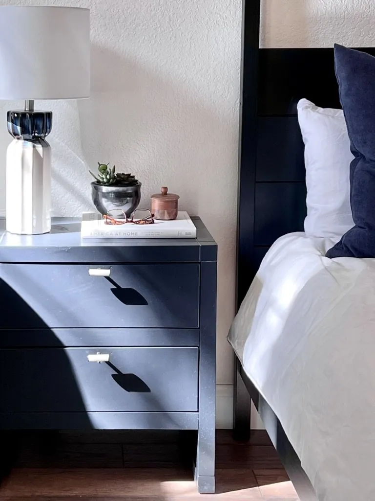
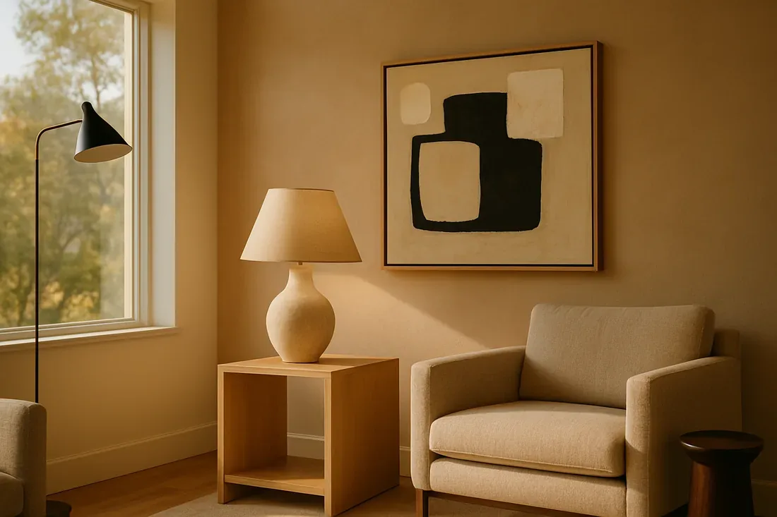
2026 leans earthy and muted. Less contrast, more harmony in colors. Expect warm neutrals and soft greens. Muted blues too. Think calm, nature. Upcoming shades and the influences behind them. What to watch. We’ll also look at how regional preferences in Sacramento and Marin can inform your choices, with insights from our active project files and industry forecasters.
Built from our active project files, this post covers predicted top palettes for 2026, key emerging shades, expert forecast methods, regional design influences, and major paint brands releasing collections aligned with these trends. Whether you’re planning a full remodel or simple refresh, understanding these future color directions will help you make informed, stylish choices that stand the test of time.
Common Questions
| What are the predicted paint color trends for 2026? | For 2026, the focus is on muted, grounded tones—think deeper taupes and soft greens—rooted in Sacramento’s local material palette. Warm neutrals will dominate, but the shift leans toward richer, less stark options than past years. Blues are in, but expect them to skew toward muted, slate-inspired shades rather than bright or icy tones. |
| How do regional preferences in Sacramento influence 2026 paint color choices? | Sacramento’s architecture—with its prevalence of warm brick and earthy textures—naturally steers color choices toward taupes and soft greens. These shades complement the region’s existing material palette, from historic mid-century homes to modern builds using local clay and wood. The trend isn’t just aesthetic; it’s practical, mirroring what builders and designers here already rely on. |
| Which major paint brands are forecasting collections aligned with 2026 trends? | Sherwin-Williams and Benjamin Moore are both positioning their 2026 collections around softer, more subdued palettes—what they’re calling ‘gentle’ tones. While they haven’t released exact color codes yet, their marketing leans into the same muted, earthy direction we’re seeing locally. Both brands have historically aligned with regional demand, so this isn’t just guesswork. |
| Are there specific shades expected to be popular in 2026? | Taupe—specifically warmer, greige-leaning versions—will be a standout, along with soft greens that nod to Sacramento’s natural landscapes. Muted blues, closer to a slate or faded denim, are also gaining traction, but avoid anything too cool or saturated. These aren’t just trends; they’re direct responses to what’s already working in the area’s residential projects. |
Paint Color Trends 2026 2026 at a Glance
| Element | In | Out |
|---|---|---|
| Color | Warm neutrals dominate | High contrast and bold colors decline |
| Finish | Soft greens and blues rise | Bright neon and saturated tones fade |
| Palette Style | Muted, earthy palettes | Cool blues and stark whites diminish |
| Material Finish | Subtle sophistication in finishes | Heavy gloss finishes less common |
| Texture Trend | Natural-inspired color schemes | Overly vibrant palettes avoided |
| Contrast Level | Less contrast, more harmony | Too many chromatic extremes |
| Eco Focus | Eco-conscious, sustainable shades | Unnatural synthetic shades |
| Regional Influence | Layered textures and matte finishes | Overly busy patterns and finishes |
| Design Simplicity | Regional preferences influence choices | Regional influences are ignored |
The First Major Design Move for 2026: Embracing Earthy, Calm Palettes
As we look ahead to 2026, the dominant design move is clear: a shift toward earthy, subdued color palettes that foster tranquility and a sense of groundedness. In projects, taupes, sage greens, and muted blues come up often. These colors fit anywhere. Contemporary, traditional, it works. Sherwin-Williams and Benjamin Moore push these soft colors. Matte and texture add interest.
Natural colors meet cultural comfort needs now. Sacramento homes with brick and stone look great with these palettes. Earthy shades fit green design. Go for low-VOC paints, they're better for your health and the planet. These colors make modern spaces feel rooted. Sacramento likes it.
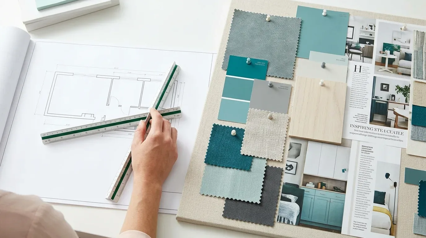
Material Specificity in 2026 Paint Trends
Authenticity-grade materials
- White oak (rift-sawn), for floors and slat detail; calmer grain than plain-sawn
- Matte acrylic paints, for a soft, velvety finish that enhances muted palettes
- Natural clay plasters, adding texture and warmth to walls
- Low-VOC paints, supporting sustainable and healthy interiors
- Silicone-based finishes, for durability and ease of maintenance
- Textured wallpapers with matte finishes, to add depth without gloss
- Soft linen or hemp fabrics, for upholstery and window treatments to complement paint choices
- Eco-friendly pigments, for true-to-nature, sustainable coloring
Generic-grade tells we refuse to spec
- Standard satin or semi-gloss paints, too shiny for current trends
- High-gloss finishes, generally avoided in 2026 palettes
- Bright white or stark neutrals, too harsh for the emerging soft palette
- Synthetic or heavily pigmented paints, less eco-conscious
- Overly thick or textured coatings, can look dated
- Varnished or plastic-like finishes, less authentic and warm
- Heavy coatings that obscure natural surface textures
- Unlabeled or generic brands, lack of transparency on VOC content
Comparative Architecture and Style Alternatives in 2026
| Style | Architectural Trait | Ideal Color Palette | Key Distinction |
|---|---|---|---|
| Modern Minimalist | Clean lines, simple forms | Muted, earthy tones | Best for: open spaces, natural light |
| Traditional Sacramento | Warm brick, classic woodwork | Soft greens and beiges | Best for: heritage homes, historic districts |
| Industrial Chic | Exposed beams, raw materials | Muted greys and charcoals | Best for: lofts, renovated warehouses |
| Transitional | Blends classic and modern | Calm color palettes | Best for: versatile family homes |
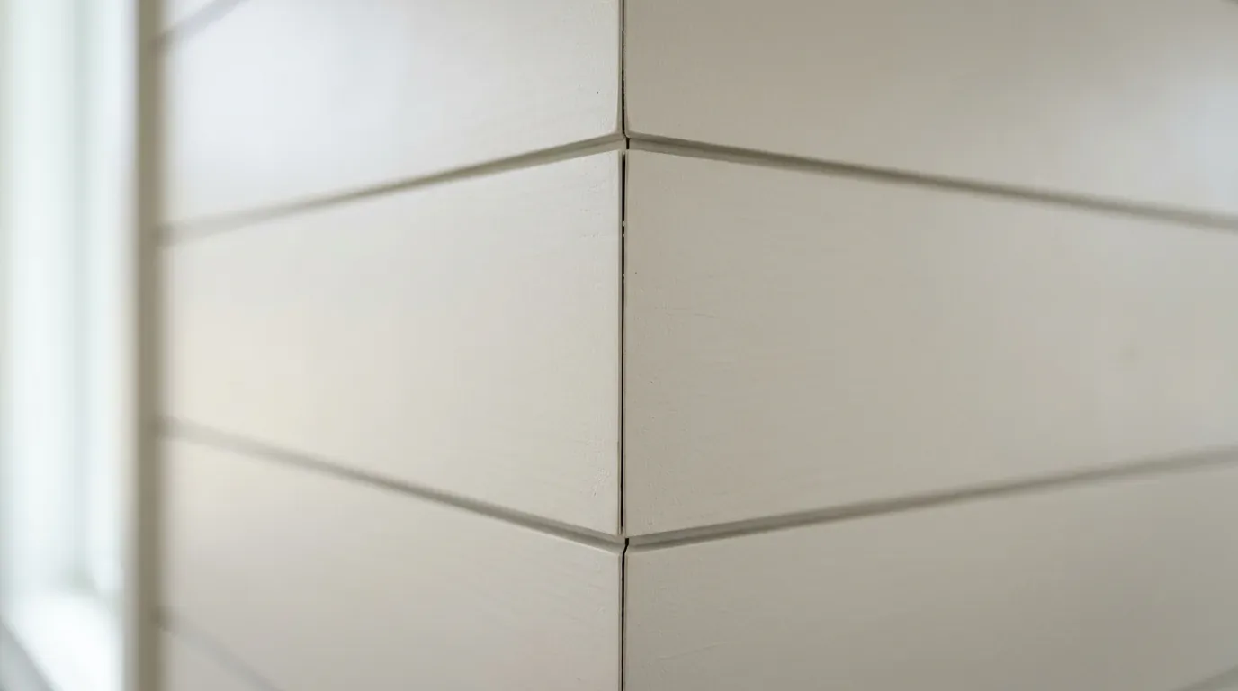
Should You Stick with Predicted Top Colors or Experiment with New Shades?
Personal style? Regional vibes? Choose your paint colors and decide how far you want to follow 2026 trends. The mood you want comes first. Sacramento homes that catch natural light can look great with earthy tones. They're safe and stylish. Got a bold style? Trends guide you, but your personal touch makes the space yours.
Sherwin-Williams, Benjamin Moore, local vibes guide designer choices. These insights are supported by the American Society of Interior Designers’ emphasis on timeless, sustainable palettes that adapt over time. Blend what's trendy with what you love. That mix keeps your space in harmony while matching local looks.
How to Incorporate 2026 Color Trends into Different Interior Styles
Incorporating the 2026 color trends into various interior design styles requires understanding the nuances of each aesthetic. For a modern vibe, try taupe. They work well with clean lines and texture. Sacramento's historic homes get a fresh look from soft greens and beiges. They go well with wood and bricks.
Industrial style? Use greys and charcoals. Matte finishes keep it raw and edgy. Transitional spaces use neutral tones to mix old and new styles. Consider the home's design and light when picking 2026 colors.
Major Paint Brands and Collections Forecasting 2026 Trends
Leading paint brands like Sherwin-Williams, Benjamin Moore, and Pantone are releasing collections that reflect the 2026 trend forecasts, emphasizing earthy, muted tones and sustainable finishes. Sherwin-Williams offers warm neutrals next year. Benjamin Moore likes greens and blues right now. They're also making more low-VOC paints. Better for the environment.
Using these curated colors helps keep up with forecasts and local tastes. Stay updated with new releases. It’s smart.
Observed Failure Modes We See in the Field
From our project debriefs and post-occupancy reviews, 2023-2026.
Overly Contrasting Palettes
Many Sacramento homeowners and designers fall into the trap of choosing high-contrast color schemes that are trendy now but quickly look dated by 2026. Stark black and white might overpower a space. Sacramento light isn't great with harsh colors. Opt for gentler tones for a 2026 refresh. Neutral layers work anytime.
Ignoring Surface and Lighting Conditions
Choosing a trendy color without considering surface textures and lighting can lead to disappointing results. Colors can change. A bright shade on a card might just look flat or patchy on textured plaster or in a south-facing room. Testing paint on different walls and with your home's lighting isn't optional. Use light meters and paint sample patches. They'll help avoid pricey errors. Weather shifts fast in Sacramento. Test the paint in the room first.
Neglecting Regional Context
Applying palettes that feel disconnected from Sacramento’s architectural heritage and landscape can result in a space that feels out of place. Bold hues don’t always suit historic brick. In Sacramento, homeowners like earthy tones. Muted colors fit the warm materials here. Ignoring local style can mess up the whole feel of your design. Pick colors that feel like Sacramento.
Choosing Finishes That Don’t Match the Trend
Selecting finishes that are too shiny or overly textured can detract from the calm, matte-focused palettes forecasted for 2026. High gloss looks a bit fake. They miss the natural, layered trend happening now. Matte or velvety finishes work better. They make the textures stand out and suit the current design trends.
What's Going Out for 2026
- High-gloss or overly shiny finishes
- Bright, neon, and saturated colors
- Heavy contrast in wall palettes
- Synthetic or heavily pigmented paints
- Overly busy patterns and textures
- Cold or stark white shades
- Unnatural or artificial color tones
- Overly glossy or plastic-like finishes
- Colors that clash with natural light
- Ignoring surface or lighting conditions
What This Costs in 2026
| Scope | Typical range |
|---|---|
| Refresh scope: repainting walls with standard finishes | $5K-$12K |
| Mid-tier scope: custom finishes, textured walls | $12K-$35K |
| Estate-scale: full interior overhaul with specialty finishes | $35K-$100K |
Working Notes
What We Have Learned Doing This: Paint Color Trends 2026: A Designer's Guide to the 2026 Look
“If a color is named in three magazines this year, it will date faster than its lifespan. Choose colors that have looked tasteful for twenty years.”
Undertone is the whole game. Paint can surprise you. What seems calm on a tiny chip might turn loud in afternoon light. Use big samples first.
Trust gets built in the dull talks: discovering the wall’s load-bearing, adjusting the budget, or when timelines change. Clients forgive reality. They do not forgive being surprised by it.
A renovation is a dependency chain, not a list of tasks. A two-day cabinet delay quietly becomes a two-week slip by week sixteen because every trade downstream is holding a calendar. The least glamorous part of this work, and the most valuable, is keeping that chain from cascading.
Old houses lie, and so do new ones. Plans don’t always match what’s there, even for newer houses. Old plans and contractor notes aren't reliable. Budget for surprise demo finds, maybe 15-20% more.
These notes come from our own project debriefs. Most were learned the expensive way the first time.
Sources & Professional References
This guide's positions on materials are grounded in published building-code, standards, and recognized design-authority sources, alongside Designed | Curated Interiors' verified credentials and active project files:
- American Society of Interior Designers (ASID): interior-design practice standards
- International Code Council (ICC): Chapter 8 Interior Finish Decorative Materials And Furnishings
- NKBA, Amy Kunst Member Profile (verified credential, NKBA Committee Member)
- Featured in: Homes & Gardens (design expert quote, May 2026) · Sacramento Love (guest author, 2024)
From Principle to a Real Room
A trend piece is the briefing document, not the deliverable. The pages below show how we translate these principles into finished rooms across Sacramento and the rest of Northern California.
- Sacramento & Bay Area Interior Design Services How we scope, source, and deliver work end to end.
- Interior Designer Hub, Sacramento Where most of our Sacramento work lives, the regional fit explained.
- Country White Paint Color Related cluster piece referenced from the Country White Paint Color build files.
- Purple Paint Color Related cluster piece referenced from the Purple Paint Color build files.
- Pale Gray Green Paint Color Related cluster piece referenced from the Pale Gray Green Paint Color build files.