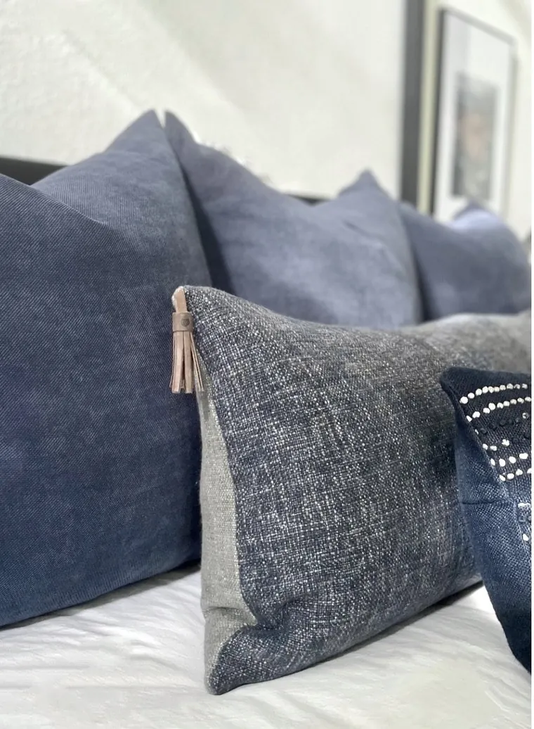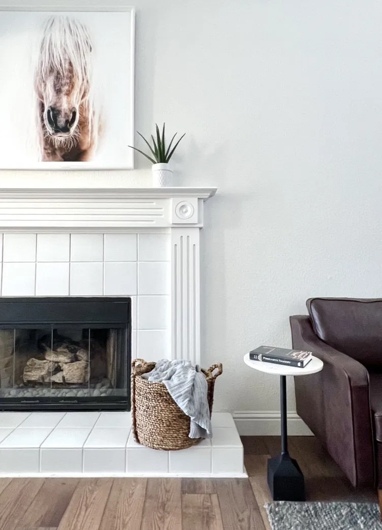
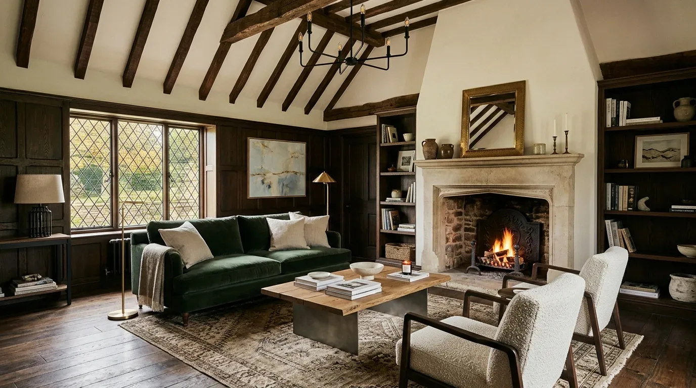
Dark purple works best with lots of light and a mix of finishes. Dark purple is a controlled color in 2026, not for everywhere. Warm control: dark purple deepens sightlines without overpowering the room.
This guide shows light effects on dark purple and how it pairs with wood, stone, carpet, and painted furniture. In Sacramento, strong sun, shaded interiors, and older houses mean the same paint can look very different.
Direct Answers (Paint Dark Purple)
| Can dark purple paint be used effectively in Sacramento homes? | Dark purple rooms stay light and airy with bright windows and balanced materials. |
| In which types of rooms is dark purple paint most effective? | Dining rooms or libraries suit dark purple. |
| What should be considered when choosing a shade of dark purple for walls in Sacramento? | Red-brown purples pair well with walnut or oak. Blue-violet can look cold in bright light, so use it carefully. |
| How does the finish affect the appearance of dark purple paint in a room? | Matte finishes absorb glare. Satin works well for high-touch areas; gloss highlights architectural details. |
Use Dark Purple Where the Room Can Carry It
Dark purple is strongest in rooms where you want enclosure rather than visual expansion. Dining rooms, libraries, and bedrooms can handle dark purple because it adds weight to the walls. Carefully choose colors in large open kitchens. Use dark purple at the end of a sightline but avoid all walls for an indoor-outdoor vibe.
Look closely at undertones, not just the color chip. A red-brown purple looks great beside walnut and limestone. Blue-violet purples can look cold against Sacramento's strong afternoon light. Deep aubergine with mineral finishes works better than highly saturated violet. Benjamin Moore's color guidance is useful here because it treats color as a coordinated palette rather than an isolated swatch: Benjamin Moore's color overview is a good reference point for comparing undertones and adjacent colors.
Matte or low-sheen finishes calm deep colors on walls. Satin finishes work well for cleanable trim areas. Gloss is a deliberate architectural move, not a default. The National Kitchen and Bath Association's emphasis on coordinated material, lighting, and functional planning reinforces the same basic principle: the paint has to work with the room around it, not simply look attractive by itself. The National Kitchen and Bath Association is a useful professional reference for that broader coordination.
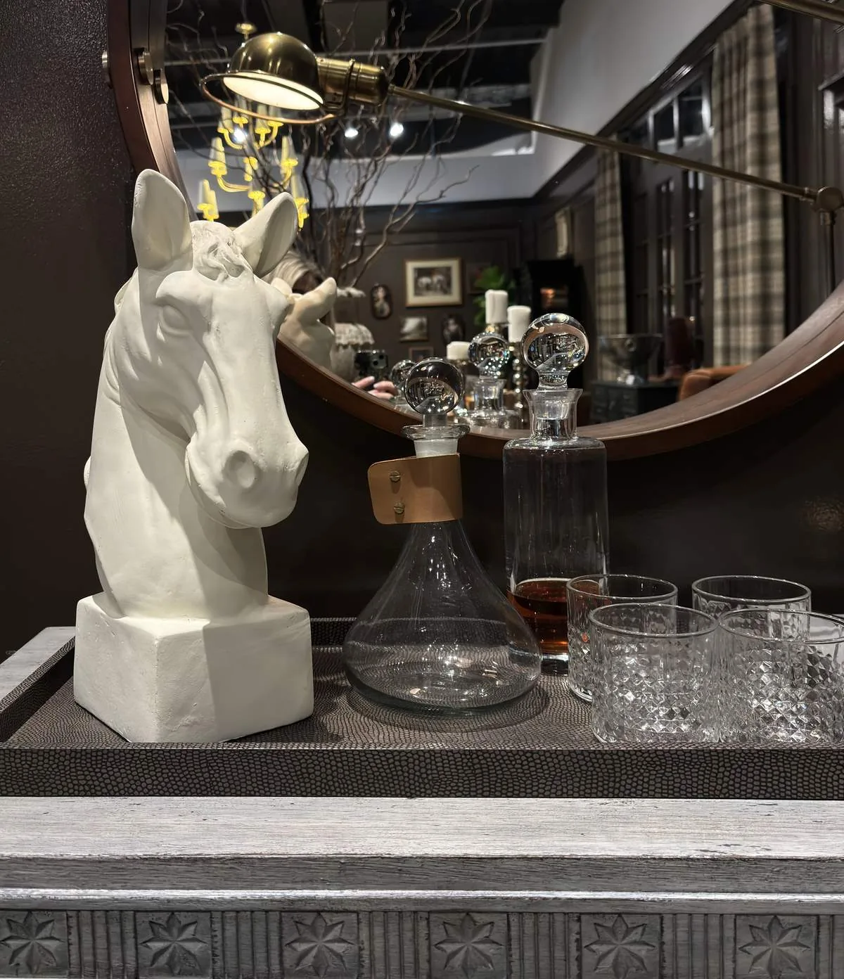
Designer Decision Matrix: Which Paint Dark Purple Approach Fits Your Home
How we actually decide: match your situation to what we would specify, and the reasoning behind it.
| Your Goal | Best Solution | Why We Recommend It |
|---|---|---|
| Small room | Use dark purple on all walls with a warm-white ceiling | Keeping the wall color continuous can make awkward corners disappear visually, while the lighter ceiling preserves vertical breathing room. |
| Low-light room | Choose a warmer aubergine and add layered lighting before committing to it | Red-brown undertones survive dim conditions better than blue-violet, while multiple light sources prevent the walls from becoming a single dark mass. |
| Contemporary look | Pair matte dark purple with rift-sawn white oak and aged bronze | The restrained wood grain and low-reflective finishes keep saturation sophisticated instead of making the room feel theatrical. |
| Traditional Sacramento home | Use dark purple in a dining room, library, or bedroom with cream trim and walnut furniture | The palette works with the proportions and warmer detailing common in older Sacramento houses without pretending the architecture is newly built. |
| Rental or low-commitment update | Use dark purple on a single removable or easily repainted focal wall | A concentrated application delivers the mood change without committing the entire room to a color that may be difficult to reverse. |
| Luxury finish | Specify a premium matte wall coating with satin trim and carefully aimed decorative lighting | A low sheen reveals the depth of a saturated color while satin on high-touch details provides practical cleanability and controlled contrast. |
| Bright south-facing room | Test a red-brown aubergine in morning and afternoon light before ordering paint | Strong Northern California daylight can expose undertones that are invisible on a small sample, especially when direct sun and shadow alternate across the same wall. |
Will Dark Purple Make the Room Too Dark?
The real question is not whether dark purple makes a room dark. Does the room have enough reflected light to make purple feel intentional? First, check where daylight enters and how it changes throughout the day. A south-facing room with lots of windows can handle deep aubergine well. For north-facing rooms, use warmer paint colors, lighter floors, and layered lighting.
Use ceiling fixtures for just one lighting layer. Add table lamps or concealed lights where needed. Warm-white bulbs help purple tones stay rich. In Sacramento, afternoon sun can be particularly revealing, so test the paint after the strongest daylight has moved across the room.
Our preferred visual test is simple: paint a generous sample area rather than relying on a small card, then view it at several times of day beside the actual flooring, upholstery, and wood samples. If the purple looks beautiful only at one hour, it is not ready to specify.
Which Colors Work Best With Dark Purple?
Warm neutrals complement dark purple, giving it a grounded look. Creams, putty, camel, tobacco, muted clay all work well because they share warmth with dark purple tones. Wood like white oak or walnut adds variation.
Try restrained greens, dusty blues over jewel tones. Aged bronze works better with purple undertones than chrome. The goal is not to match purple with purple. It is to build a hierarchy in which the wall is strong and everything around it has a reason to be quieter.
Color guidance from Sherwin-Williams' Color of the Year resources can help with broader palette thinking, but I would still judge the final combination against your home's flooring and daylight. A paint that looks balanced beside a white sample can behave very differently beside honey oak or warm limestone.
Which Finish Should I Use for Dark Purple Paint?
For most walls, choose matte or a very low sheen because deep colors are unforgiving when reflected light starts bouncing across them. Matte makes dark purple more like a solid surface than a mirror. Satin works well on trim and doors for easy cleaning. Use semi-gloss or gloss sparingly, maybe just on a door or special woodwork.
The practical reason is maintenance as much as appearance. Dark paint can show fingerprints, dust, patched areas, and uneven wall texture differently from a pale neutral. A quality washable matte is therefore more useful than simply choosing the flattest possible product. The National Kitchen and Bath Association's focus on performance, material coordination, and functional planning is relevant here because finish selection has to survive how the room is actually used.
Check if walls are original plaster, drywall, or heavily repaired. A smooth wall gives more sheen options. Go with matte on irregular walls for a calmer look.
How Does Dark Purple Look With Different Floors and Furniture?
White oak pairs well; its light, quiet surface keeps purple from feeling too heavy. Walnut pairs well with brass or bronze accents. Cream carpet makes a purple bedroom feel cozy. Dark floors are okay, but stick to light furniture for balance.
Orange-toned red oak is tricky with dark purple. Both wood and purple can clash because of their warm tones. Use a neutral rug or cream upholstery. In older homes, soften transitions with light colors.
Furniture needs to scale the space properly. Use substantial pieces like a linen sofa or pale bed as focal points. A few textured materials are better than many small purple objects. It's not just about the color choice.
Key failures in dark purple paint implementation and how they were resolved
From our project debriefs and post-occupancy reviews, 2023-2026.
Dark purple walls appear flat under low light and cool artificial lighting
This usually happens when a deep color is placed in a room with weak ambient light and a cool artificial source. The symptom is a wall that feels flat and nearly black at night even though the daytime sample looked rich. The cure is not automatically choosing a lighter purple. First add or reposition light, then test a warmer aubergine. In several recent specifications, a modest change in lamp temperature and the addition of a wall-washing sconce made more difference than moving several steps lighter on the paint deck.
Undertone conflicts with warm wood flooring, creating visual dissonance
A purple wall can expose the orange or yellow cast in older wood flooring. The symptom is a room that feels like two unrelated color stories. The cure is to place the actual floor sample beside the paint and introduce a bridge material, often cream wool, mushroom upholstery, walnut, or aged brass. In Sacramento, original floors often have a lot of character that showroom samples lack.
Uniform lighting fails to illuminate corners, making dark purple feel oppressive
Deep matte paint can look beautiful, but saturated colors can make uneven preparation visible at certain angles. The symptom is flashing, visible repair areas, or inconsistent sheen. The cure is better wall preparation and a consistent application method before blaming the color. For textured walls with repairs, go with a washable sheen. It's more forgiving and reflects more light in practical rooms.
Deep matte paint reveals wall imperfections, compromising the finish quality
Repeating purple in curtains, rugs, pillows, art, and furniture is an easy way to flatten the design. Too much purple? Dial it back with softer lighting or lighter accessories. Let the paint handle the bold color and add materials instead of matching accessories. Linen, oak, stone, bronze, leather, and cream textiles create variation that a collection of purple objects cannot.
Sources & Professional References
This guide's positions on materials are grounded in published building-code, standards, and recognized design-authority sources, alongside Designed | Curated Interiors' verified credentials and active project files:
- American Society of Interior Designers (ASID): interior-design practice standards
- International Code Council (ICC): Chapter 8 Interior Finish Decorative Materials And Furnishings
- NKBA, Amy Kunst Member Profile (verified credential, NKBA Committee Member)
- Featured in: Good Housekeeping (storage and space-planning expert quotes, July 2026) · Homes & Gardens (design expert quote, May 2026) · Sacramento Love (guest author, 2024)
Frequently Asked
What common mistake should be avoided when selecting dark purple paint for a kitchen in Sacramento?
Why is testing the actual wall with dark purple paint important before finalizing a choice for an expensive room?
What impact can choosing dark purple paint have on home improvement costs in Sacramento?
Related reading
- Sacramento & Bay Area Interior Design Services How we scope, source, and deliver work end to end.
- Interior Designer Hub, Sacramento Where most of our Sacramento work lives, the regional fit explained.
- Mill Valley Dark House Fix: What Actually Works (Not Just Paint) Summary: Most dark Mill Valley houses are not failing because the owner chose the wrong lamp. They feel dark because daylight is being reduc
- Best Dark Blue Paint Colors Related cluster piece referenced from the Best Dark Blue Paint Colors build files.
- Purple Paint Color Related cluster piece referenced from the Purple Paint Color build files.