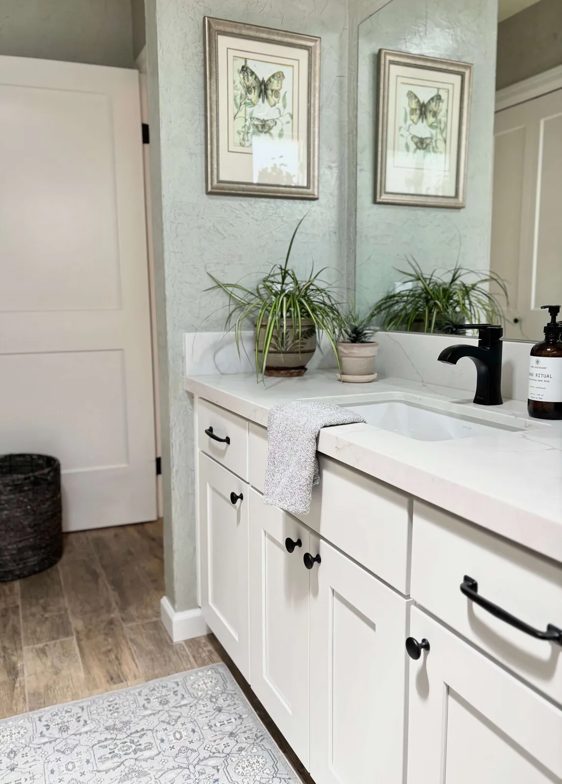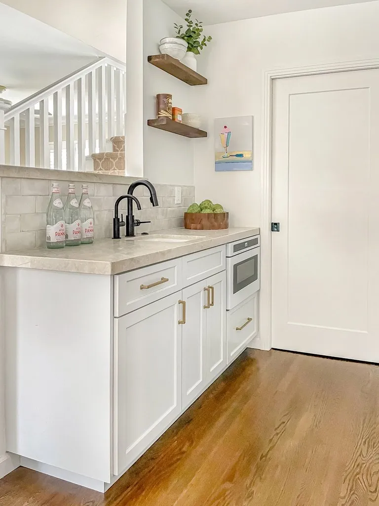
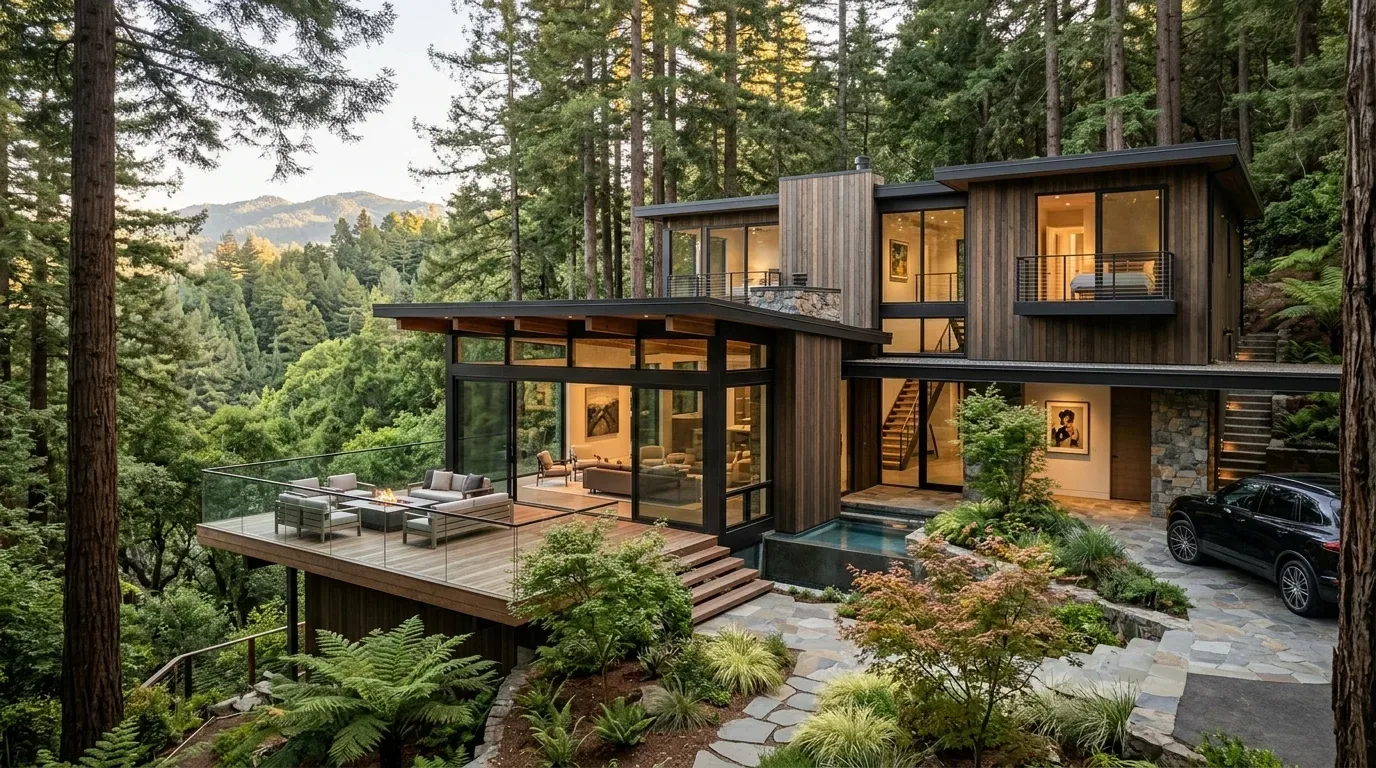
Dive into color pairings with grey. Learn about texture impacts, trendy combos, modern moods. Sacramento style leans toward clean lines with a hit of bold color, and it works.
Direct Answers (What Colors Go With Grey)
| What colors go with grey in interior design? | Grey works well with taupe or terracotta, maybe olive. Try blush pink. Maybe soft teal. Warm mustard can do wonders. |
| How can I make a grey room feel warmer? | Use warm textures. Linen, wool, leather work well. Reclaimed wood softens grey's coolness. |
| Are there regional preferences for colors that go with grey in Sacramento? | Sacramento's light calls for warm hues. Layered materials enhance grey. |
| What finishes work best with grey walls? | Matte finishes soften walls. Gloss adds modern touch. |
The Power of Warmth and Texture in Grey Interiors
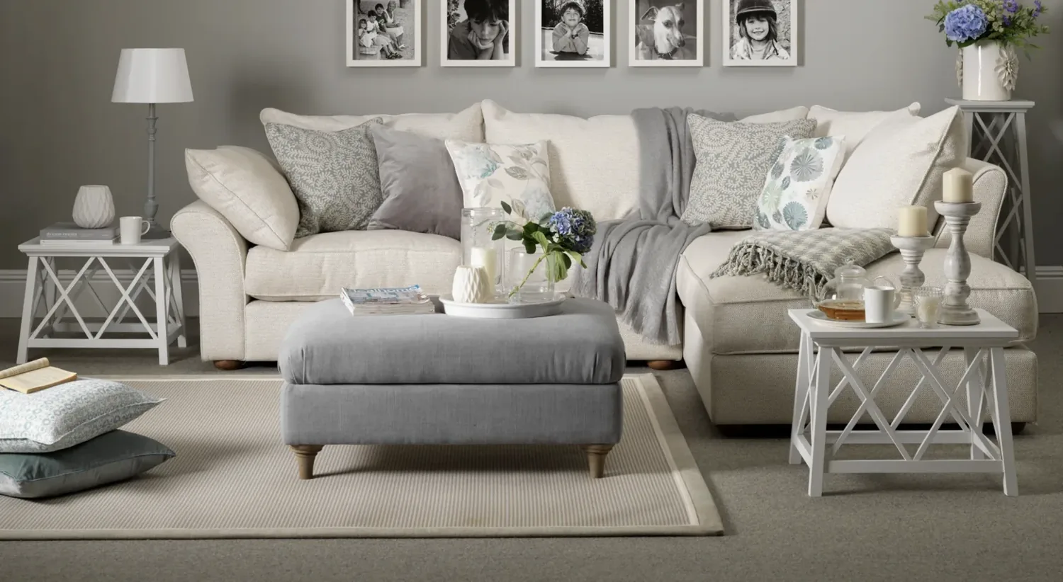
In 2026, the most compelling grey interiors are those that incorporate warm, earthy tones and layered textures. Grey looks sharp with taupe or terracotta. In Sacramento, try Sherwin-Williams warm grey on walls. Add linen drapes, woven rug. It softens grey, adds interest.
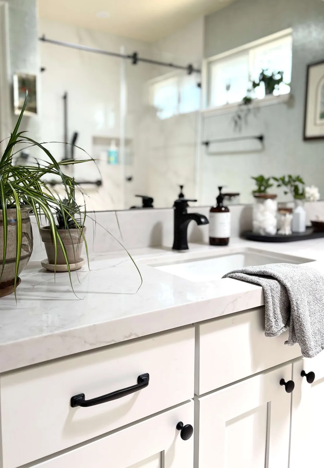
Textures are crucial. Matte walls contrast with glossy cabinets. Leather and rattan add warmth. Use color. A teal splash can brighten a room. Matte black fixtures with warm grey walls. Creates sleek, cozy look.
Material Specifics for Complementary Color Pairings
Authenticity-grade materials
- White oak (rift-sawn), for floors and slat detail; calmer grain than plain-sawn
- Linen fabric, soft and textured, enhances warmth against grey walls
- Reclaimed walnut, rich, deep tone that complements warm grey shades
- Matte black hardware, sleek contrast that adds depth
- Terracotta tiles, earthy, warm accent in kitchens or bathrooms
- Soft woven wool, for rugs, adding tactile warmth and comfort
- Brushed brass fixtures, warm metallic that pairs well with muted palettes
- Natural rattan, introduces organic texture and visual interest
Generic-grade tells we refuse to spec
- Glossy finishes, tend to reflect too much light, making spaces feel colder
- Bright primary colors, often overpower the subtlety of grey palettes
- High-gloss paints, can create a stark, clinical look
- Synthetic fabrics, less textured and warm compared to natural fibers
- Cool-toned metals, like chrome, often clash with warm greys
- Vivid neon accents, generally too jarring for sophisticated interiors
- Overly patterned fabrics, can make space feel cluttered and dated
Designer Decision Matrix: Which What Colors Go With Grey Approach Fits Your Home
How we actually decide: match your situation to what we would specify, and the reasoning behind it.
| Your Goal | Best Solution | Why We Recommend It |
|---|---|---|
| Create a warm, inviting space in a smaller Sacramento condo | Use warm grey walls with linen textiles and warm wood accents | Northern California’s variable light makes warm tones feel more luminous and inviting, especially in smaller rooms where light is limited. |
| Achieve a sleek, contemporary look on a mid-range budget | Opt for matte black fixtures and textured wall finishes | These choices add depth and sophistication without high-cost custom finishes, fitting Sacramento’s modern homes. |
| Add organic warmth in a historic home | Use reclaimed wood, terracotta tiles, and natural fibers | These materials honor the home's era while creating a cozy, regionally appropriate environment. |
| Design a family-friendly living room with durability | Layer textured rugs, brushed brass fixtures, and durable fabrics | Tactile, warm finishes stand up to daily wear and foster a welcoming atmosphere. |
How to Choose the Right Shades of Grey and Complementary Colors
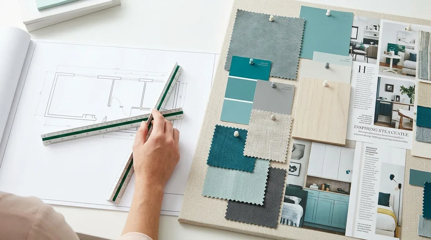
The first question homeowners ask is often about the shades of grey themselves. Should they go for warm or cool greys? Depends on light and mood. Want bright? Need soft? Warm greys, think inviting. Pair with terracotta or olive. Sacramento's sun enhances these shades. Cool greys look modern. Watch out, though. Without warm accents, they might feel too cold.
Picking the right tone? Don't forget materials and finishes. Matte walls soften a room. Gloss? Adds a sleek feel. Test paint in natural light. Notice shifts throughout the day. For regional homes, light meets material. Get it right, or it clouds the vibe. Layer textures to warm up those cold greys.
What Accent Colors Brighten Up a Grey Room?
Want to liven up grey? Choose bright accents, but carefully. 2026? Think muted pastels. Blush pink or warm mustard. They perk up a space without shouting. Pair these colors with warm grey walls and naturals. Adds balance and elegance.In Sacramento, add accents like art or textiles. Boosts the home's mood. Teal throw pillow on a grey sofa? Keeps things feeling fresh, calm. The American Society of Interior Designers emphasizes that color psychology plays a role, warm hues tend to promote relaxation, while soft pastels add a gentle lift. Balance matters. Use accents with care. Avoid clutter.
How Do Textures and Materials Affect Color Pairing Choices?
Texture and materials shape how colors act in a room. 2026 loves natural textures. Linen, wool. Reclaimed wood adds warmth. They soften grey, so it’s not clinical. Sacramento’s light makes this crucial.
Matte walls absorb, enrich warm greys. Glossy? Adds modern light play. The American NKBA guidelines suggest layering different textures to create a tactile experience that invites touch and visual interest. A matte wall finish with leather couch and wool rug? Cozy vibe, right there. Out here, natural textures blend with interiors naturally.
Trending Color Combinations with Grey in 2026
Current trends favor subtle, muted palettes that emphasize harmony. Soft blush works with warm grey. Deep navy adds contrast. Olive green? A touch of nature. These pairings stay classic, never tired. Ranch homes here suit soft, layered hues over stark contrasts. Give warmth to a room by matching warm grey walls with darker grey trims. Add beige fabrics. Match room colors to Sacramento's distinctive light. Design for comfort and local light.
Using Grey to Achieve Specific Mood or Style
Grey is versatile enough to evoke many moods. Warm grey and soft textures? Perfect for 2026 bedrooms. Cool greys and sleek surfaces suit modern, minimalist homes here. Ask what mood you want. Cozy? Go with warm tones and soft lighting. Love modern design? Use monochrome colors and metal details. Warm light with warm greys? Yes. Cool light? Use cool greys. This advice comes from top design bodies. Striking a balance makes local homes feel true to the area.
Examples of Successful Grey Color Schemes in Real-Life Interiors
In several recent projects, we’ve used warm grey walls paired with natural wood, linen textiles, and soft lighting to create inviting Sacramento living rooms. Imagine warm grey walls with a reclaimed wood console and brass accents. Perfect mix for Northern California style.
A cool grey room looks sharp with navy accents and nickel details. Layer fabrics and lighting to soften grey's chill. Avoids a sterile feel. The bright Valley sun can overpower colors. Use materials that embrace warmth yet handle brightness.
Lighting Conditions and Their Effect on Grey and Complementary Colors
Lighting dramatically influences how grey and its accents appear. In Sacramento, seasons change lighting, shifting color perception. Direct sun brightens warm greys. Shade makes cool tones dull.
Check samples in various lights, especially under low winter sun. Mix a floor lamp with a reading lamp and in-built dim lighting. Layers make any room inviting, no matter the hour. Lighting changes mood, big time in Sacramento.
Cultural and Psychological Implications of Using Grey with Certain Colors
Grey’s psychological impact varies with its pairing. Warm greys, earthy tones, perfect for family comfy zones in 2026. Cool greys, metallics? Think modern workspace.
Sacramento light changes grey's effect. Faces Rocklin's hills? Different vibe than a south-facing Land Park home. The American Society of Interior Designers notes that warm, natural palettes foster feelings of safety and comfort, which is especially relevant in a region with a relaxed, outdoor-oriented lifestyle. Muted colors are big here. Keeps a place feeling calm. From our project debriefs and post-occupancy reviews, 2023-2026. Many homeowners attempt bold contrasts with grey, such as pairing it with bright reds or yellows. Spaces feel off when lighting changes. Mornings might clash with afternoons. Use soft accents. Layer textures. Try soft blush or olive green. Complements grey nicely without overpowering it. Some designers focus solely on color without considering how materials behave. Shiny finishes? Makes grey feel cold. Avoid them. Matte surfaces and natural fibers add warmth. Better for welcoming spaces. Lighting can make warm greys look dull or cool greys appear harsh. Folks forget to test paint in all lights. Then they’re surprised. Try varied lighting. Test colors at different times. Sacramento's light changes often. Using too much dark grey can make a room feel smaller and more enclosed, while too much light grey risks a sterile vibe. Mix shades. Textures and finishes add dimension. Dark grey walls? Use lighter fabrics. Add textures. Colors can carry cultural or psychological meanings that influence how a space feels. Metallic and cold grey? Not as cozy. Warm grey with natural textures? Much better. Consider local tastes and mood impact. Makes spaces inviting.Observed Failure Modes, How What Colors Go With Grey Goes Wrong
Overly Contrasting Color Schemes
Ignoring Material and Texture
Choosing the Wrong Light Temperature
Overusing Dark or Light Grey
Neglecting Cultural or Psychological Context
What's Going Out for 2026
What What Colors Go With Grey Costs in 2026
| Scope | Typical range |
|---|---|
| Refresh scope: repaint walls, update textiles, and fixtures | $15K-$25K |
| Mid-tier scope: add custom millwork, layered textures, and high-end finishes | $40K-$70K |
| Estate-scale: full remodel with structural updates, custom cabinetry, and premium materials | $100K-$200K |
Working Notes
What We Have Learned Doing This: what colors go with grey
“If a color is named in three magazines this year, it will date faster than its lifespan. Choose colors that have looked tasteful for twenty years.”
Undertone is the whole game. Colors change with light. Full-size samples help before final choice.
Fear delays or bad framing, not taste. Execution issues haunt you. Design draws people in. But it’s execution that makes it real.
Money drains away on fixing the wrong issues confidently. Client wants space? Sometimes it’s just bad proportions, odd sightlines. We make the room tell us the problem before anyone signs a demolition contract.
Trust grows in dull talks. Like discovering a wall’s structural. Clients forgive reality. They do not forgive being surprised by it.
These notes come from our own what colors go with grey project debriefs. Most were learned the expensive way the first time.
Sources & Professional References
This guide's positions on materials are grounded in published building-code, standards, and recognized design-authority sources, alongside Designed | Curated Interiors' verified credentials and active project files:
- American Society of Interior Designers (ASID): interior-design practice standards
- International Code Council (ICC): Chapter 8 Interior Finish Decorative Materials And Furnishings
- NKBA, Amy Kunst Member Profile (verified credential, NKBA Committee Member)
- Featured in: Good Housekeeping (storage and space-planning expert quotes, July 2026) · Homes & Gardens (design expert quote, May 2026) · Sacramento Love (guest author, 2024)
Frequently Asked
What colors go with grey in interior design?
How can I make a grey room feel warmer?
Are there regional preferences for colors that go with grey in Sacramento?
What finishes work best with grey walls?
How do lighting conditions affect color choices with grey?
What are some trendy accent colors to pair with grey in 2026?
What are common mistakes to avoid when choosing colors with grey?
From What Colors Go With Grey to a Real Room
A trend piece is the briefing document, not the deliverable. The pages below show how we translate these principles into finished rooms across Sacramento and the rest of Northern California.
- Sacramento & Bay Area Interior Design Services How we scope, source, and deliver work end to end.
- Interior Designer Hub, Sacramento Where most of our Sacramento work lives, the regional fit explained.
- What colors go with grey sofa: A Designer's Guide Learn about the best colors to pair with a grey sofa in 2026, focusing on warm tones and materials that resonate with Sacramento's design ae
- What Colours Go with Grey Sofa: A Designer's Guide to the 2026 Look Discover the best colors to pair with grey sofas in 2026, focusing on warm tones and textures that enhance Sacramento's interior design.
- What Colors Go With Brown: A Designer's Guide to the 2026 Look Explore the best color combinations to complement brown in your Sacramento home. This 2026 trend guide covers shades, accents, lighting, tex