
Completed client project. The owners came to us wanting their whole home in Lakeport to feel more connected and current without losing its water views or the practical layout they already used. Built in 1988, the two-story wood-frame house measured about 1,951 square feet, with three bedrooms and two and a half baths on a flat 16,988-square-foot lot. The entry and central hallway connected the bedrooms to the open kitchen and living room; the kitchen had light wood cabinets, white counters and a window above the sink, while the living room had a black metal wood stove on a red brick hearth, a carpeted sitting area, a large water-facing window and double French doors. We began with the budget-setting choice: keeping the sink at its window or moving it into a new island. We kept it at the window.
The photographs on this page are from the Designed & Curated portfolio and show finishes we have used on other projects. They are not photographs of this house.
My first question was whether the owners wanted to spend on moving plumbing, or preserve the sink’s view and put that effort into the shared rooms. They wanted the kitchen and living area to feel like one comfortable space, not a construction project centered on a relocated drain. On site, we found the existing kitchen-to-living opening already connected the rooms, and the tile-to-carpet change made the boundary feel more pronounced than the layout did. The house’s two-story frame made keeping that established opening the sensible choice. I used the public record as a starting point, then checked the rooms, surfaces and routes in the house before we settled the scope.
The kitchen sink and the new island
We kept the sink beneath the kitchen window, along with the existing electric range and vent hood. The house had district or public water and a public sewer connection, so there was no reason to shift the established supply and drain route just to create an island feature. Instead, we installed a prep island without a sink or cooktop. It added useful work surface and seating while leaving the cooking appliances against their existing wall and preserving clear movement between the kitchen, living room and French doors.
The kitchen’s light brown cabinets and glass-front upper doors still suited the room, but their hardware made the finish feel dated beside the stainless refrigerator and dishwasher. We updated the pulls and kept the white countertops, which remained a quiet surface against the cabinetry. We also kept the window above the sink rather than enlarging it: the living room already held the broad Shirley Slough view, and the kitchen’s existing window gave the sink its own outdoor connection without expanding the exterior opening.
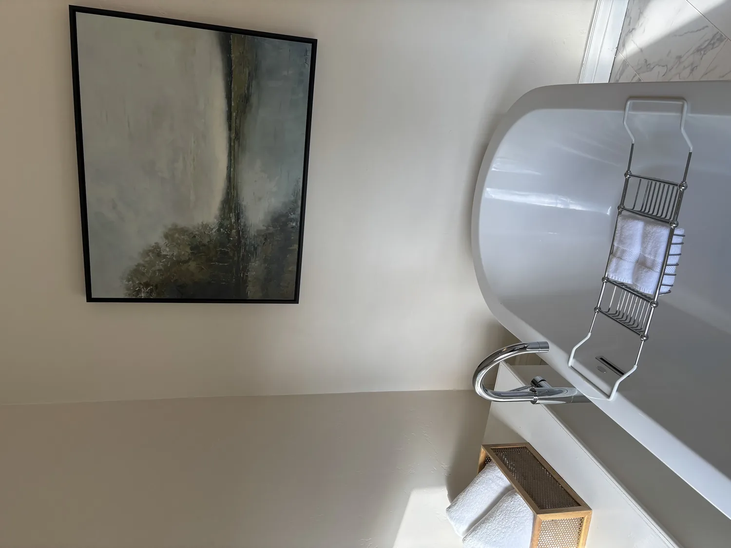
The tile, carpet and brick hearth
The entry, kitchen and part of the living room already had ceramic tile, while carpet covered the sitting area. We removed the carpet and carried a consistent hard surface through the connected kitchen and living spaces, so the floor no longer divided the rooms at the edge of the sitting area. We kept the hallway’s route to the bedrooms legible and finished the transitions at the entry and exterior doors carefully. The result gave the owners an easier-to-clean shared space without changing the footprint or the existing room connections.
We retained the black metal wood stove, which remained a useful focal point, and refreshed the red brick hearth with a cleaner, simpler finish. The ceiling fan and light stayed in the living room, but we updated the entry’s flush mount and wall sconces and added focused kitchen task lighting. This balanced the natural light from the large water-facing window and French doors with more useful light at the counters and through the central rooms. The house’s tankless propane water heater stayed in service, and the two-car attached garage continued to provide storage during the work.
The entry, porch and cream siding
The tiled entry had a dark stained wooden front door with an arched window, white walls and a direct connection to the central hall. We kept the door and its shape, softened the surrounding finish, and installed updated lighting so the entry felt more considered without narrowing the hallway. We also added discreet closed storage along the hall where it fit without interfering with the route to the bedrooms.
Outside, the cream board-and-batten siding, green trim, gable roof and covered porch gave the two-story frame its established character. We refreshed the exterior palette and made the porch feel more cohesive with the entry, while keeping the siding’s vertical lines and the roof form. The flat lawn and mature shade trees remained part of the setting. We also kept moisture in mind: the public map identified poorly drained Landlow variant silty clay loam and a FEMA flood zone AE designation, so we did not extend the project footprint or disturb the site to make the interior changes.
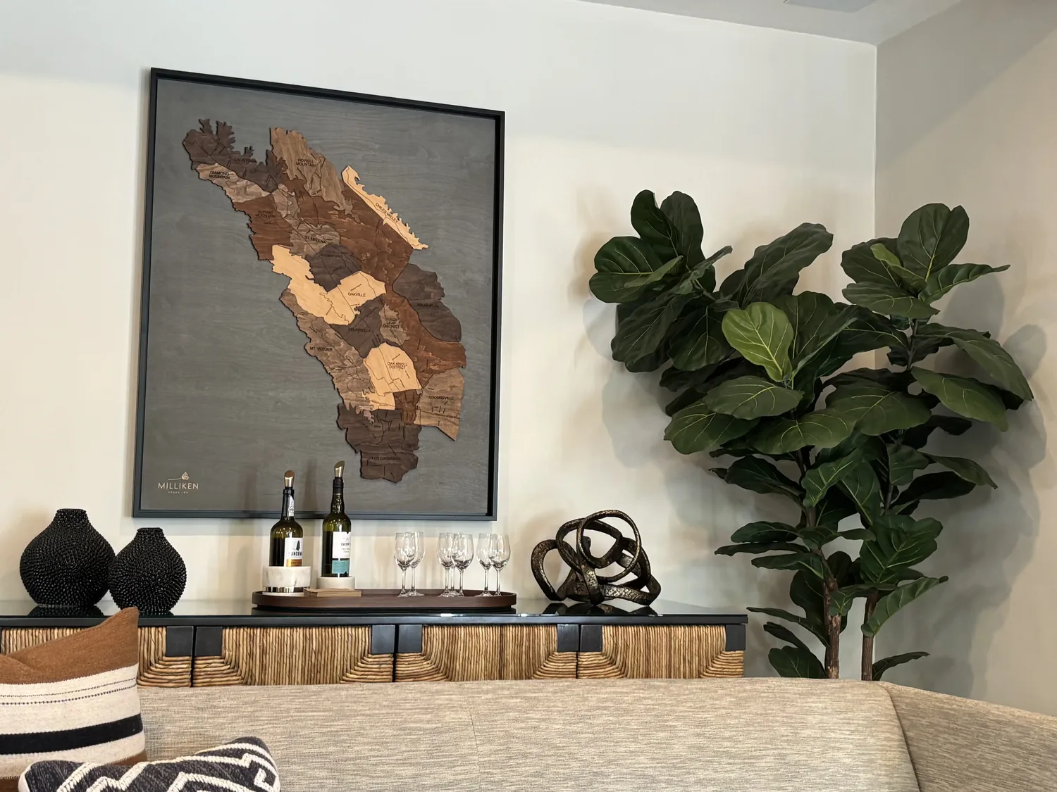
Lighting and the permitted scope
We checked the local requirements for the lighting work against the house’s mapped Title 24 building climate zone 2, and kept the electrical changes focused on the new fixtures and task lighting. The Lakeport market context also supported a restrained approach: among 105 single-family closings, the median home measured 1,750 square feet on a 13,504-square-foot lot; 16% were built before 1960 and 43% before 1980, while the most common decades were the 2000s, 1980s and 1990s, and 10% had an HOA fee. We used that context to keep the remodel centered on the owners’ rooms and the house’s own features, rather than chasing a larger addition or a different layout (Lakeport recorded closings).
If you’re ready to make your home work better, get in touch.