Completed client project. The owners came to us for a whole home remodel in Merced, with a particular frustration at the front door: coats, shoes, mail, and bags had no clear landing place. Their 2021-built, single-story, modern stucco home measured about 2,265 square feet on a 7,797-square-foot lot. It had four bedrooms and two bathrooms, an open kitchen, dining, and living area, a primary suite with a large walk-in closet, and a laundry room with additional walk-in storage. The kitchen already had an island with dining seating, an eat-in area, a walk-in pantry, and an oversized commercial-style refrigerator. The owners wanted the arrival to feel organized without losing the light and open flow that connected those rooms.
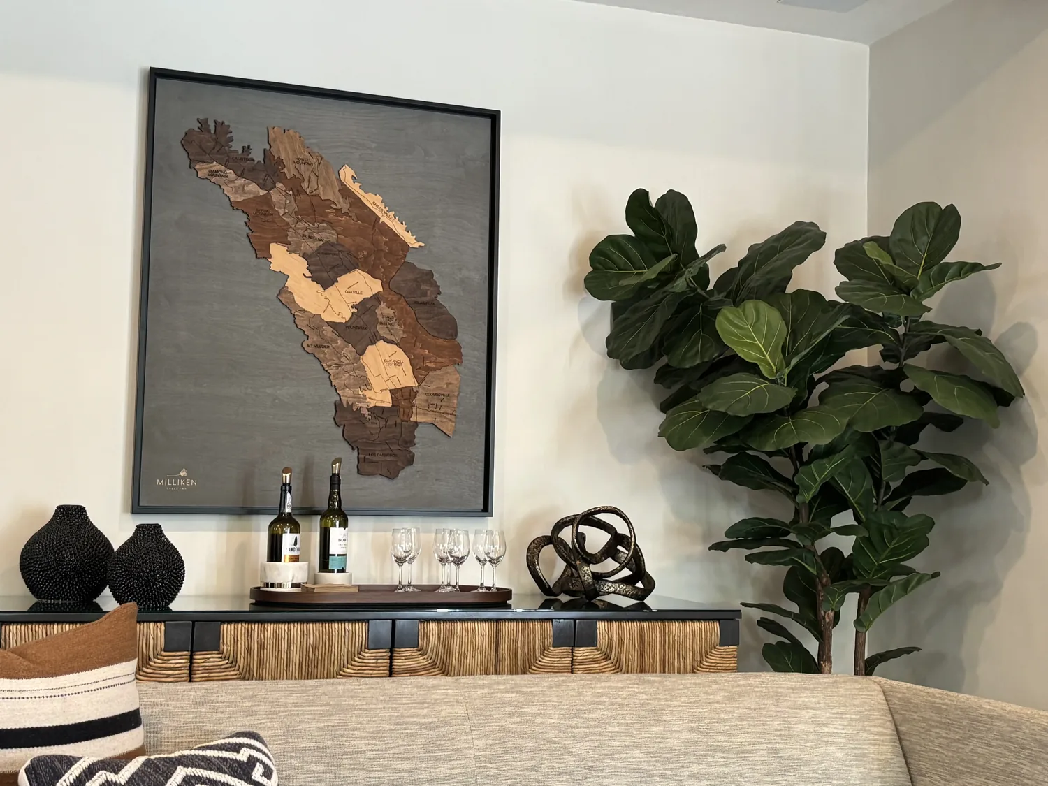
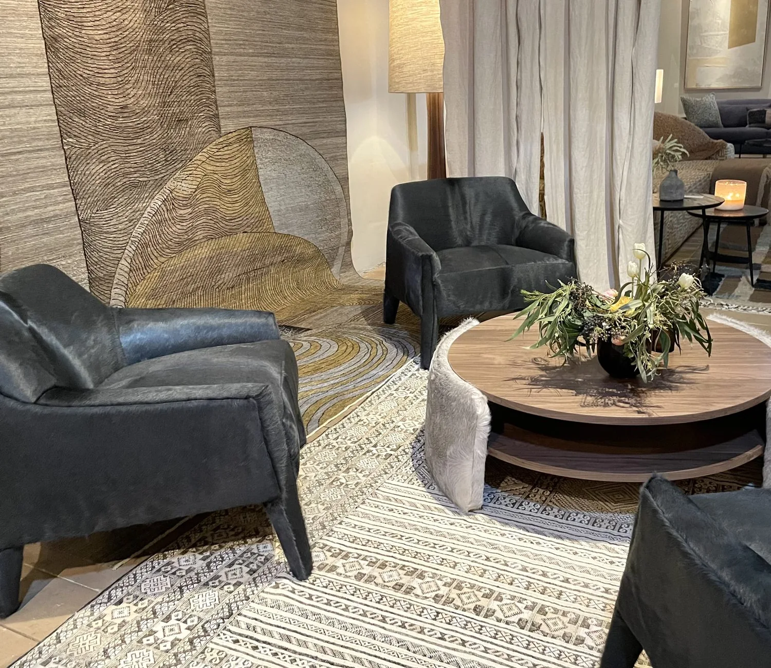
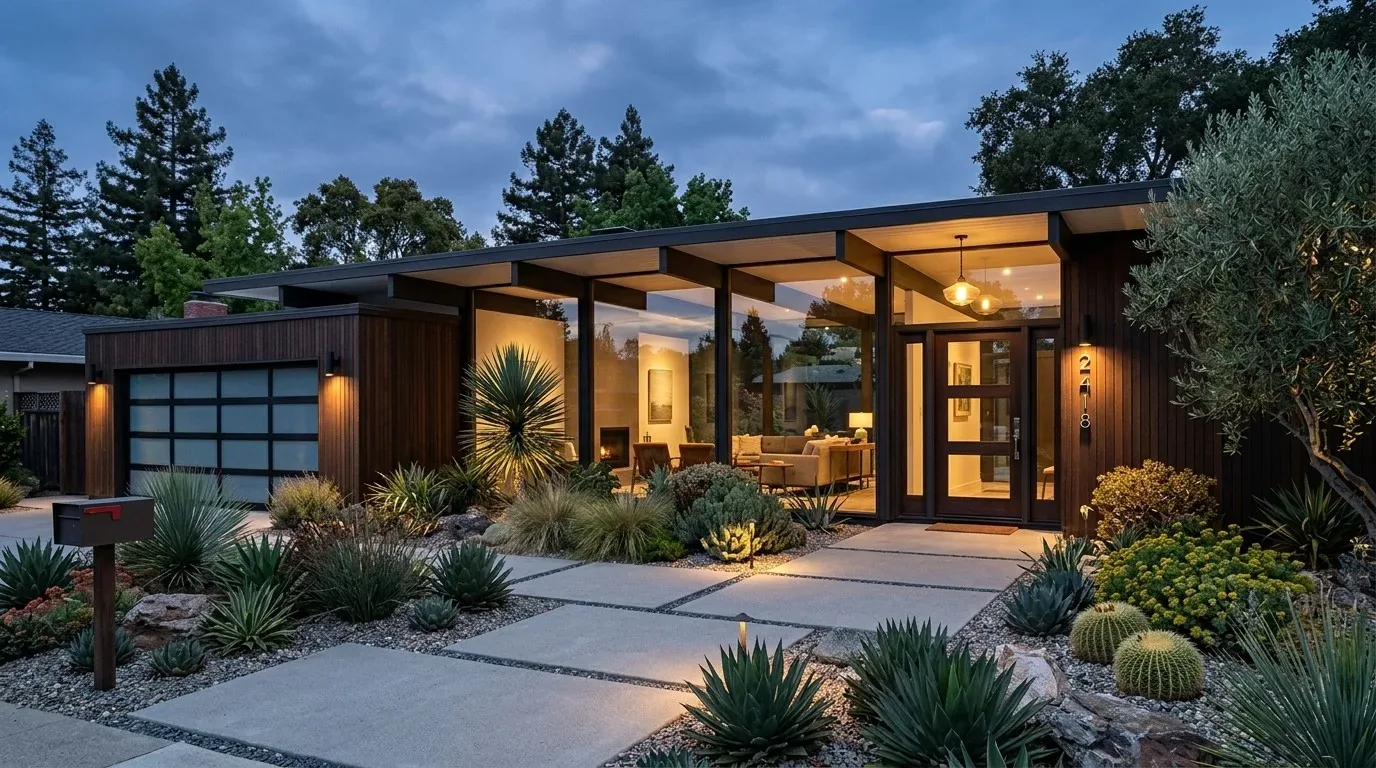
The photographs on this page are from the Designed & Curated portfolio and show finishes we have used on other projects. They are not photographs of this house.
My first question was: where did the coats, shoes, mail, and bags land in the first thirty feet, and what needed to stay clear? On site, we found that the front door opened into the shared living space without a dedicated entry closet or drop zone. We also found a slab foundation beneath this single-story home, which made an above-floor solution the sensible choice. We measured the entry wall and the path into the living room before choosing storage, so the new landing place fit the house rather than becoming a barrier in it.
The broader context helped us keep the design specific to this family. Redfin's record of 307 single-family closings in Merced showed a median build year of 1972, with 30% built before 1960 and 63% before 1980. The median home measured 1,633 square feet on a 7,500-square-foot lot, and 4% had an HOA fee. The most common build decades were the 1970s, 1960s, and 1950s. This house was newer and larger than those medians, with its own open layout and existing smart lighting, so we kept the work focused on improving how its rooms functioned together rather than borrowing a renovation template (Redfin's Merced sold data).
The front door and its landing wall
We chose a shallow, closed storage unit for the usable wall within the entry stretch, then installed it with a bench, a small mail surface, and hooks for items used every day. The closed doors kept the view into the open living area calm, while the bench gave the owners a place to pause and deal with shoes before moving further into the house. We kept the arrangement clear of the door swing and the route from the entry through the living and dining areas. Because the foundation was a slab, we secured the unit to the wall framing and kept the work above the finished floor rather than cutting into the slab.
The exterior already brought together two-tone brown stucco, white trim, a dark garage door, and a concrete walk and driveway. We carried the same grounded palette indoors with a warm, light finish on the storage and a natural oak seat. That contrast gave the entry its own identity without adding a partition or blocking the south-facing daylight. We also used the existing Lutron dimming lights to give the entry a distinct, softer setting from the main living area, while keeping the home's keyless entry and other smart features in use.
The open rooms beyond the entry
The kitchen, dining area, and living room already shared one open plan, so we did not break that connection to make the entry feel defined. Instead, we treated the landing wall and lighting as a quiet threshold. From the front door, the owners could now put things away before entering the main room; from the kitchen, the storage read as part of the room's finish rather than a freestanding pile of furniture. We kept the kitchen's island, eat-in area, pantry, and appliance layout in place, and used the entry's warm finish to relate to the existing earthy exterior colors.
The house's central forced-air heating and cooling also shaped where we put the storage. We measured the wall and checked the airflow locations before installation, then kept the unit clear of the system's supply and return paths. We left the laundry room's additional walk-in storage available for household overflow, rather than asking the front entry to hold everything. The attached two-car garage remained useful for vehicle access, while the front door gained its own organized landing place.
The shingle roof, public water, and public sewer were existing parts of the house, and none needed to change for this entry-centered work. The lot was flat and open, with a concrete approach, low shrubs, lawn, and a young front-yard tree. We kept the entry design light so it did not interrupt the natural light or the sightline from the door into the open rooms. The house worked better on arrival, and the kitchen, dining, and living areas still felt connected rather than divided.
We checked the site's recorded Title 24 building climate zone, zone 12, as part of the lighting decisions. The lighting work stayed within the existing smart dimming system, and the storage and finish work did not alter the home's structure, plumbing, heating, or cooling.
Get in touch to talk about making your home work better.