Completed client project. The owners came to us with a 1960, approximately 3,595-square-foot, stucco house on a 11,305-square-foot lot in Montclair, Oakland. It was a one-and-a-half-story home with three bedrooms and four bathrooms, a vaulted living room, an open kitchen and dining area, and a second living space. They wanted a whole-home remodel that made those rooms work better together without losing the exposed wood beams, large windows, or living-room fireplace that gave the house its character. The entry and courtyard patio also needed to feel connected to daily life, while the large windows needed better privacy and light control. My first question was: what did they most want to preserve when we changed how the house worked? Their answer made the beams, windows, and fireplace the fixed points for our decisions.
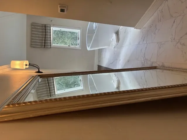
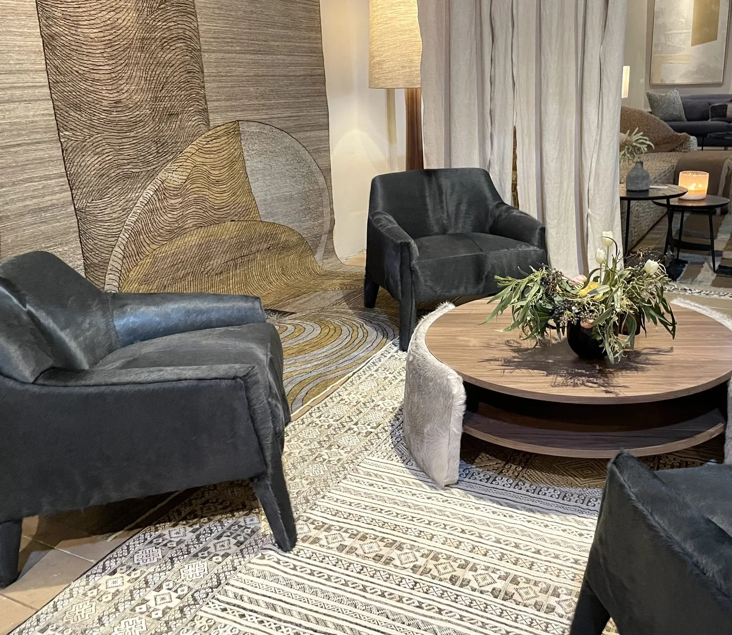
The photographs on this page are from the Designed & Curated portfolio and show finishes we have used on other projects. They are not photographs of this house.
Oakland’s housing stock offered context, not a design template: among recorded closings, the median home was built in 1945, and 67% predated 1960. We used that context to pay attention to this house’s actual structure and finishes, rather than applying a generic period look (Redfin Oakland closing data). Published Oakland work, including the Fox Theater renovation, also showed how distinct the city’s design responses could be; for this home, we kept the response quieter and centered on its own wood, slate, and stone (7x7 on the Fox Theater renovation).
The vaulted ceiling and roof framing
On site, we found that the exposed beams followed the vaulted ceiling rather than sitting beneath a simple, flat ceiling plane. The house’s one-and-a-half-story form and its raised post-and-pier foundation with a crawl space helped us understand where the roof and floor structure shaped the rooms below. We also found that the visible beams were part of the character and scale the owners wanted to keep, so we did not raise the roof or flatten the living-room ceiling to create a new overhead plane.
Instead, we traced the accessible roof and attic areas and treated their varying access as a design constraint. We kept the roof profile and beam rhythm intact, and focused the overhead work on air sealing and insulation where the existing assembly allowed it. The house already had partial insulation and sealed areas, so we kept sound work in place and addressed the places that needed attention without concealing the beams. That approach protected the daylight and height of the main rooms while making the roof and attic part of the whole-home work, not an afterthought.

The kitchen, dining area, and family room
The kitchen and dining area already formed an open space, with a central island and a banquette tucked beside the windows. We kept that arrangement, the gas range, and the sink in their existing zones. The raised foundation and crawl space made it possible to trace the plumbing below the floor, and we found no reason to move the drain just to make the room feel more connected. We refined the kitchen’s lighting and storage around the existing work areas, keeping the island useful for seating and food preparation rather than making it carry every household activity.
The secondary living room offered a different kind of connection: its large windows brought in landscape and daylight, while its exposed beams and wood floor gave it a distinct character. We kept it as a separate retreat rather than cutting a new opening through the wall and roof framing. We placed seating so the family could stay connected to the kitchen and dining area without giving up a quieter place to settle. A washable area rug softened the wood floor in the shared spaces, and window treatments gave the owners more control over privacy and glare without hiding the views.
Entry, living room, and the connected whole
At the entry, we used the existing slate floor as the threshold between the courtyard and the house. We added closed storage for shoes and bags along the circulation route, so the entry worked harder without crowding the path toward the living room. We kept the slate transition clear and aligned the new storage with the existing wood finishes rather than introducing another competing surface.
In the living room, the textured white fireplace wall remained the focus. We layered the lighting so the vaulted space had useful ambient light, while the kitchen work surfaces and banquette received more direct illumination. The natural-gas forced-air system stayed in place, and we mapped the existing supply and return locations before finalizing the connection between the shared rooms. The home’s cooling relied on ceiling fans and multiple wall or window units, so we kept the seating and lighting choices compatible with those existing systems. The seller-owned solar remained part of the house, but we did not treat it as proof of spare electrical capacity.
We checked the permit scope for the roof, insulation, and electrical work before construction, and used the house’s listed Title 24 climate zone 3 to guide the energy-related decisions. We kept the work within the existing roof form and made the permit decisions around the actual scope, rather than assuming that cosmetic changes and building-system work followed the same path. Oakland closing data supplied local housing context, but our decisions came from the structure and conditions we found in this house (Redfin Oakland closing data).
Get in touch with Amy to talk about your home.