Completed client project. The owners came to us wanting their 1993 house in Montclair, Oakland, to feel more connected to its outdoor spaces and work better as a whole. At about 4,157 square feet, with stucco walls, a tiled roof and a 1.5-story layout, the house had four bedrooms and three and a half baths. Its main level held the primary suite, kitchen and family room; the lower level held a second primary bedroom with an attached bath and sauna, plus three additional bedrooms. They wanted us to refresh the entry, improve the kitchen and family room, and make the decks feel like a natural extension of the rooms beside them. My first question was: which everyday route between the house and the decks felt least connected? They pointed us toward the family room and the rear outdoor spaces.
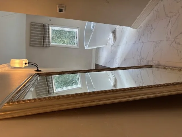
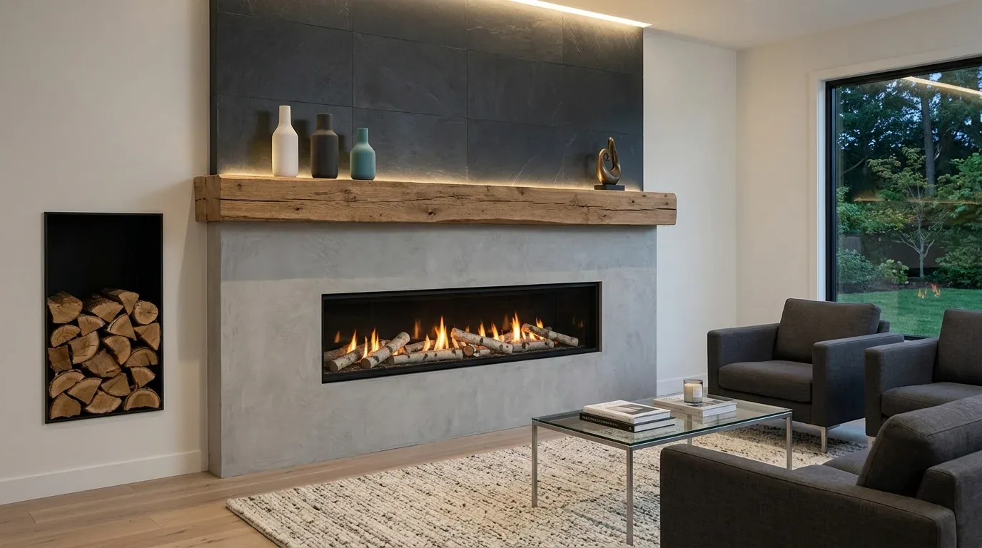
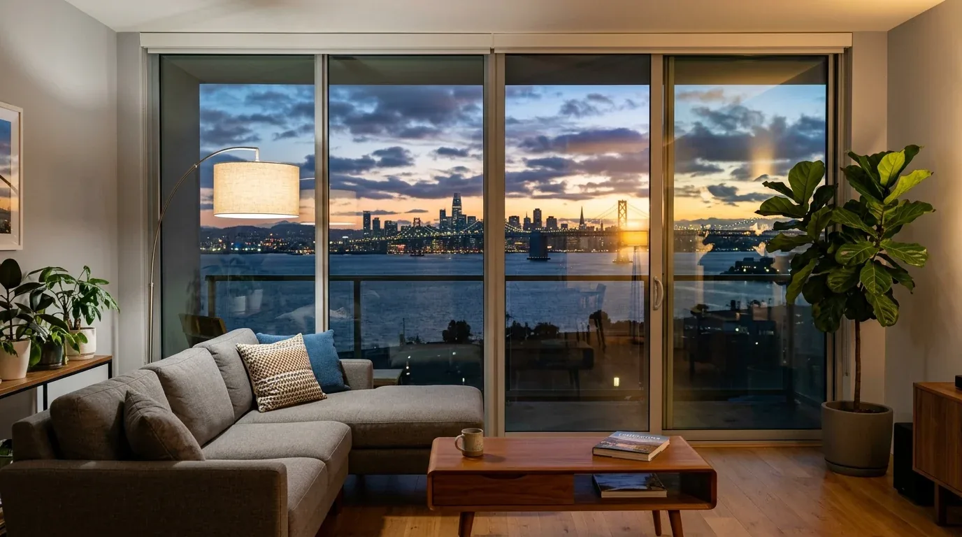
The photographs on this page are from the Designed & Curated portfolio and show finishes we have used on other projects. They are not photographs of this house.
The house already had a strong identity in its rounded entry tower, large wooden door, stucco and tile. We kept those features as the starting point rather than borrowing another style. Oakland's Fox Theater had its own renovation story, but its historic language did not fit this house; that distinction guided our restrained approach to the entry (7x7 Bay Area). We based decisions on the owners' rooms and our site measurements, then checked each material against the house's existing finishes and views.
The entry and the hillside approach
On site, we found the house's pillar-and-post foundation and crawl space, details that mattered because the house sat on a steeply sloped lot and its floors met at several levels. We measured the transitions instead of assuming a continuous, level floor could run through the whole home. The foundation also helped us understand where the house met the hillside, while the rear decks and patio gave us the outdoor destinations the owners wanted to bring into the daily flow.
We kept the rounded tower and wooden entry door, then made the approach feel clearer with a more open-feeling entry treatment and a simplified planting arrangement. The paved driveway, mature trees and shrubs, and landscaped front approach already gave the house privacy and shade. We refined the planting rather than stripping the hillside bare, and used a drought-conscious palette suited to the site's exposure. We also kept the view from the approach and the visual weight of the tiled roof in mind when choosing the exterior finish direction. The result kept the house's Mediterranean-influenced character while making the entrance feel less closed off.
The kitchen, family room and main-level route
The kitchen already opened to the bright family room, where large windows framed the city view. We kept that connection and focused the changes on a more useful island, clearer circulation and flexible seating. We expanded the island's working and gathering surface without relocating the gas range, double oven or sink. The existing kitchen had a 220-volt outlet, a pantry and solid-surface counters, so we worked with those useful parts rather than replacing them simply to make the room feel different. We positioned the seating to preserve a direct route from the family room to the rear decks, and kept the window view open rather than letting furniture dominate it.
The house's listed flooring was carpet, and the crawl-space access and level changes made careful floor transitions important. We replaced carpet through the main gathering area with a warm, matte wood finish, then made the thresholds between the kitchen, family room and adjoining spaces deliberate and easy to read. We did not force the lower level and main level into one visual plane. The family's three fireplaces, including the one in the family room, remained part of the house's character; we arranged seating around the room's use and views rather than treating the fireplace as the only focal point.
The lower level, decks and evening light
The lower level gave the family a second primary suite, its attached bath and sauna, and three more bedrooms. We added built-in storage where the room layouts allowed, which helped keep furniture and belongings from crowding the bedroom corners. We layered the lighting so each room had useful general light and softer light for reading, and brightened the routes between bedrooms and the shared areas. The main level received focused light at the kitchen work surface and gentler light around the family-room seating.
We found zoned natural-gas heating, central air and a heat pump in the house, so we kept the room layout compatible with the existing heating and cooling zones. We placed the expanded island and family-room seating with those systems in mind. The house also had seller-owned photovoltaics, which we retained as part of the home's existing energy setup. Outside, we refreshed the decks and railings with a cleaner, simpler finish and carried a related palette from the family room through the doors. The decks remained the destination, not just a view from inside. With the routes cleared and the finishes related, the owners could move from the family room to the outdoor spaces without the change in surface feeling abrupt.
We checked the Oakland permit scope for the work before construction, including the exterior deck and railing changes, and kept the project within the house's existing footprint. The lot's recorded zoning was residential, and the steep hillside and mapped wildfire hazard informed how we handled the landscape: we maintained the existing sense of privacy while keeping the planting approach mindful of defensible space. Oakland's housing stock often reflected much earlier construction than this house, so we used that context as a reason to respect the house's own era rather than add unrelated period details (Redfin Oakland sold-home data).
Get in touch to talk about your home.