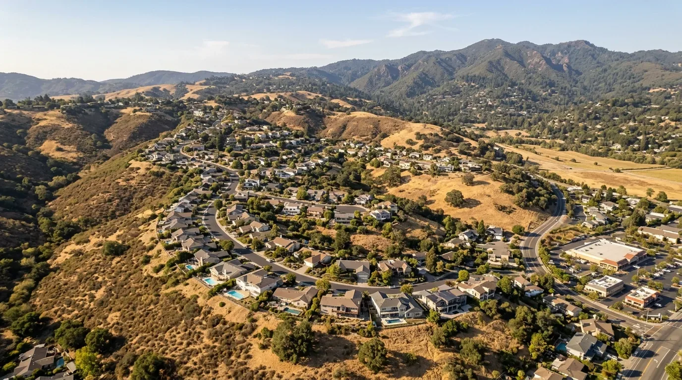
Completed client project. The owners came to us with a 1935 Tudor in Oakmore, Piedmont, and wanted the downstairs to feel like one place to cook, gather and get out to the yard. The house had about 2,268 square feet on a 4,000 square foot lot, with three bedrooms and two baths. Its brick and stucco walls, steep shingle gables, diamond-paned leaded glass and original interior woodwork gave us clear details to preserve. The kitchen was separate from the large family room, while the attached one-car garage, laundry and bonus space occupied the lower level. Upstairs, three bedrooms shared a large bath.
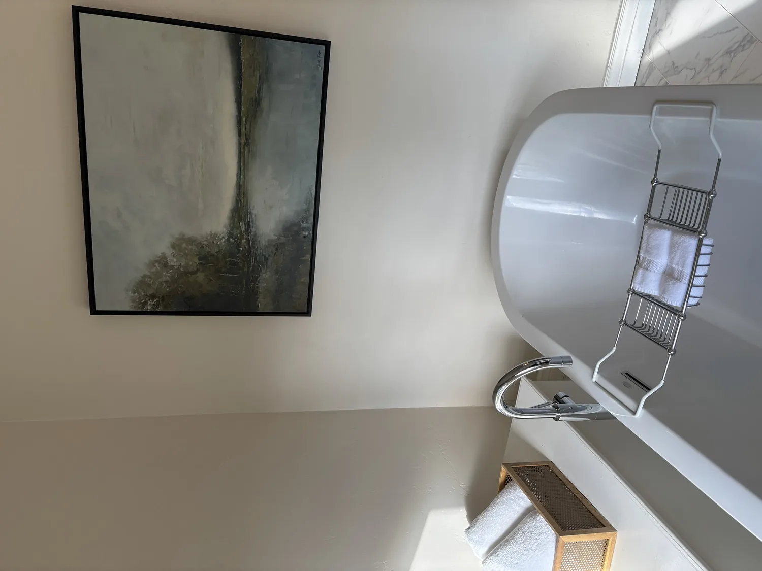
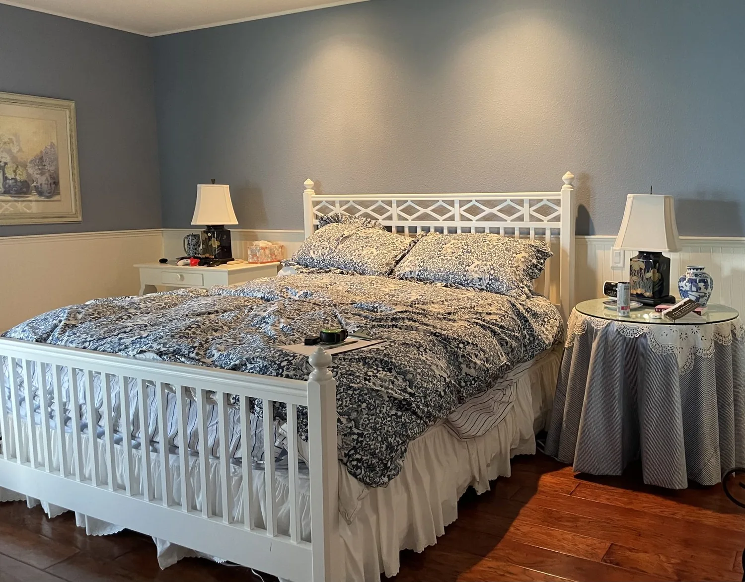
The photographs on this page are from the Designed & Curated portfolio and show finishes we have used on other projects. They are not photographs of this house.
At six in the evening, the family arrived through the garage, left bags near the entry stairs and spread between the kitchen and the family room. The cook could not easily see the people in the lower room, and the lower level felt dim against the brighter yard beyond the family room. My first question was where the family wanted to stay connected as dinner came together. They wanted sightlines from the kitchen to the family room, more useful storage at the garage entrance and brighter light below, without losing the Tudor character.
The kitchen opening and the family room
On site, we found that the kitchen and family room were already on the lower level, with the family room opening to the fenced yard, deck and patio. The lot sloped down toward the street, and the lower room received less daylight than the upstairs rooms. That relationship between the lower level and the grade shaped the work: we opened the kitchen toward the family room and kept the yard connection clear, rather than changing the house’s footprint or moving the kitchen to a new location.
We measured the kitchen and family room together, then placed storage at the garage entry and along the approach to the stairs, where shoes, coats and bags had been collecting. The kitchen kept its solid-surface counter, range, dishwasher and refrigerator. We coordinated the new opening with the forced-air heating layout, tracing the supplies and returns before we settled the lighting positions. The public water and public sewer service stayed in place, and the kitchen plumbing remained where it was. Those choices made the room feel more connected without extending services across the lower floor.
The change was noticeable at the family’s six o’clock return. From the kitchen, the person cooking could see the family room and the yard beyond it. The family could gather in the larger shared space instead of being divided by the kitchen wall, while the route from the garage stairs to the laundry and outside remained usable.
Light on the lower level and the garage entry
The house was one and a half stories, with a lower-level garage integrated into the downhill site. We found that the lower floor’s limited natural light called for layers, not just a brighter ceiling fixture. We installed task lighting at the kitchen work surface, softer general light in the family room and focused light along the route from the garage entry. We also placed accent lighting to bring out the original woodwork without competing with the leaded glass.
We kept the existing forced-air system and arranged the lighting around its routes. The mix of hardwood, linoleum and tile had made the lower rooms feel more separate, so we coordinated the floor finishes across the kitchen and family room and kept the transitions at the laundry and entry clear. We replaced the garage door with a simpler design that sat comfortably beside the brick and stucco exterior. At the stairs, we added a defined place for everyday belongings, so arriving home no longer meant carrying clutter into the shared room.
The family room already opened to the fenced backyard, with a deck, patio and garden/play area. We improved the approach to that outdoor space by clearing the family room’s path to the yard and organizing the existing planting around it. We left the roof, steep gables and diamond-paned windows untouched. The roof was shingle, and the exterior details were a large part of what made the house feel like itself.
The upstairs bath and the Tudor details
Upstairs, the large bath had room for a double vanity, so we modernized it within its existing footprint. We chose restrained finishes that related to the house’s original woodwork rather than making the bath feel like a separate style. The remodeled bath downstairs stayed in place, giving the lower family room and laundry area convenient access to a bath without changing the plumbing layout.
The original woodwork and leaded-glass windows guided the finish decisions throughout the house. We kept those features visible and chose quieter lighting and surface treatments around them. Published Piedmont projects have included both airy Scandinavian and playful interiors, but this family’s Tudor details called for a more restrained approach (Domino’s coverage of a Piedmont home project). Local housing context supported the same respect for the existing fabric: among 217 recorded single-family closings, the median build year was 1927 and 93 percent were built before 1960 (Redfin sold data).
For permitting, we checked the kitchen opening and electrical work before construction and kept the project within the existing exterior envelope. We left the public services, shingle roof, exterior walls and window openings unchanged, while the work focused on the interior connection, lighting, storage and finishes. That scope let the house’s original Tudor character remain visible while the downstairs worked better for the family.
If you are ready to make your home work better for your family, get in touch.