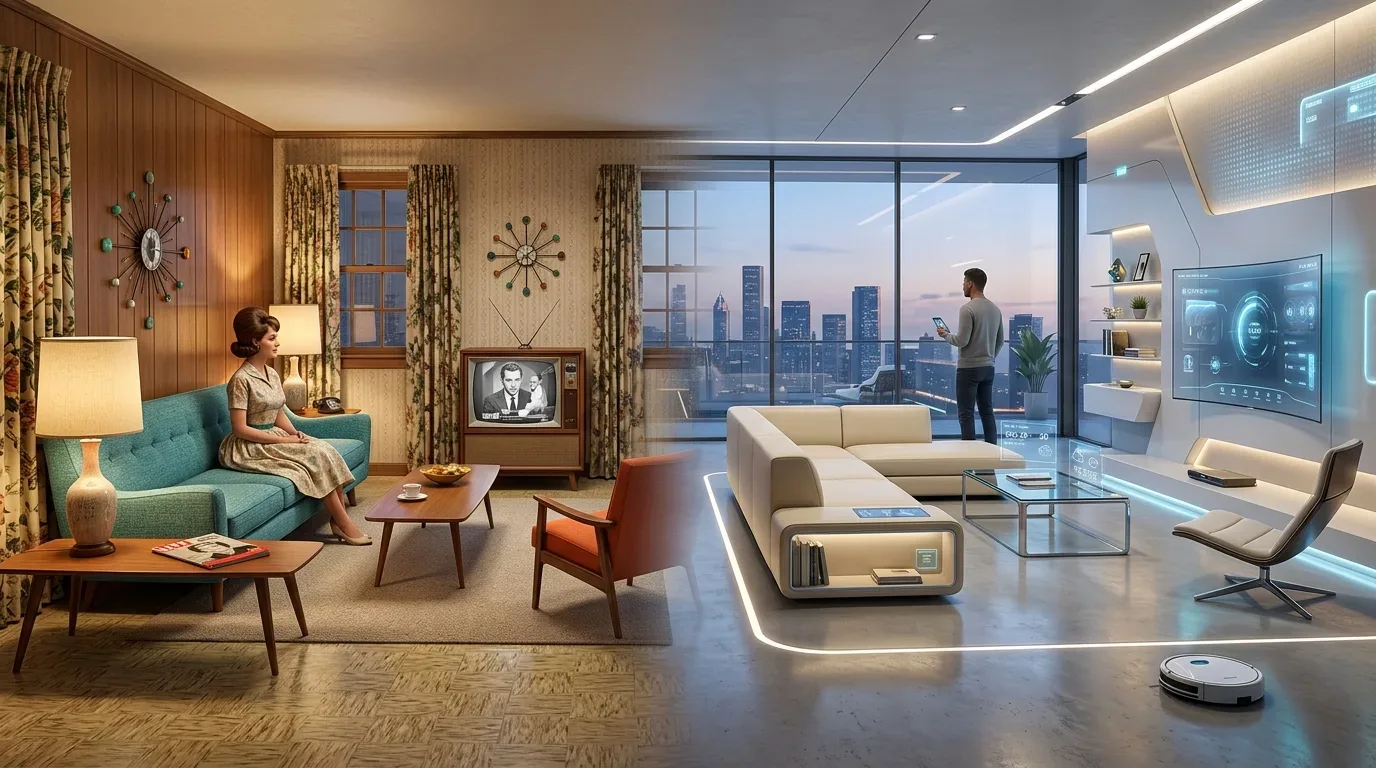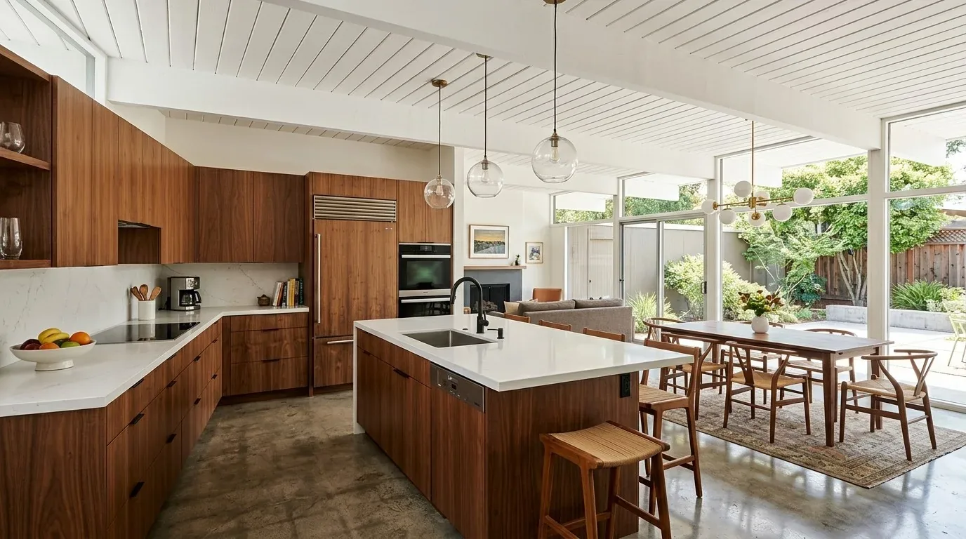
Completed client project. The owners came to us with a whole-home remodel for their 1956 house in Farm Hills Estates, Redwood City. The Mediterranean-inspired home measured about 4,324 square feet, with four bedrooms and four-and-a-half baths, stucco and natural stone veneer walls, a tile roof, and wrought iron details. They wanted the rooms beneath the roof to feel brighter and more comfortable without losing the exterior character that made the house feel at home on its lot. The main living area sat above the attached garage, and the gently sloping paver driveway led up to stone steps and a landscaped front entry. Our decisions began with what we could see in the house and what its public records described, especially the tile roof, slab foundation, and central heating and cooling.
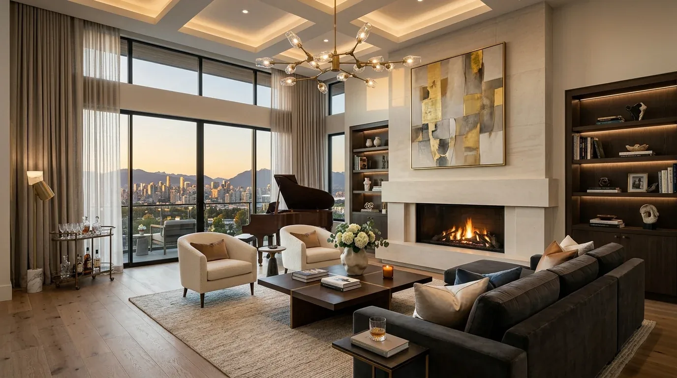
The photographs on this page are from the Designed & Curated portfolio and show finishes we have used on other projects. They are not photographs of this house.
My first question was how much usable space the attic actually gave us before we changed a ceiling. On site, we found a shallow attic beneath the tile roof, with forced-air ducts running above the rooms. The roof pitch and framing left little clear volume for a vaulted ceiling, so we kept the existing ceiling heights rather than forcing a new shape under the established roofline. We also found that the slab foundation ruled out easy below-floor routes for new wiring or air distribution. That combination made the attic, ceiling surfaces, and existing service paths the practical focus of the work.
The tile roof and the attic clearance
The tile roof was in place above the home’s stucco and stone exterior, and its profile gave the front elevation much of its Mediterranean character. We kept the roofline intact and worked from inside, where the attic access let us trace the framing and duct routes before deciding what could change. We measured the ceiling heights room by room and mapped the duct locations, then kept the main ceiling planes in place. That choice protected the roof silhouette and avoided sacrificing the limited attic clearance to a dramatic ceiling opening that the structure could not comfortably support.
The house had central forced-air heating powered by gas and central forced-air cooling. We traced the supply and return paths through the attic and coordinated the ceiling work around them, keeping the system’s routes clear rather than shifting equipment or sending ducts through the slab. We improved the overhead finish and lighting while preserving the locations that served the rooms. The family got a calmer ceiling and more even light without losing the heating and cooling arrangement that already served the house.
We also treated the attic as part of the home’s comfort, not just the space above the rooms. We sealed accessible gaps and added insulation where the existing attic assembly allowed, while keeping air paths around the roof framing clear. We did not raise the roof or change the tile covering. The result kept the rooms’ original proportions while making the transition from ceiling to roof more considered and reducing the sense that the attic was an unfinished afterthought.
The ceilings and the rooms below
The room-by-room lighting work responded to the cream-toned stucco and natural stone outside without trying to copy those materials indoors. We replaced visually bulky ceiling fixtures with a quieter, layered arrangement, adding general light where rooms needed even coverage and focused light where people read or worked. We used dimmable fixtures so the same rooms could feel open during the day and softer in the evening. The ceiling color stayed warm and restrained, which let the existing room finishes and the natural light do more of the visual work.
The slab foundation and public utilities also shaped the boundaries of the whole-home scope. The house was served by public water and public sewer, and we kept plumbing in its existing routes rather than opening floors for new connections. We kept the gas fireplace and the attached two-car garage in their existing roles. Those decisions kept the work centered on the interior surfaces, attic comfort, lighting, and air distribution instead of expanding into changes that the owners had not needed to make the rooms work better.
The roofline, the front approach, and city review
The paver driveway, tiered stone retaining walls, mature deciduous trees, and balcony all contributed to how the house met the street. We kept those exterior elements and the tile roofline as a consistent frame for the interior changes. Redwood City’s residential design guidance addressed neighborhood compatibility, building massing, and architectural style, so we used it to keep the project’s interior focus from drifting into an unnecessary exterior redesign (City of Redwood City, Residential Design Guidelines). The front approach remained familiar, while the brighter rooms made better use of the daylight coming through the existing windows.
We checked Redwood City’s permit requirements against the completed scope. The city required permits and plan review for work that altered structural walls, changed room layouts, or involved electrical or plumbing systems, except for work specifically exempted under the California Building Code. We submitted the electrical work for review and kept the ceiling and room arrangement within the existing structure (Redwood City residential building permit information).
Get in touch to talk about your home.