Completed client project. The family came to us because homework, snacks, and the dog all converged in the open living, dining, and kitchen area, where the children's movement competed with cooking and time to relax. They wanted the whole home to support family life without closing off the rooms or losing sightlines. Built in 1971, the house had about 5,180 square feet on a 21,780-square-foot lot. It was a stucco home with a flat and slightly sloped roof combination, an entry foyer, connected living and dining areas, a kitchen, bedrooms and baths, and several outdoor living spaces. The kitchen had dark wood cabinetry, quartz counters, built-in ovens, a breakfast bar and nook. The main rooms had light wood flooring, white walls, and recessed lights. The attached garage sat below the main living quarters, and stairs rose from the entry toward the upper floors.
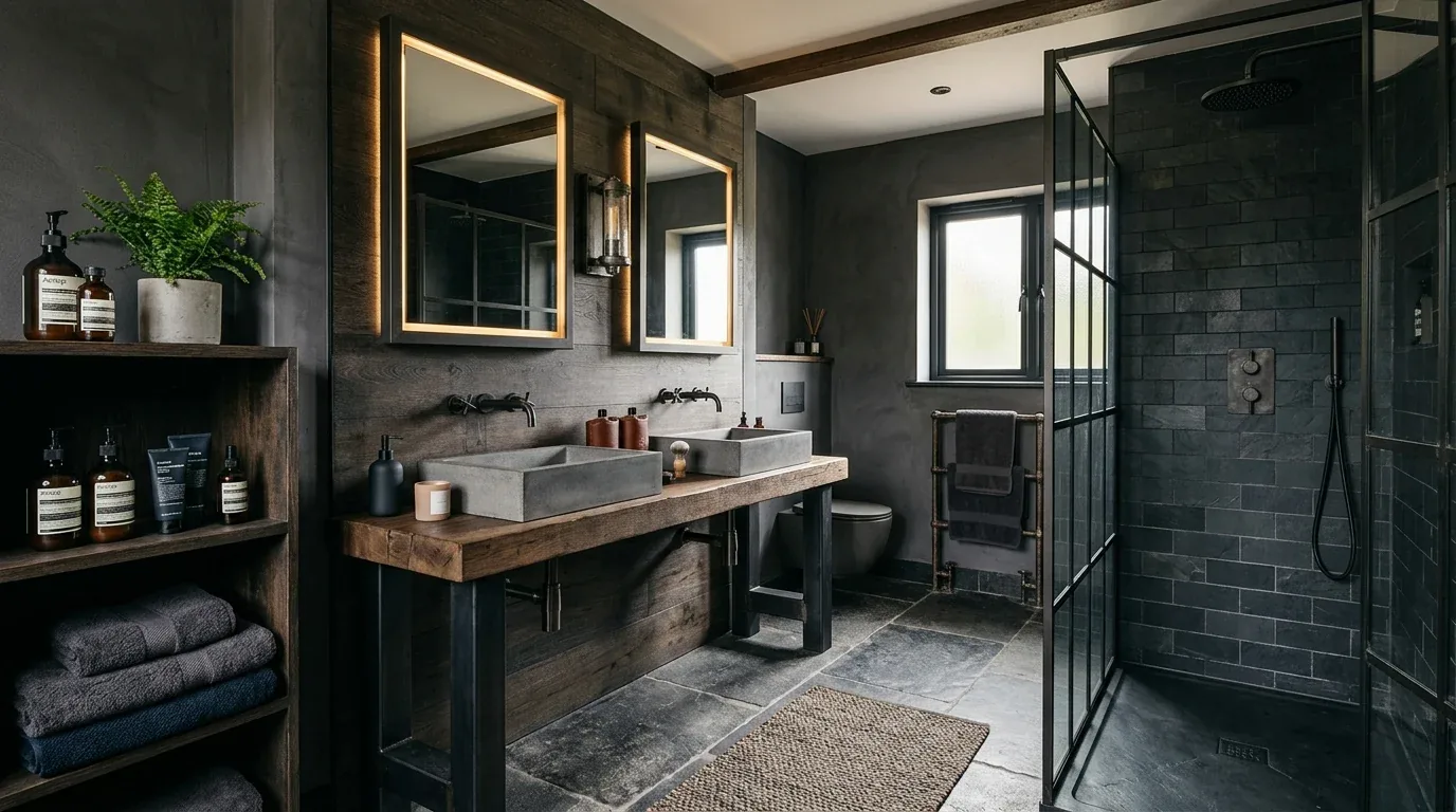
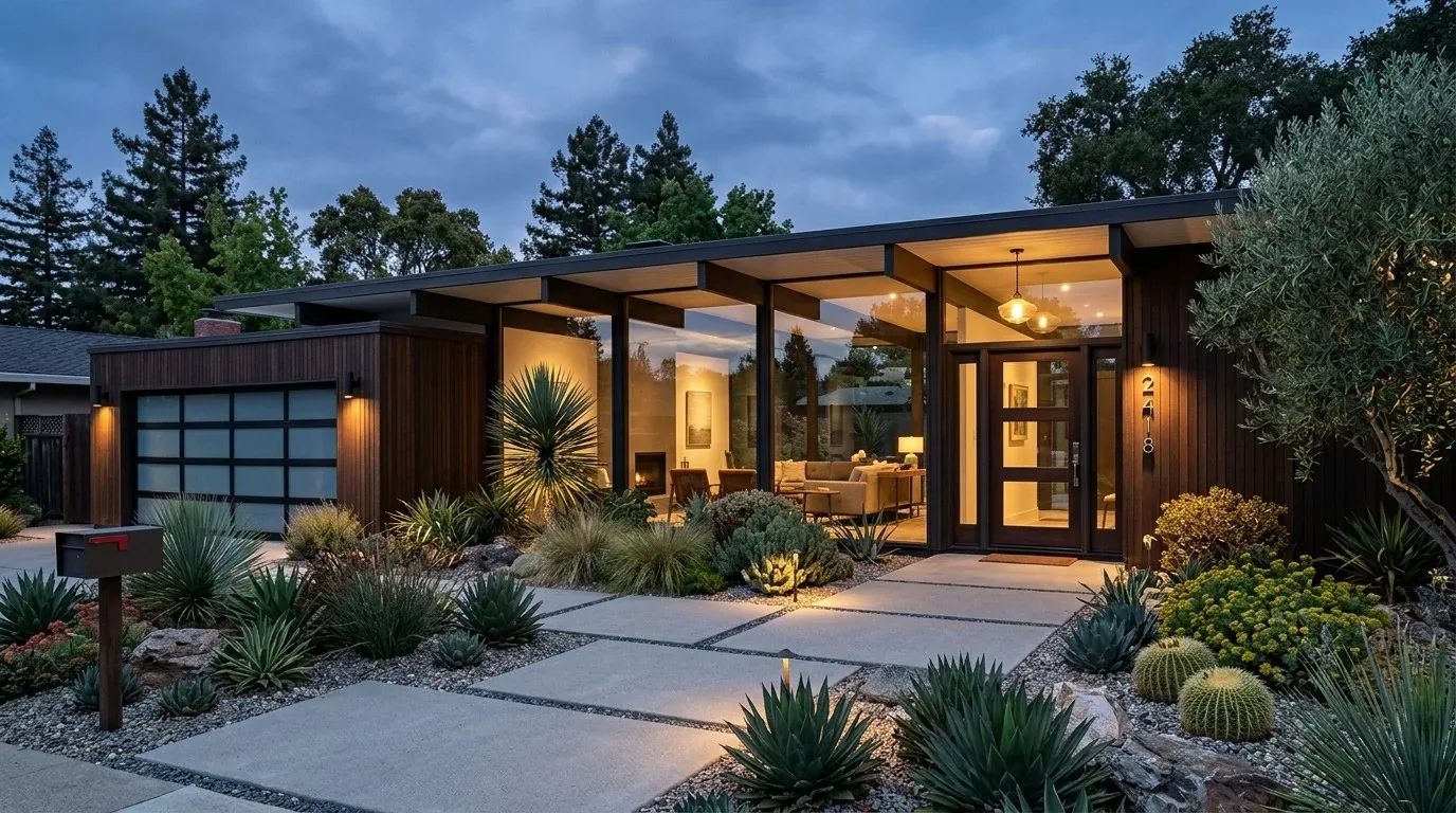
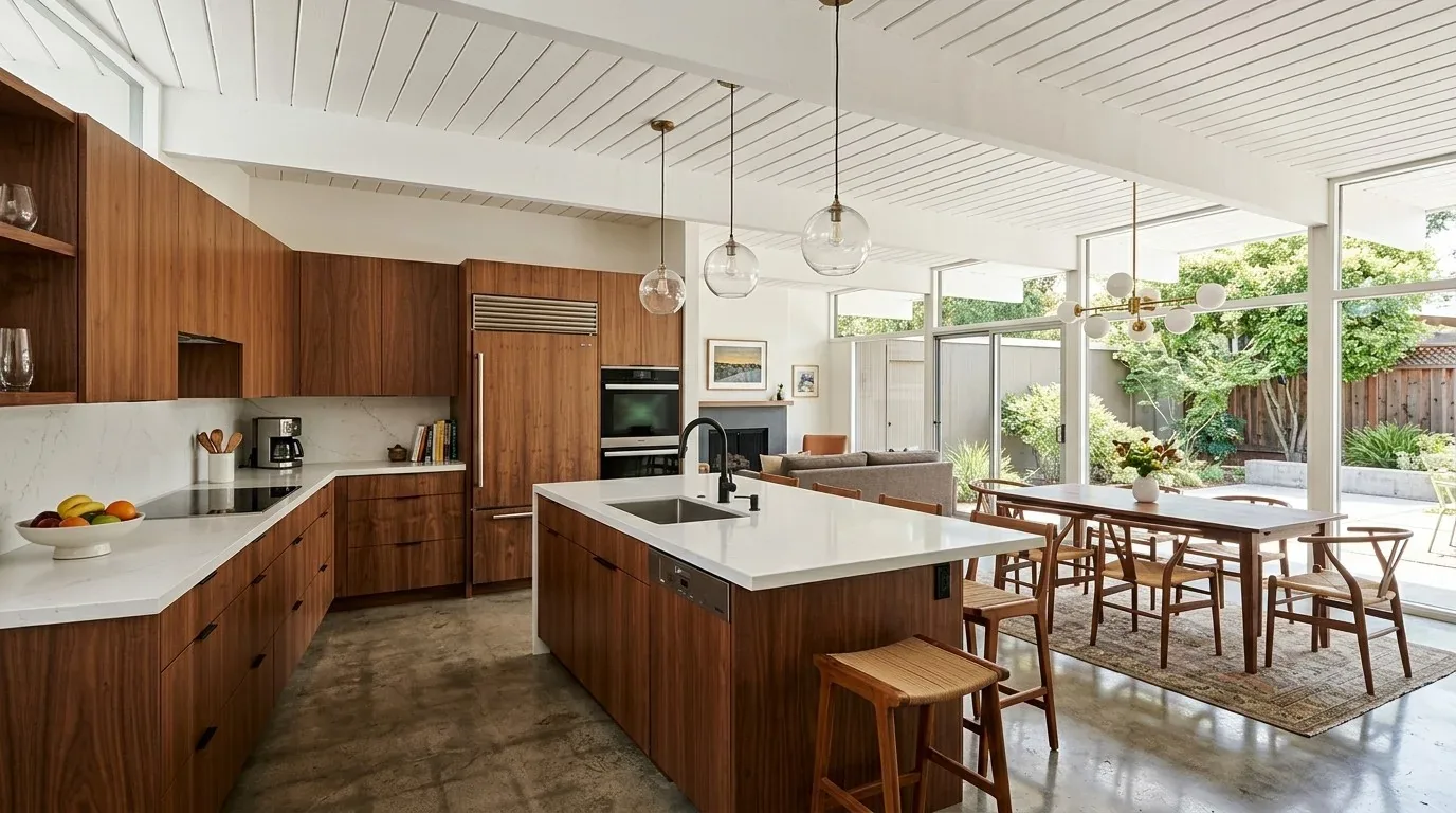
The photographs on this page are from the Designed & Curated portfolio and show finishes we have used on other projects. They are not photographs of this house.
My first question was: where did the children's everyday routes cross the cook's view from the stove, and which activities needed quiet rather than another wall? On site, we found the kitchen already visible from the living room, while the entry and stairs fed directly into that shared space. The house's arrangement made the issue one of movement and sound, not a missing connection between rooms. We also found the garage beneath the living quarters and outdoor areas terraced along the sloped lot, so we treated the interior routes and the decks as one family circulation system. The Redfin sold-home data put the local median home at 2,144 square feet on a 15,200-square-foot lot. Against that context, the family's larger open interior and generous outdoor areas called for clearer zones, not more open floor area.
The kitchen sightline and the shared room
We kept the kitchen, dining area, and living room connected. From the stove, the family needed a clear view into the living area, but the dining table also needed to remain usable when cooking and conversation were happening at once. We measured the routes between the kitchen, dining table, entry, and stairs, then arranged the furnishings to leave those paths open. The breakfast bar and nook continued to handle quick snacks; we did not turn the island or another kitchen surface into a catchall for every routine.
The light wood floor carried through the main rooms, so we kept it as the visual thread and used rugs and softer textiles to distinguish sitting and dining areas. The black leather chairs, gray sofa, and neutral dining furniture stayed in their respective zones, with warmer fabric and wood tones bringing more comfort to the otherwise restrained palette. We added window treatments in the living and dining areas for privacy and softness, keeping the daylight that made the open plan feel spacious. At the dining table, we added focused light for reading and schoolwork, while a more decorative fixture made the dining area feel distinct without interrupting the kitchen sightline.
The entry, stairs, and changing sound levels
The entry opened directly into the living room, and the stairs were visible from the foyer. We kept that arrival route clear rather than letting bags, shoes, or pool items migrate across the main floor. The open room had to accommodate the noise of people arriving, children moving between spaces, and the kitchen in use. Rugs and fabric at the windows helped soften sound, while the furniture arrangement kept a calmer sitting area outside the direct line from the entry to the kitchen.
The house already had zoned heating and central air with multiple units. We kept those systems in place and arranged the shared rooms around the way the family used them, rather than treating the open plan as one undifferentiated space. The double-pane windows also remained. The entry's beige textured accent wall and the clean-lined front door with frosted horizontal glass stayed part of the home's identity; we balanced those sharper surfaces with the softer finishes in the living and dining areas.
Decks, pool, and the sloped lot
Outside, we found an elevated wood deck with a clear-coated railing, an in-ground unheated pool, concrete paving, and a composite-wood seating and dining area. Mature trees gave the terraced lot dappled shade, while the pool and open decks remained exposed to sun. We kept the separate outdoor levels and made the seating more comfortable with cushions and fabrics. We also chose adjustable, freestanding shade so the family could change coverage as the sun moved, rather than adding a permanent structure that would dominate the deck.
The lot's mapped soil was Lodo clay loam on slopes, with somewhat excessive drainage and clay content. That information shaped our approach to the pool-side landscape: we softened the hard edges with planting suited to the site instead of treating the sloped ground as a flat garden. The garage's frosted glass panels and metal framing, the stucco exterior, and the shingle roof remained the architectural backdrop. We kept the outdoor changes focused on comfort and use, not on disguising the house's clean lines.
Before we closed the work, we checked the lighting scope against California Title 24 and the home's listed climate zone 12. We kept the lighting choices within that energy-efficiency framework, and the finished work stayed focused on the rooms, circulation, and outdoor areas rather than changes to the roof, plumbing, or heating and cooling systems.
Get in touch with Amy to talk about your home.