Direct Answers (Blue Green Paint)
| What are some popular blue-green paint shades for Sacramento homes? | Sherwin-Williams Sea Salt and Wythe Blue from Benjamin Moore. Good picks for Sacramento light and local materials. |
| How does Sacramento's natural light affect blue-green paint colors? | Sacramento's light makes blue-green paint pop in daylight, soft by evening. |
| What finishes are recommended for blue-green interior paint in high-moisture rooms? | For bathroom walls, go with satin. Semi-gloss works too. They fight moisture. Simple. |
| How should I test blue-green paint shades in my Sacramento home? | Check paint samples throughout a room. Corners will look different than windows. |
Matching Blue-Green Paint with Furniture and Decor
When you're considering blue-green paint for your Sacramento home, the question that really matters is: How do I make sure my new walls blend perfectly with the existing furniture and decor? The key to success lies in understanding the nuances of color coordination and how light affects these choices.
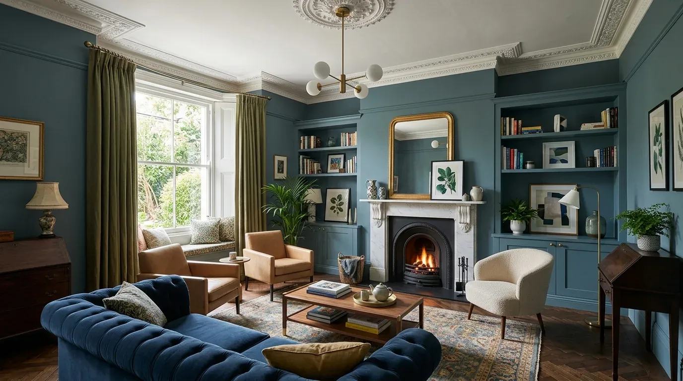
To get it right, start by identifying the dominant shade you want for your blue-green wall. Based on our experience, Sherwin-Williams' Sea Salt or Benjamin Moore's Wythe Blue are excellent choices as they complement a wide range of furniture styles (see Sherwin-Willams and Benjamin Moore). Next, consider the room's lighting. Sacramento’s natural light can make blue-greens pop during the day but soften in evening hours. Use this to your advantage by selecting furniture that has complementary tones.
- Choose light-colored furniture for a modern look and dark wood or leather for a traditional feel.
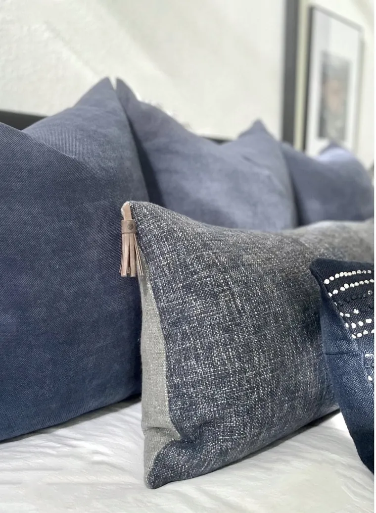
- Incorporate accent pieces like throw pillows, rugs, and curtains with patterns featuring blue-green hues to tie the room together.
- Consider layering different textures such as velvet, linen, and wool to add depth and visual interest.
- Use artwork that includes shades of blue and green to create a cohesive palette.
- Evaluate your existing decor items for any color clashes or mismatches before making new purchases.
From Amy Kunst's NorCal projects. In a recent project in Folsom, 95630, we found that blue-green walls paired with light gray furniture created a serene yet lively atmosphere for the living room. The cost ranged from $800 to $2,000 installed, including NKBA-approved materials and finishes.
Ultimately, matching your new blue-green paint with existing decor requires careful consideration of color balance and lighting conditions. By following these steps, you can create a harmonious space that feels both modern and comfortable.
First Major Design Move, Selecting the Perfect Blue-Green Shade
Homeowners love blue-green shades for their sophisticated serenity. Sherwin-Williams or Benjamin Moore: try their muted shades. Sea Salt and Wythe Blue stand out. Sacramento's climate and sunny weather? They affect color shifts.Blue-green undertones matter. Is it teal, gray, or yellow? Sea Salt by Sherwin-Williams has a green undertone. It pairs nicely with warm woods and black fixtures. Satin or semi-gloss? Budget $20-$30 a gallon. Matte makes color softer. Satin adds sheen, showing off details.
Designer Decision Matrix: Which Blue Green Paint Approach Fits Your Home
How we actually decide: match your situation to what we would specify, and the reasoning behind it.
| Your Goal | Best Solution | Why We Recommend It |
|---|---|---|
| Create a calming primary bedroom with a timeless appeal | Muted blue-green with satin finish | This shade offers a soothing atmosphere that reflects Sacramento’s indoor-outdoor lifestyle, while the satin finish maintains durability and subtle elegance. |
| Bring energy into a small kitchen without overwhelming the space | Bright, slightly teal blue-green in semi-gloss | The semi-gloss reflects light, making the room feel larger and more vibrant, fitting Sacramento’s sunny climate and active lifestyle. |
| Modernize a vintage Sacramento bathroom with a fresh look | Gray-green matte finish | Matte colors hide imperfections common in older homes and add a contemporary edge while complementing vintage fixtures. |
| Achieve a sophisticated look in a living room with ample natural light | Deep teal-blue green satin finish | The darker tone grounds the space and the satin finish enhances architectural features without too much glare. |
How to Select the Right Blue-Green Shade for Your Sacramento Home
People often ask how to pick a blue-green that fits their light and architecture. The trick? Sacramento's bright light alters paint appearance. Watch how blue-green changes. Morning sun can make it bright. In the evening, it might look muted. The Sherwin-Williams Color of the Year guides us toward shades like Sea Salt that adapt well across different environments.Test paint! Near windows, corners. Light shifts there wildly. Satin or semi-gloss keeps color sharp in busy or wet spots. Think undertones. Gray or yellow bases shift colors with local light or materials. Choose a shade that works in Sacramento’s style long-term.
Choosing Finishes and Pairings to Enhance Blue-Green Paint
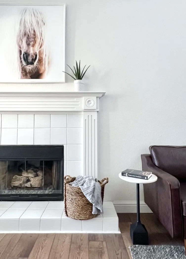
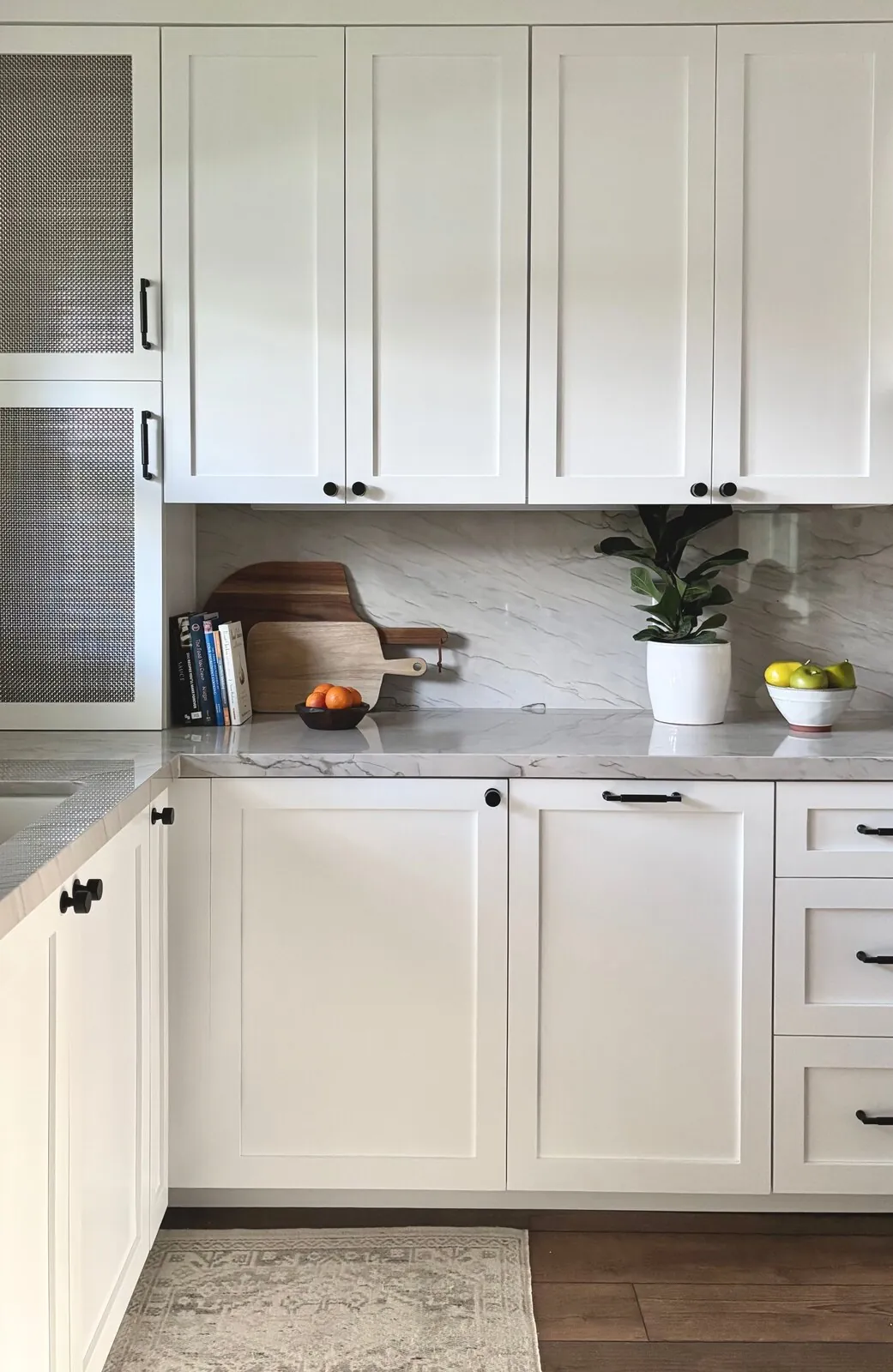
In our projects, the right finish can make or break the appearance of blue-green paint. Satin or semi-gloss great for kitchens. Moisture won't bother it. Pop of shine too. Matte finish softens color. Great for calming bedrooms or living spaces. Pair blue-green with warm woods or matte black. That's Sacramento modern. Wythe Blue satin finish with oak cabinets and black iron lights gives a space an organic touch. The American Society of Interior Designers emphasizes how material and finish choices influence color perception and longevity, especially considering Sacramento’s indoor-outdoor lifestyle and varying daylight hours.
Sources & Professional References
This guide's positions on materials are grounded in published building-code, standards, and recognized design-authority sources, alongside Designed | Curated Interiors' verified credentials and active project files:
- American Society of Interior Designers (ASID): interior-design practice standards
- International Code Council (ICC): Chapter 8 Interior Finish Decorative Materials And Furnishings
- NKBA, Amy Kunst Member Profile (verified credential, NKBA Committee Member)
- Featured in: Good Housekeeping (storage and space-planning expert quotes, July 2026) · Homes & Gardens (design expert quote, May 2026) · Sacramento Love (guest author, 2024)
Frequently Asked
What regional materials pair well with blue-green paint in Sacramento?
Are there any permits required for painting interior walls in Sacramento?
Related reading
- Sacramento & Bay Area Interior Design Services How we scope, source, and deliver work end to end.
- Interior Designer Hub, Sacramento Where most of our Sacramento work lives, the regional fit explained.
- Blue Green Paint Colors: A Designer's Guide to the 2026 Look Discover the latest trends in blue green paint colors for 2026, enhancing interiors in Sacramento and Mill Valley with serene and vibrant hu
- Best Dark Blue Paint Colors Related cluster piece referenced from the Best Dark Blue Paint Colors build files.
- Pale Gray Green Paint Color Related cluster piece referenced from the Pale Gray Green Paint Color build files.