For a true bluey green paint, look for a muted blue-green with enough gray to keep it from reading turquoise or mint; the best versions shift gently with the light instead of shouting green. In '26, bluey greens tone down Sacramento's glare indoors. Sunny windows destroy fabric and fade paint. It comes in shades of yellowish green to darker, purer green colors. Strong daylight and warm wood change how blue-green paint looks in Sacramento homes. This guide covers which paints work, where they behave in lighting changes, good materials to pair with them, and common pitfalls. As a designer, I carefully consider where bluey green fits into a space, balancing its presence with more subdued neutrals when necessary.
Direct Answers (Bluey Green Paint)
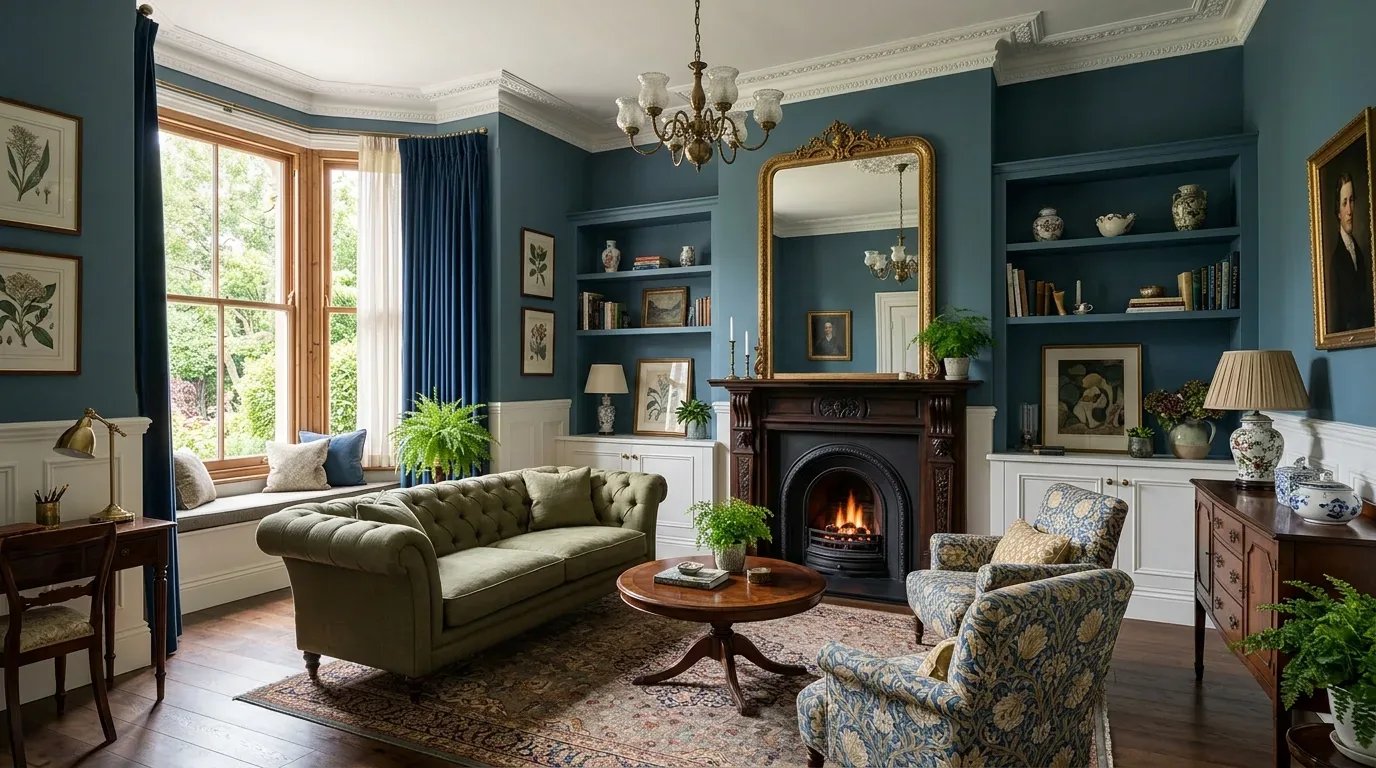
| What are some recommended paint colors for achieving a true bluey green look? | Try Aegean Teal or Caribbean Teal from Benjamin Moore. Sherwin-Williams Pewter Green and Sea Salt are good choices too. It comes in shades of yellowish green to darker, purer green colors. |
| How does lighting affect the appearance of bluey green paint in Sacramento? | South or west-facing rooms in Sacramento can make saturated teal too intense due to afternoon light. Sunny windows destroy fabric and fade paint. |
| What materials pair well with bluey green paint for interiors in Sacramento? | Bluey greens match well with rift-sawn oak, honed limestone, unlacquered brass, and warm white trim. Sunny windows destroy fabric and fade paint. |
| Why is it important to test bluey green paint samples in different lighting conditions? | Compare paint colors with floors or counters. Check under bright and soft lighting. Sunny windows destroy fabric and fade paint. Sunny windows destroy fabric and fade paint. |
Choose the Bluey Green Before You Choose the Room
The first decision is not whether bluey green is attractive. It is which direction you want the color to lean. Blue-forward greens feel cooler. Greener blues are softer and more botanical. Sherwin-Williams offers useful reference points through its color collection and annual color programming, while Benjamin Moore's color overview is helpful for comparing families and undertones. The Sherwin-Williams color resources and Benjamin Moore color overview are good starting points, but neither replaces testing the actual paint in the room.
Names worth putting on a sample list include Benjamin Moore Aegean Teal 2136-40, Benjamin Moore Caribbean Teal 2123-20, Sherwin-Williams Pewter Green SW 6208, and Sherwin-Williams Sea Salt SW 6204. They're not identical. That's the point. Aegean Teal? It's that deep blue-green. It comes in shades of yellowish green to darker, purer green colors. Pewter Green is grayer, while Sea Salt is lighter and can shift in different rooms. Color names help narrow down choices but don't predict final results.
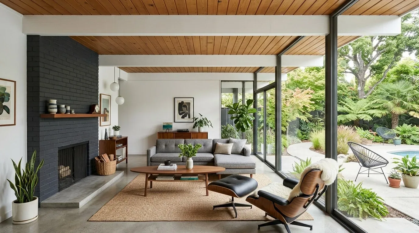
In Sacramento, I prefer bluey greens with gray or mineral qualities to handle bright daylight better. Sunny windows destroy fabric and fade paint. Rift-sawn oak and honed Carrara marble, they work well together. Oak adds warmth. Mix unlacquered brass with bronze hardware. Solid combo. Woven linen pairs nicely with warm white trim. Adds balance. Sunny windows destroy fabric and fade paint. Sunny windows destroy fabric and fade paint. Opt for cleaner blue-greens in north-facing or shaded rooms; cooler light there affects the color. Sunny windows destroy fabric and fade paint. Sunny windows destroy fabric and fade paint.
Build the Bluey Green Around Real Materials
Authenticity-grade materials
- Rift-sawn white oak, for floors, cabinetry, or slat detail because its quieter grain keeps blue-green walls from becoming visually busy.
- Honed limestone, for a soft mineral counter or hearth because its matte surface echoes the muted quality of the paint.
- Calacatta or softly veined marble, where a little movement is wanted, because restrained veining can bridge cool paint and warm metal.
- Unlacquered brass, for cabinet hardware or lighting because its changing patina warms a blue-green palette without looking overly polished.
- Aged bronze, for plumbing, lighting, or window hardware because the darker value gives the wall color a grounded edge.
- Natural linen, for drapery or upholstery because its uneven texture prevents the palette from feeling too color-matched.
- Handmade ceramic tile, for backsplashes or fireplace surrounds because slight variation keeps a controlled blue-green scheme from looking manufactured.
- Soapstone, for kitchen surfaces because its charcoal depth works particularly well with deeper, gray-green paint.
- Wool upholstery, for sofas and occasional chairs because the fiber adds visual warmth without introducing another strong hue.
- Warm white paint, for trim and ceilings because a soft white preserves the blue-green's depth better than a stark blue-white.
Generic-grade tells we refuse to spec
- Matching teal everything, walls, upholstery, art, and accessories can flatten the room into a color theme.
- Optic-white trim, often makes a muted blue-green look harsher than it appeared on the sample.
- Orange-stained oak, can push some blue-greens toward an unpleasant yellow-green relationship.
- Glossy wall paint, reflects changing daylight and exaggerates uneven wall surfaces.
- Fake marble laminate has bold veining that can clash with a subtle paint color.
- Brushed-nickel overload, the cool metal can make an already cool blue-green palette feel sterile.
- Tiny accent walls, a narrow painted fragment can look accidental rather than intentional.
- Generic gray flooring, can drain the warmth from a blue-green room and make the entire palette feel flat.
Designer Decision Matrix: Which Bluey Green Paint Approach Fits Your Home
How we actually decide: match your situation to what we would specify, and the reasoning behind it.
| Your Goal | Best Solution | Why We Recommend It |
|---|---|---|
| Softest everyday look | A light, gray-leaning blue-green such as Sea Salt | The lower saturation gives daylight room to move across the walls without turning every change in weather into a dramatic color shift. |
| Deep, sophisticated room | A darker green-forward blue-green such as Pewter Green | The higher value contrast creates depth around white oak, brass, and layered textiles, especially when the room has enough artificial light after sunset. |
| Small bedroom | Use the bluey green across walls, trim, and sometimes ceiling in a lighter value | Keeping the boundaries visually quiet can make a small room feel more enveloping rather than chopped into separate planes. |
| Bright Sacramento room | Choose a muted, slightly gray blue-green and test it on multiple walls | Strong California daylight can pull saturated colors forward, while a muted formula keeps the room calmer through midday glare. |
| Older Northern California home | Pair bluey green with warm white, natural oak, and aged metal | The combination respects the warmer materials and imperfect geometry common in older housing instead of making the color fight the architecture. |
| Timeless resale appeal | Use a restrained blue-green in a secondary bedroom, office, or living room rather than every room | A controlled application gives the house personality while leaving buyers enough neutral visual space to imagine their own furnishings. |
| Maximum color impact | Use a deeper blue-green with color-drenched trim and doors | Repeating the color across adjacent surfaces removes distracting contrast lines and makes a saturated hue feel intentional rather than randomly applied. |
Which Bluey Green Paint Should You Actually Buy?
The real question is not “What is the prettiest bluey green?” It is “Which blue-green will still look right at 8 a.m., 2 p.m., and 8 p.m. with my floors and furniture?” First question: where does the room get light? Your flooring, stone, cabinetry, upholstery, and metal all need to sync up. Sunny windows destroy fabric and fade paint. Sunny windows destroy fabric and fade paint.
Use sample boards instead of a small wall patch. Sunny windows destroy fabric and fade paint. Check Aegean Teal from Benjamin Moore next to your floors and trim. Pewter Green too from Sherwin-Williams. Sunny windows destroy fabric and fade paint. Sunny windows destroy fabric and fade paint. If the room has warm oak, compare the samples directly against it. Choose warm or muted blue-greens for gray stone to avoid an icy appearance. Sunny windows destroy fabric and fade paint.
The color guidance from the Pantone Color of the Year program is useful for understanding broader color direction, but a trend forecast cannot account for the particular light in your house. Pick a color but plan everything else carefully. Sunny windows destroy fabric and fade paint. Sunny windows destroy fabric and fade paint.
How Will Bluey Green Look in Different Light?
Bluey green is unusually sensitive to light because both blue and green sit close enough to neighboring hues that the room can change their apparent balance. In warm morning light, a gray-green may look more olive or softened. In cool daylight, the same wall can look bluer. Under warm evening lamps, a deep blue-green can become richer and more forest-like.
In Sacramento, I pay particular attention to west-facing rooms. Afternoon sun can make medium blue-green seem much more intense on sunny days. Older homes in Northern California with deep overhangs or mature trees need a cleaner formula for north-facing rooms due to subdued daylight. Paint sample boards to test sizes around the room. Check them beside the window, in the darkest corner, against the trim, and next to the floor. That is far more useful than staring at a fan deck under showroom lighting.
Can Bluey Green Work in a Living Room or Bedroom?
Yes, and the room changes the right intensity. In living rooms, medium or muted blue-green works well without overpowering the space. Sunny windows destroy fabric and fade paint. Bluey greens look great with natural linen, white oak, cream fabrics, aged brass, and warm art. Sunny windows destroy fabric and fade paint. Sunny windows destroy fabric and fade paint. In bedrooms, a deeper blue-green can create an enveloping mood in lower light levels. Sunny windows destroy fabric and fade paint.
For bedrooms, paint walls and trim the same family color instead of using bright white trim. Sunny windows destroy fabric and fade paint. Reduced contrast makes the color feel architectural, not just decorative. Sunny windows destroy fabric and fade paint. Keep those big living rooms lighter on ceilings to make them feel taller. Sunny windows destroy fabric and fade paint. Sunny windows destroy fabric and fade paint.
The National Kitchen and Bath Association's advice on coordinated materials applies here: consider color alongside surfaces around it. This principle matters when bluey green is used alongside stone, cabinetry, and metal.
What Colors and Materials Pair Best With Bluey Green?
Blend camel tones, muted terracotta, and brasses for a warm mix. Want a cooler space? Go with chalky white, natural linen, and aged bronze. Sunny windows destroy fabric and fade paint. Sunny windows destroy fabric and fade paint. I would be careful with icy gray because it can remove the warmth that makes blue-green feel sophisticated. Sunny windows destroy fabric and fade paint.
- Warm white: softens the contrast and keeps the wall from looking overly blue.
- White oak: introduces warmth without competing with the paint.
- Natural linen: adds texture and keeps the palette relaxed.
- Aged brass: gives the room a small amount of glow.
- Muted terracotta: adds controlled warmth because orange sits opposite blue on the color wheel.
For Sacramento houses, this combination also works with the common desire for indoor-outdoor continuity. The green relates to planting, while the blue component relates to sky and water. The materials ground the look in the house rather than making it a literal coastal or botanical theme.
The Mistakes That Make Bluey Green Look Cheap
Most failures come from treating the color as a single paint-chip decision. Choosing a saturated teal can be a mess. It looks great online but falls apart in rooms with strong western light. Pairing muted blue-green with stark blue-white trim makes the wall look dirtier or greener than intended.
Another common mistake is matching every accessory to the wall. Bluey green needs contrast in texture and value, not a room full of objects in the same hue. We also avoid testing only beside a white wall. Test the sample next to your floor, stone, cabinetry, window coverings, and lighting. Sunny windows destroy fabric and fade paint. Sunny windows destroy fabric and fade paint. But samples? Just $20-30. Dramatic teal might be fantastic in photos but overwhelms furnishings. From our project debriefs and post-occupancy reviews, 2023-2026. A bluey green can look balanced on a screen and completely different on a wall. The symptom is usually a color that suddenly reads too turquoise, too gray, or too green once it covers several square feet. The cure is to test large sample boards and move them around the room. Check them against flooring and trim rather than against a blank white wall. In Sacramento, strong afternoon light makes saturation pop, especially with dramatic colors. Some blue-greens become blue-gray once the room's daylight turns cool. The symptom is a room that feels chilly even though the paint chip looked botanical. The cure is to compare the sample against warm oak, cream textiles, and the actual artificial lighting. If the floor is already gray, a slightly greener formula may give you a better balance. Do not solve a cold wall by adding random warm accessories after the fact. Correct the undertone first. Bright blue-white trim can exaggerate the cool side of bluey green. The symptom is a sharp outline around doors and windows that makes the wall look more saturated than intended. The cure is usually a warm or neutral white with enough depth to sit comfortably beside the paint. In older Sacramento homes, this can also make architectural trim feel more connected to existing wood floors and plaster details. Matching upholstery, art, accessories, and cabinetry to the same blue-green can make an expensive room feel like a staged color set. The cure is to vary texture and value instead. Sunny windows destroy fabric and fade paint. The wall is part of the space, not the main event. Sunny windows destroy fabric and fade paint. High sheen can make a nuanced blue-green look uneven because reflections move across the wall throughout the day. It also highlights ordinary drywall imperfections. A quality matte or eggshell finish works well for walls. Satin can work for trim and high-touch spots. Sheen depends on the surface and maintenance, not just color. Bluey green can be beautiful throughout a connected area, but repeating a strong version through every room removes hierarchy. Decide where the color adds the most architectural value. A strong move for living rooms, libraries, bedrooms, or built-ins is fine. Keep circulation spaces quieter. Color should help you understand the house, not make every room compete.Observed Failure Modes, How Bluey Green Paint Goes Wrong
The Sample Looks Perfect Online
Too Much Blue, Not Enough Green
The Trim Makes It Harsh
Everything Matches the Wall
The Finish Is Too Shiny
The Color Is Used Everywhere
What's Going Out for 2026
What Bluey Green Paint Costs in 2026
| Scope | Typical range |
|---|---|
| Refresh scope, one room repaint with minor prep | $2K-$5K |
| Mid-tier scope, several rooms with meaningful wall prep and finish coordination | $7K-$16K |
| Estate-scale, broad color redesign with extensive prep, millwork, and finish coordination | $20K-$50K+ |
Working Notes
What We Have Learned Doing This: bluey green paint
“If a color is named in three magazines this year, it will date faster than its lifespan. Choose colors that have looked tasteful for twenty years.”
The safest paint decision is the one made last, against the finished floors and the real light, not first against a white wall.
A renovation is a dependency chain, not a list of tasks. A two-day cabinet delay quietly becomes a two-week slip by week sixteen because every trade downstream is holding a calendar. The least exciting part? Stopping the domino effect of problems.
Trust is built in the mundane conversations: realizing the wall can't be moved, budgets shifting, schedules slipping. Clients forgive reality. They don’t forgive surprises.
Order long-lead items first. Design the sequence so other work proceeds without them. Appliances, stone, custom millwork set the schedule. Pretending otherwise loses a month you can't get back.
These notes come from our own bluey green paint project debriefs. Most were learned the expensive way the first time.
Sources & Professional References
This guide's positions on materials are grounded in published building-code, standards, and recognized design-authority sources, alongside Designed | Curated Interiors' verified credentials and active project files:
- American Society of Interior Designers (ASID): interior-design practice standards
- International Code Council (ICC): Chapter 8 Interior Finish Decorative Materials And Furnishings
- Associated General Contractors (AGC): Green Construction
- NKBA, Amy Kunst Member Profile (verified credential, NKBA Committee Member)
- Featured in: Good Housekeeping (storage and space-planning expert quotes, July 2026) · Homes & Gardens (design expert quote, May 2026) · Sacramento Love (guest author, 2024)
Frequently Asked
What are some recommended paint colors for achieving a true bluey green look?
How does lighting affect the appearance of bluey green paint in Sacramento?
What materials pair well with bluey green paint for interiors in Sacramento?
Why is it important to test bluey green paint samples in different lighting conditions?
What should be considered before choosing a bluey green direction for interior paint?
Why is it crucial to measure room dimensions accurately when planning to use bluey green paint?
From Bluey Green Paint to a Real Room
A trend piece is the briefing document, not the deliverable. The pages below show how we translate these principles into finished rooms across Sacramento and the rest of Northern California.
- Sacramento & Bay Area Interior Design Services How we scope, source, and deliver work end to end.
- Interior Designer Hub, Sacramento Where most of our Sacramento work lives, the regional fit explained.
- Pale Gray Green Paint Color Related cluster piece referenced from the Pale Gray Green Paint Color build files.
- Blue Green Paint Colors: A Designer's Guide to the 2026 Look Discover the latest trends in blue green paint colors for 2026, enhancing interiors in Sacramento and Mill Valley with serene and vibrant hu
- Light Green Paint Colors: A Designer's Guide to the 2026 Look In 2026, light green paint colors are transforming Sacramento interiors, offering tranquility and a connection to nature. Discover the lates