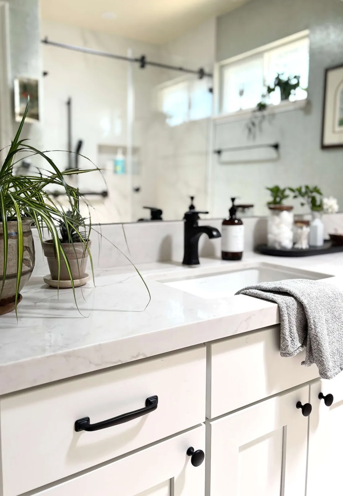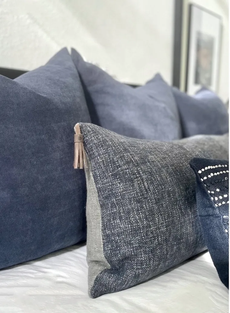
Design words tell what works and doesn't. Good design turns vague ideas into real choices about space, light, colors, layout, materials. Trends matter less than the right words in 2026 to clear a room visually and save money. Warm-restraint: know terms, use them wisely.
This guide covers key design terms from active projects: scale, balance, accent, hue, saturation, ambient lighting, task lighting, modern, rustic, feng shui, circulation, focal point, proportion. I will also show how I use that vocabulary when discussing specifications, layouts, materials, and trade decisions in Sacramento and beyond, with the designer's perspective rather than a glossary detached from real houses.
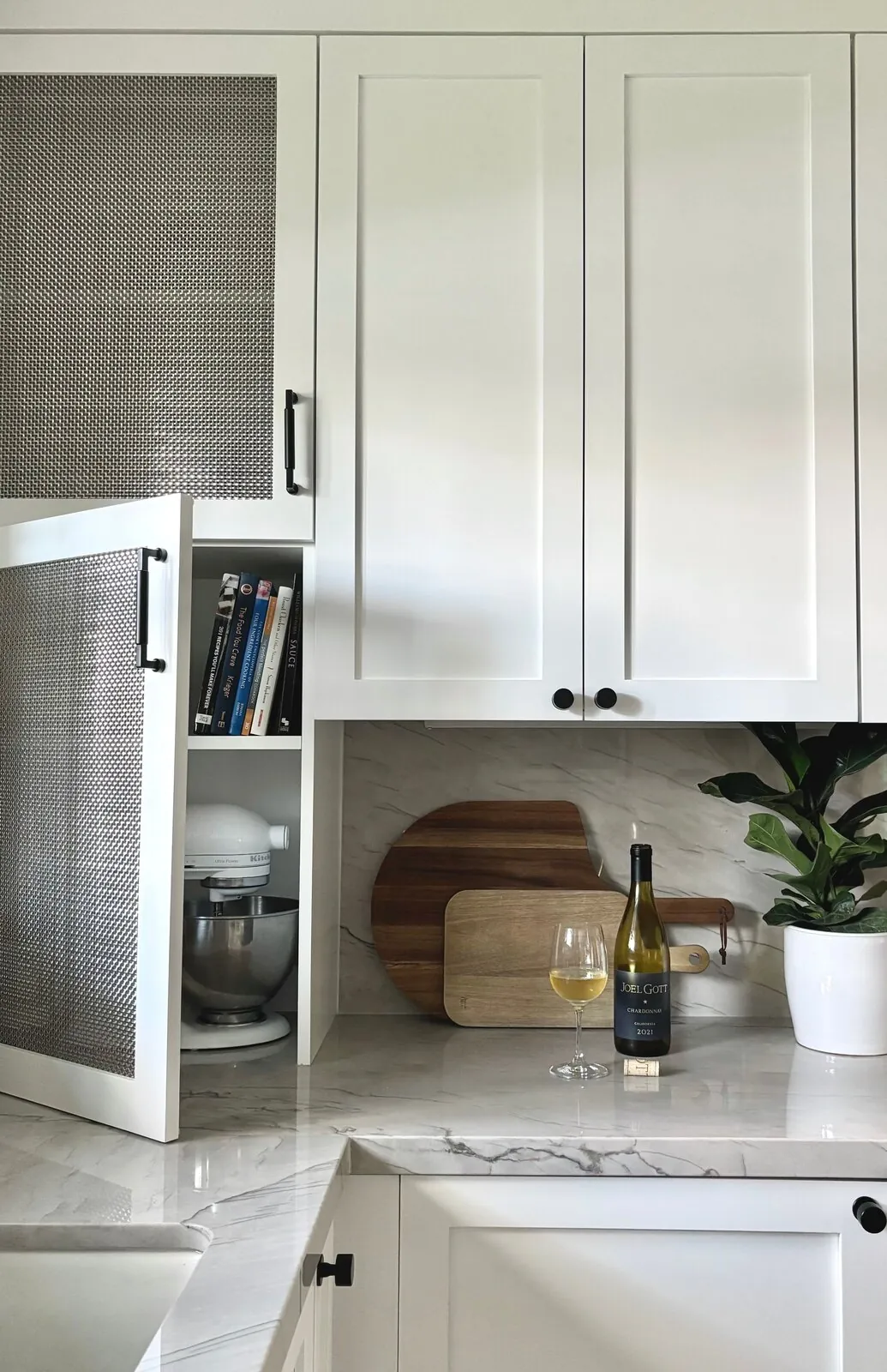
Direct Answers (Interior Design Words)
| What services do interior designers provide in Sacramento? | We plan space, pick colors, materials. Manage projects for look and function. |
| Do I need an interior designer or a decorator for my Sacramento home? | Hire a designer for consistency. For simpler aesthetic projects, a decorator might work. |
| What distinguishes high-end design from decorating in Sacramento? | High-end focuses on building, layout, function; decorating adds personal touches. Mix looks and function to make spaces that feel right. |
| How can I make my home feel luxurious through interior design in Sacramento? | Hardwood floors, custom cabinetry, stone countertops, crown molding, upscale lighting make it luxurious. |
The Design Words That Actually Change a Room
The first terms I want homeowners to understand are scale, proportion, balance, focal point, contrast, and circulation. Scale asks whether an object is appropriately sized for the room and the things around it. Proportion asks whether its dimensions relate well to one another. Balance is the visual distribution of weight, which can be symmetrical or deliberately uneven. A focal point is where the eye lands first. Circulation is the usable path in a room. These aren't just words. They're practical. Terms tell if a sofa fits, island size works, fireplace stands out.
Color terminology gets more useful when it becomes specific. Hue is the basic color family, such as blue or green. Saturation describes how intense or muted that color is. Value describes how light or dark it appears. Olive green and bright emerald are similar but differ in saturation. Sunny afternoons vs. gloomy mornings vary daylight here. I consider these contrasts before picking paint colors.
Lighting words matter just as much. Ambient light provides general illumination, task light supports an activity, and accent light directs attention toward an object or surface. A kitchen may need all three. Across our active project specifications, that can mean a restrained ceiling fixture for ambient light, under-cabinet lighting for prep work, and a small beam of controlled light on art or architectural detail. The National Kitchen and Bath Association's professional focus on functional kitchen planning is useful here: terminology should lead to better use of the room, not simply make the conversation sound more sophisticated.
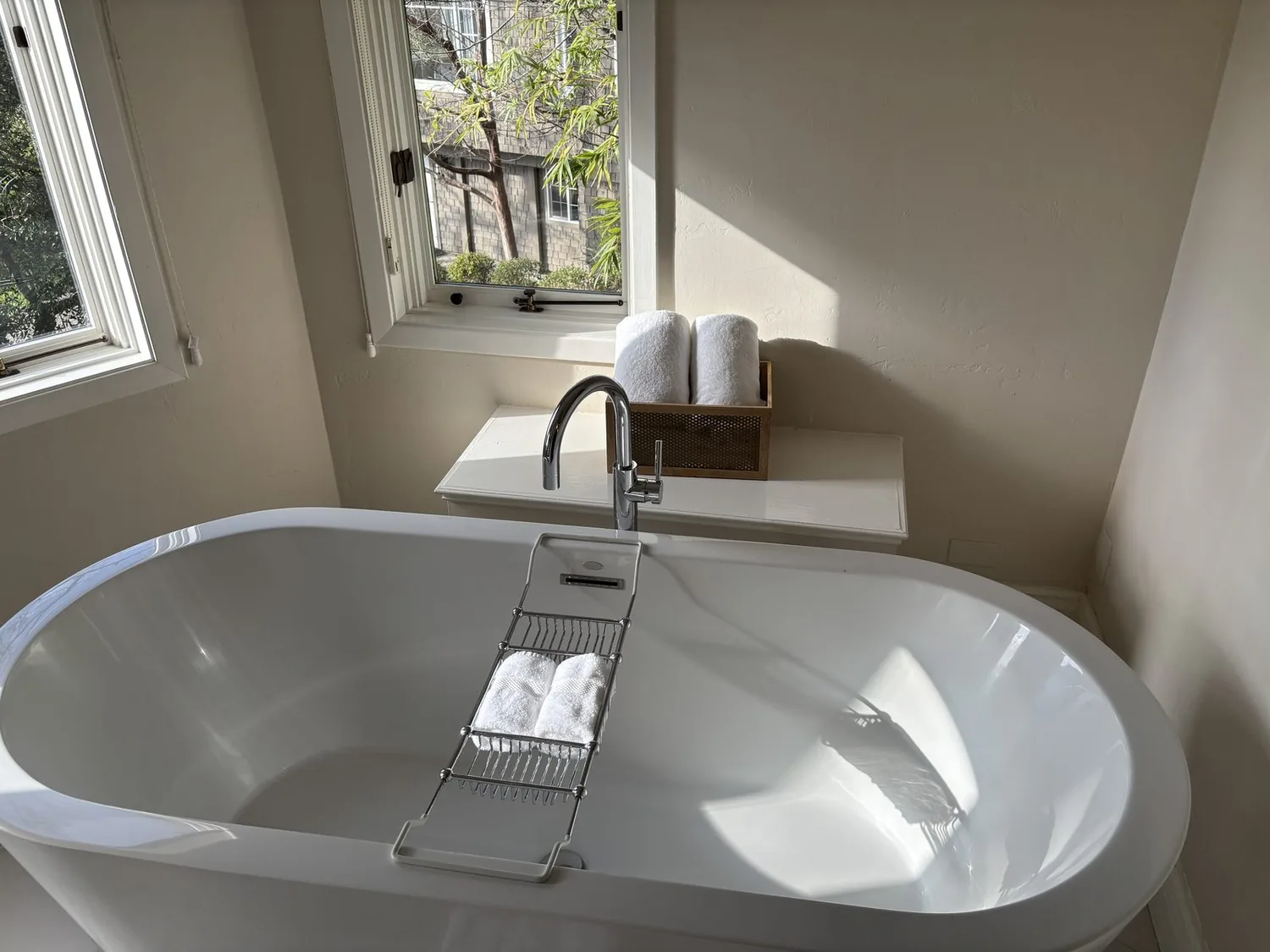
Designer Decision Matrix: Which Interior Design Words Approach Fits Your Home
How we actually decide: match your situation to what we would specify, and the reasoning behind it.
| Your Goal | Best Solution | Why We Recommend It |
|---|---|---|
| I need the lowest-cost vocabulary | Prioritize scale, proportion, circulation, and focal point before buying decorative pieces | These decisions can prevent expensive purchases that later have to be replaced because the room cannot accommodate them. |
| I want a luxury finish | Specify fewer materials with stronger texture and construction quality | Luxury is usually more convincing when grain, sheen, joints, and proportions are controlled instead of multiplied. |
| My room is small | Use scale and circulation to keep furniture compact and pathways clear | A smaller footprint often feels larger when sightlines remain open and furniture does not interrupt the primary route. |
| My Sacramento home has older architecture | Use the home's original proportion and trim as reference points before introducing a modern style | Many Sacramento houses have architectural details that become visually awkward when new finishes ignore their established scale. |
| I want a contemporary look | Use modern terminology to control geometry, negative space, and material contrast | Contemporary rooms become dated quickly when the look depends on a short-lived decorative object instead of durable spatial relationships. |
| I am choosing paint colors | Discuss hue, saturation, and value instead of relying only on color names | A color with the right hue can still feel wrong when its saturation or value fights the room's daylight and surrounding materials. |
| I am planning lighting | Specify ambient, task, and accent layers separately | Separate lighting roles make a room usable at different times of day and reduce the need to over-light the entire ceiling. |
What Do Interior Design Words Actually Help You Decide?
Homeowners want details on cost and look. In tight kitchens, terms like circulation, clearance, scale matter a lot. Add contrast and textures if the space is dull.That distinction matters because jargon can hide weak decisions. Describing a sofa as just overscaled isn't enough. Does its depth block movement? Does it compete with windows? Is it too big for nearby chairs? Calling a wall color warm is incomplete. Check hue, saturation, and how it looks in natural light.
The American Society of Interior Designers emphasizes the role of interior design in the function and experience of spaces. I use these terms every day in design work. A good design word should help two people make the same decision after looking at the same room.
How Do You Use Color Terms Without Getting Lost?
Hue, saturation, value, they're key. Hue defines the color category. Saturation tells you how intense or muted it is. Value tells you how light or dark it reads. Then add undertone when discussing neutrals. A designer needs details beyond "soft beige".
Someone might want a calm green to match white oak and brass finishes. Look for a muted green that holds up in the room’s lighting. In a Sacramento room with strong southern exposure, that can matter more than the paint chip suggests. Daylight changes can make colors look different.
Colors interact with other elements, so NKBA guidelines are helpful. Cabinets, counters, flooring, all affect how we see color. Pick paint that sticks around.
Which Lighting Words Should I Know Before Approving Fixtures?
Know your lights: ambient, task, brightness. Ambient light sets the mood. Task lighting for work spots only. Use accent lighting to highlight pieces. Glare makes a room uncomfortable if not controlled. Beam spread tells you how far light spreads from a fixture. Dimming adjustments let you change light intensity during the night. Choosing fixtures without knowing their specific purpose leads to mistakes. Pendants over islands add mood lighting but not task light. Under-cabinet lights put focused beams on the counter. Use a narrow strip to highlight art without washing out walls.
In Sacramento, mix artificial and natural light carefully. Evenly lit rooms can feel harsh at night. Layering lights lets you control the ambiance better.
How Do I Know Which Design Style Fits My House?
The first useful style word is often not modern, rustic, or traditional. It is context. Check architecture, windows, trim, floors, ceilings, and outdoor connections closely. Decide how new stuff fits with old character. Modern cabinets must fit 1920s homes scale.
Modern means more than minimal. Rustic means more than adding reclaimed-looking wood. Traditional means more than buying ornate furniture. These labels become useful only when they describe a consistent approach to proportion, materials, color, and ornament.
The American Society of Interior Designers' broader professional perspective is helpful because the goal is not a label for its own sake. The goal is a space that supports the people using it. I often prefer a restrained blend of references when that produces a better relationship between new work and the architecture.
Common Mistakes When Applying Interior Design Terminology
From our project debriefs and post-occupancy reviews, 2023-2026.
Failing to Measure Before Buying Furniture
One of the most expensive uses of design vocabulary is knowing the word "scale" but not applying it before shopping. A beautiful sectional, island stool, pendant, or dining table can become an expensive mistake when its actual dimensions interrupt circulation. Photos can fool us on furniture looks. Measure, check clearances, compare with surroundings. Size and weight matter in rooms.
Overgeneralizing Style Labels Without Considering Architecture
Calling a house "modern" can lead homeowners into a pile of disconnected purchases. Mismatched new pieces can look off later. Define style traits like simple shapes, warm woods, low shine for real impact. Sacramento's mix of older and newer housing makes this especially important. A style label should guide choices, not erase the architecture.
Sources & Professional References
This guide's positions on materials are grounded in published building-code, standards, and recognized design-authority sources, alongside Designed | Curated Interiors' verified credentials and active project files:
- American Society of Interior Designers (ASID): interior-design practice standards
- International Code Council (ICC): Chapter 8 Interior Finish Decorative Materials And Furnishings
- NKBA, Amy Kunst Member Profile (verified credential, NKBA Committee Member)
- Featured in: Good Housekeeping (storage and space-planning expert quotes, July 2026) · Homes & Gardens (design expert quote, May 2026) · Sacramento Love (guest author, 2024)
Frequently Asked
What colors should I consider to make my rooms in Sacramento feel larger?
Why is understanding interior design vocabulary important for projects in Sacramento?
Related reading
- Sacramento & Bay Area Interior Design Services How we scope, source, and deliver work end to end.
- Interior Designer Hub, Sacramento Where most of our Sacramento work lives, the regional fit explained.
- Modern Tudor Homes Heritage-architecture renovation patterns from our project files.
- Japandi Living Room Design The 2026 warm-neutral playbook applied to the living room.