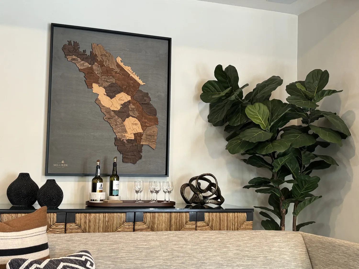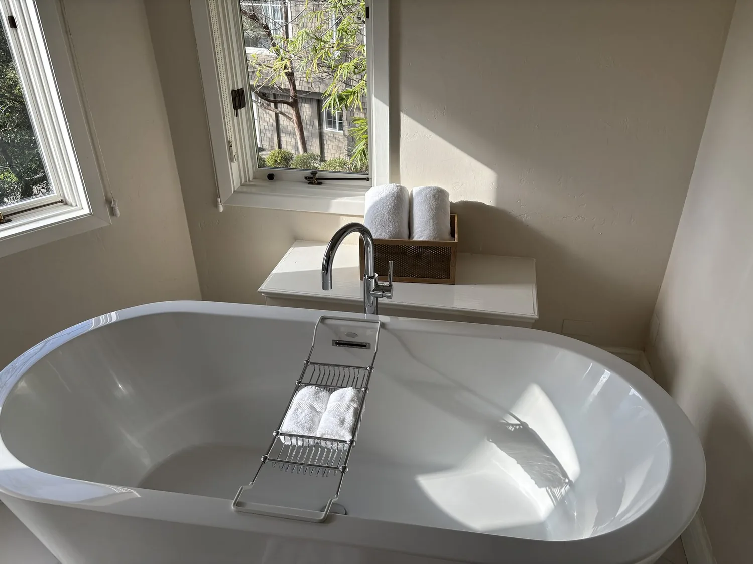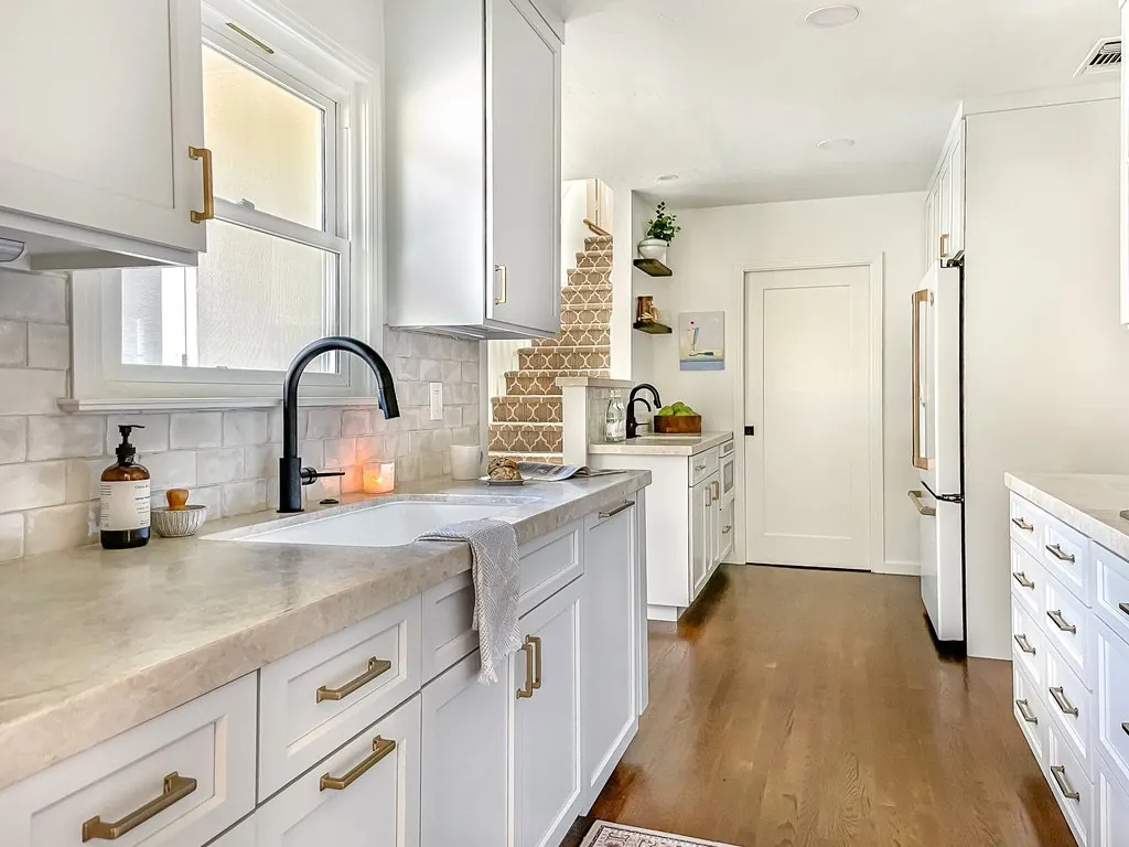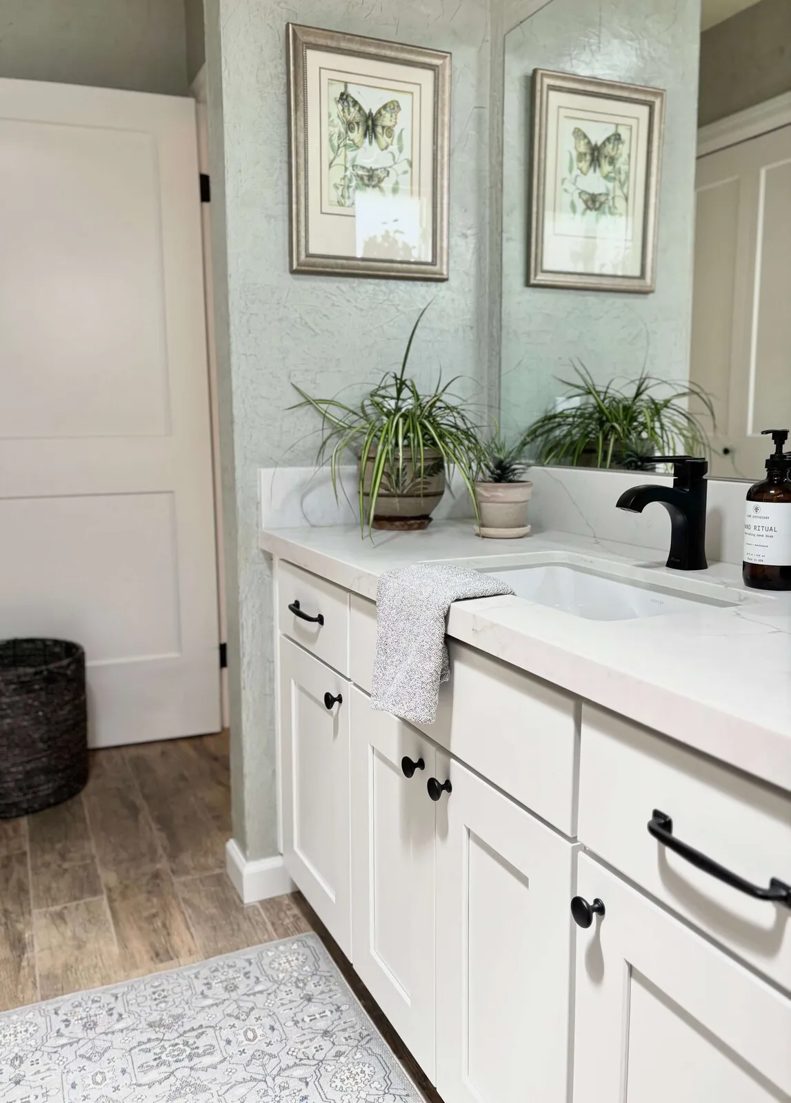
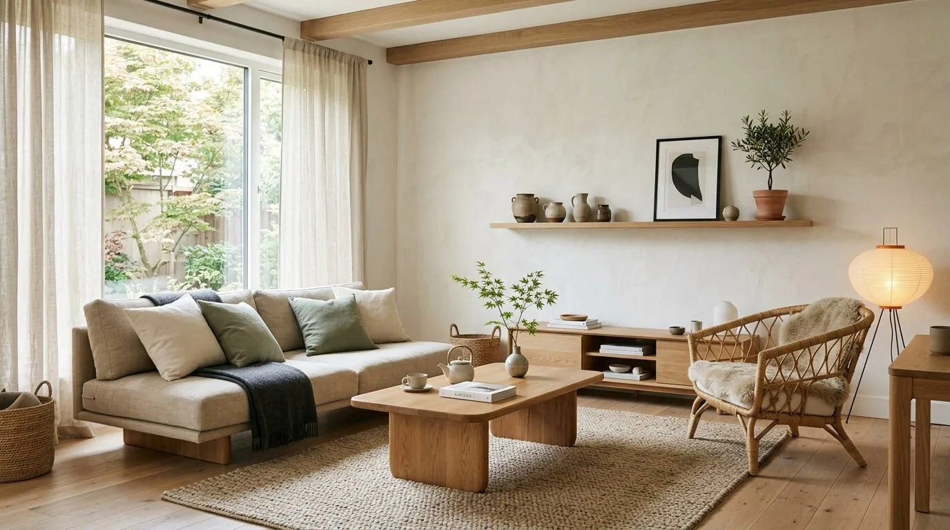
In 2026, Japandi color palettes are shifting towards a refined, muted spectrum that combines earthy neutrals with subtle pops of color. The dominant trend is a move away from stark monochromes towards warmer, more restrained tones that evoke calm and balance. Japandi color palettes for 2026 emphasize soft, natural hues paired with understated accent colors, creating serene spaces rooted in simplicity and mindful design.
Built from our active project files, this guide will explore the predicted color trends for 2026, compare them to current palettes, and discuss how these colors can be thoughtfully incorporated into different rooms and styles. As Sacramento and Marin designers, we focus on how regional influences, light, landscape, and architectural context, drive these subtle yet impactful color choices, all within a warm-restraint, designer perspective.
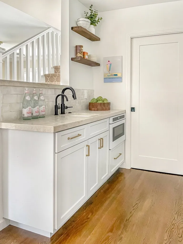
Direct Answers (Japandi Color Palettes For 2026)
| What are the main color trends for Japandi palettes in 2026? | Japandi color palettes for 2026 emphasize soft, natural hues with warm earth tones like taupes, clay reds, and muted olive greens, moving away from stark monochromes. |
| How do regional influences in Sacramento affect Japandi color choices? | Sacramento's abundant sunlight and warm climate encourage the use of warm, earthy palettes that reflect the outdoors and complement local materials like reclaimed oak and travertine. |
| What tips are there for incorporating 2026 Japandi colors into interior design? | Layer muted earth tones with textured fabrics and natural finishes, use matte or eggshell finishes to diffuse light, and consider lighting conditions to balance color choices. |
| Why are warm, restrained tones preferred in Sacramento's Japandi designs? | They evoke calm and serenity, harmonize with regional natural materials and landscape, and align with the regional light and architectural context for timeless appeal. |
Japandi Color Palettes For 2026 2026 at a Glance
| Element | In | Out |
|---|---|---|
| Color | Muted earthy tones | Bright bold colors |
| Contrast | Warm neutrals gaining prominence | High contrast palettes |
| Material | Soft greens and browns | Neon accents |
| Lighting | Minimal contrast | Cold, stark neutrals |
| Texture | Natural materials focus | Synthetic materials |
| Accent | Calm, subdued palettes | Overly vibrant hues |
| Influence | Layered textures | Clashing color combinations |
| Application | Subtle color accents | Heavy saturation |
| Mood | Organic influences | Synthetic finishes |
First Major Design Move: Embracing Warm Earth Tones
As we look toward 2026, the most significant shift in Japandi color palettes is the embrace of warm earth tones. These hues include soft taupes, gentle clay reds, and muted olive greens, which evoke a sense of grounding and serenity. Across our active project specifications, we've seen clients favor these shades for creating a calming backdrop that complements natural materials like bamboo, cork, and linen. The Pantone Color of the Year for 2026, a gentle warm beige, exemplifies this trend, reinforcing the movement toward understated sophistication.
In practical terms, incorporating these tones involves selecting matte finishes on walls and cabinetry, pairing them with warm metallic accents such as brushed brass or antique bronze, and layering textures to enhance depth. The goal is to craft spaces that feel both timeless and current, avoiding the coldness of overly gray palettes while maintaining the simplicity central to Japandi style. This approach aligns with the broader design ethos of mindful, restrained aesthetics that prioritize comfort and subtle beauty.

Material Specificity for 2026 Japandi Palettes
Authenticity-grade materials
- White oak (rift-sawn), for floors and slat detail; calmer grain than plain-sawn
- Linen fabric, for upholstery and window treatments; soft and natural texture
- Matte ceramic tiles, in kitchens and bathrooms; reduces glare and enhances muted tones
- Brushed brass hardware, for fixtures and accents; warm finish complements earth tones
- Cork, for flooring or wall panels; sustainable and warm to the touch
- Clay plaster, for textured walls; adds depth and authenticity
- Untreated linen or jute rugs, grounding the space with natural fibers
- Sandstone or travertine, for countertops or accents; subtle variation enhances natural look
Generic-grade tells we refuse to spec
- Glossy finishes, avoid overly shiny surfaces that clash with matte palettes
- Bright synthetic fabrics, steer clear of unnatural textures
- High-gloss tiles, too reflective and modern for the soft aesthetic
- Vivid plastics or acrylics, do not align with natural, restrained tones
- Cold metals like chrome, prefer warm finishes instead
- Veneered MDF, avoid if aiming for authentic natural textures

How to Incorporate 2026 Japandi Colors Effectively
Choosing the right colors is only part of the equation. The first question we ask clients is what atmosphere they want to create and how the space is used. For living rooms and bedrooms, layering muted earth tones with textured fabrics and natural finishes enhances the calming vibe. In kitchens and bathrooms, selecting matte surfaces and warm metal fixtures ensures durability and style without overwhelming the space.
Designers should consider lighting conditions, north-facing rooms benefit from warmer hues to offset cooler natural light, while south-facing spaces can handle cooler shades. The key is balancing color with material and texture choices, creating a cohesive look that feels intentional and relaxed. When specifying paint, finishes like matte or eggshell help diffuse light and maintain the muted aesthetic, aligning with the broader Japandi principles of understated elegance and functional beauty.
Sizing and Material Choices for 2026 Japandi Interiors
In 2026, selecting the right sizes and finishes for fixtures and furnishings is crucial. For example, range hoods should be proportionate to the cooktop, typically 30 to 36 inches wide for residential kitchens, with a depth of at least 18 inches and CFM ratings appropriate for the space. In primary bedrooms, furniture scale should avoid overwhelming the room, think low-profile beds and slender nightstands in muted tones.
When choosing materials, opt for natural, authentic finishes, rift-sawn white oak for flooring and cabinetry, textured linen for upholstery, and matte ceramics for tiles. These choices reinforce the understated, organic palette and ensure longevity. For budget-conscious clients, stock options from local suppliers or high-quality stock cabinetry can match the aesthetic, while custom millwork offers tailored detail but at a higher cost and lead time. The goal is to create a balanced, harmonious environment that feels curated yet effortless.
Avoiding Common Mistakes with Japandi Color Palettes in 2026
One common mistake is over-contrasting colors that disrupt the tranquil aesthetic. Using too many dark or vibrant hues can create visual tension instead of calm. Another pitfall is neglecting material finishes, pairing matte walls with high-gloss surfaces can undermine the muted palette. Finally, over-accessorizing with bright or synthetic objects risks cluttering the serene environment.
To avoid these issues, focus on a restrained color scheme, prioritize natural textures, and select finishes that complement the palette. Layering with textiles, wood, and stone enhances depth without overwhelming the senses. Consistency in material and finish choices is essential to maintain the integrity of the Japandi look and ensure the design remains timeless and regionally appropriate.
Should You Remodel or Rebuild in Sacramento for 2026?
In Sacramento, many older homes with traditional layouts can benefit from remodeling that respects their architectural character. The decision often hinges on structural conditions, budget, and the desired outcome. For homes with solid foundations but outdated interiors, updating with new color palettes, materials, and fixtures can be the most cost-effective way to achieve a modern Japandi look without losing regional charm.
However, if the home’s structure is compromised or if a more open, contemporary layout is desired, rebuilding might be the better choice. The Sacramento permit process, detailed at the city’s permit page, guides what’s feasible and cost-effective. The key is balancing preservation with modernization, ensuring that the home’s character is maintained while embracing the subtle sophistication of Japandi colors and design principles.
Observed Failure Modes, How Japandi Color Palettes For 2026 Goes Wrong
From our project debriefs and post-occupancy reviews, 2023-2026.
Choosing Too Cool or Stark Colors
One common failure is selecting overly cool or stark colors that clash with the warm, natural materials typical of Japandi interiors. These choices can create a sterile feel and undermine the calming, organic aesthetic. The mistake often stems from relying on trendy monochromes without considering regional light and material context. To avoid this, always test color samples in natural daylight and layer textures to add warmth and depth, ensuring the palette remains inviting and balanced.
Ignoring Texture and Finish
Another mistake is focusing solely on color without attention to texture or finish. Flat, glossy surfaces or synthetic fabrics can make a space feel disconnected from the authentic, understated Japandi look. Incorporating matte finishes, textured textiles, and natural materials creates visual interest and harmony. Always specify finishes that align with the muted, serene palette to maintain the style’s integrity.
Over-accessorizing with Bright Accents
Adding too many bright or contrasting accents can quickly disrupt the calm of a Japandi space. Clutter and excessive decoration dilute the palette and create visual noise. The key is restraint, select a few subtle accents in muted or warm tones and use them sparingly. This approach preserves the minimalist, tranquil atmosphere that defines Japandi design in 2026.
Poor Material Selection
Using synthetic or low-quality materials can diminish the authentic feel of Japandi interiors. Materials like cheap laminates or plastic fixtures stand out and undermine the restrained aesthetic. Instead, opt for genuine, sustainable materials such as reclaimed wood, natural stone, and linen textiles. These choices enhance durability and authenticity, ensuring the space ages gracefully while maintaining its serene character.
What's Going Out for 2026
- Bright, neon colors in walls or decor
- High-gloss, reflective finishes on large surfaces
- Synthetic fabrics and plastics
- Overly saturated or vibrant accent colors
- Cluttered decor with busy patterns
- Contrasting dark and light palettes without restraint
- Vivid plastics or acrylic accents
- Heavy use of synthetic materials in furniture and fixtures
What Japandi Color Palettes For 2026 Costs in 2026
| Scope | Typical range |
|---|---|
| Refresh scope with new paint and textiles | $12K-$20K |
| Mid-tier renovation with cabinetry, flooring, and fixtures | $35K-$70K |
| Estate-scale remodel or rebuild | $150K-$400K |
Working Notes
What We Have Learned Doing This: Japandi Color Palettes for 2026: A Designer's Spec Guide
“If a color is named in three magazines this year, it will date faster than its lifespan. Choose colors that have looked tasteful for twenty years.”
Undertone is the whole game. A color that looks calm on a chip can turn a room orange or green once it sits against the floor and the afternoon light, which is why we live with full-size samples before committing.
Old houses lie, and so do new ones. Even a ten-year-old house lies the moment you assume the framing sits where the plans say. We stopped trusting old drawings, prior contractor work, and the phrase it should be fine a long time ago. The budget needs a real line for what demolition will uncover, usually 15 to 20 percent once walls start opening.
Specify for the next ten years, not the next photo shoot. The work that holds its value is quiet, well made, and a little bit boring on the day it is installed.
A renovation is a dependency chain, not a list of tasks. A two-day cabinet delay quietly becomes a two-week slip by week sixteen because every trade downstream is holding a calendar. The least glamorous part of this work, and the most valuable, is keeping that chain from cascading.
These notes come from our own japandi color palettes for 2026: a designer's spec guide project debriefs. Most were learned the expensive way the first time.
Sources & Professional References
This guide's positions on materials are grounded in published building-code, standards, and recognized design-authority sources, alongside Designed | Curated Interiors' verified credentials and active project files:
- American Society of Interior Designers (ASID): interior-design practice standards
- International Code Council (ICC): Chapter 8 Interior Finish Decorative Materials And Furnishings
- NKBA, Amy Kunst Member Profile (verified credential, NKBA Committee Member)
- Featured in: Homes & Gardens (design expert quote, May 2026) · Sacramento Love (guest author, 2024)
Frequently Asked
What are the main color trends for Japandi palettes in 2026?
How do regional influences in Sacramento affect Japandi color choices?
What tips are there for incorporating 2026 Japandi colors into interior design?
Why are warm, restrained tones preferred in Sacramento's Japandi designs?
Are there specific materials recommended for Japandi interiors in 2026?
From Japandi Color Palettes For 2026 to a Real Room
A trend piece is the briefing document, not the deliverable. The pages below show how we translate these principles into finished rooms across Sacramento and the rest of Northern California.
- Sacramento & Bay Area Interior Design Services How we scope, source, and deliver work end to end.
- Interior Designer Hub, Sacramento Where most of our Sacramento work lives, the regional fit explained.
- Modern Tudor Homes: Authentic, Revival, and Neo-Tudor (A Designer Reference) Heritage-architecture renovation patterns from our project files.
- Japandi Living Room: A Designer's Guide to the 2026 Look The 2026 warm-neutral playbook applied to the living room.