Guide from active projects on color opposites, light vs dark, modern vs traditional, textures, shapes, and intentional harmony. I am approaching the subject from a working designer's perspective, with the same warm-restraint lens we use across our 2026 trend work.
Direct Answers (Opposition In Interior Design)
| What is the role of opposition in interior design? | Opposition involves balancing contrasting elements to create a layered and interesting space without appearing busy or mismatched. |
| How can I use material opposition effectively in my Sacramento home? | Natural materials like honed Calacatta or rift-sawn oak integrate well with Northern California light. |
| Why is it important to plan floor heights and transitions before starting a flooring project? | Plan floor levels to prevent trip hazards and visual discord, avoiding costly fixes later. |
| How does Sacramento's architectural diversity influence interior design opposition? | In Sacramento, old and new elements layer well if the new fits existing scales. |
Start With One Strong Opposition
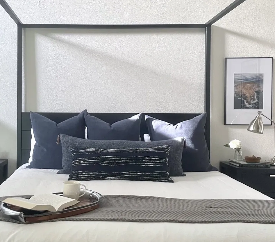
The safest way to use opposition is to decide which disagreement should carry the room. Kitchen: deep green island against warm white perimeter cabinetry. In a living room, it could be a contemporary boucle chair against traditional oak millwork. The rest of the specification should support that relationship rather than introduce six more arguments. Contrast needs hierarchy. If every element is the counterpoint, nothing reads as the main idea.
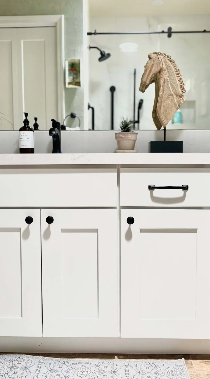
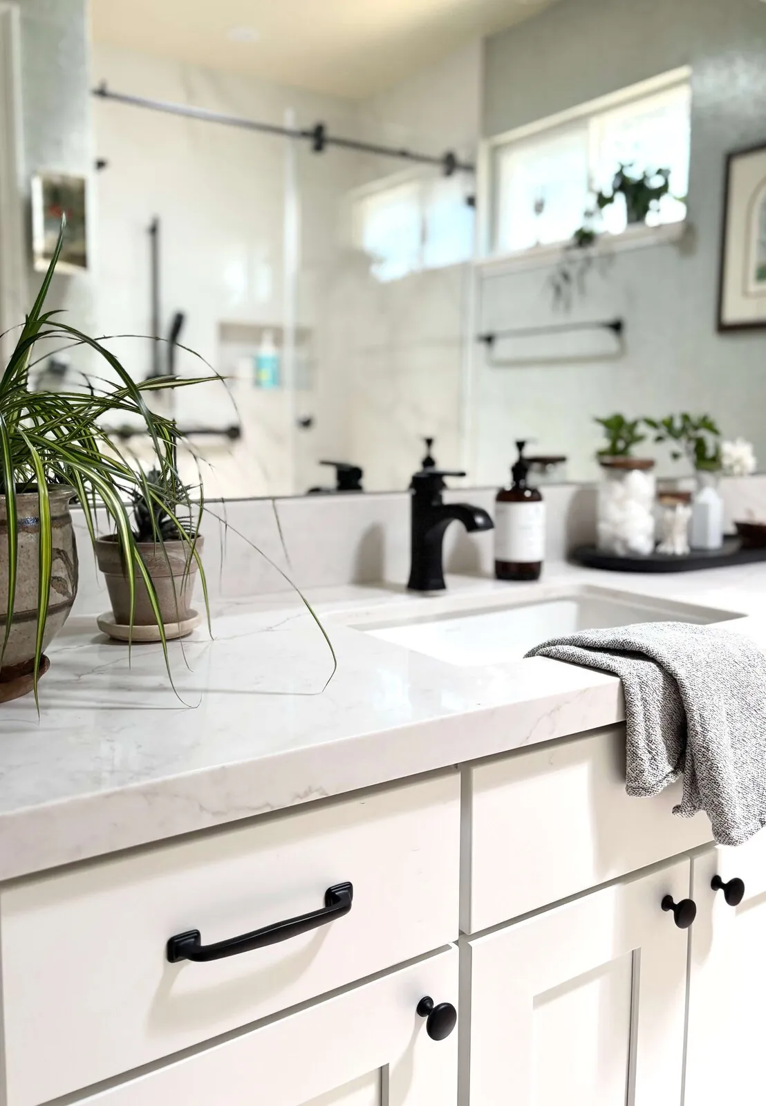
Across our active project specifications, I often use natural materials to make opposition feel less theatrical. Honed Calacatta marble can calm a dark painted cabinet. Rift-sawn white oak can bridge a blackened steel detail and a traditional plaster wall. Brushed brass from Waterworks or unlacquered brass hardware can connect contemporary cabinetry to older architectural trim because the finish develops variation instead of staying visually perfect.
Northern California light makes this particularly important. A dark finish looks crisp under showroom lights but can be overwhelming with afternoon sun and warm light. I prefer to test the contrast with actual samples in the room because the question is not whether two colors oppose each other on a color wheel. The question is whether they still look intentional at 8 a.m., 3 p.m., and after the lamps come on.
Designer Decision Matrix: Which Opposition In Interior Design Approach Fits Your Home
How we actually decide: match your situation to what we would specify, and the reasoning behind it.
| Your Goal | Best Solution | Why We Recommend It |
|---|---|---|
| Lowest-cost contrast | Pair existing furniture with a new paint value shift and one tactile textile | Changing value and texture can alter the visual hierarchy without paying for a full furniture replacement, which matters when the room already has usable pieces. |
| Luxury finish | Use natural stone, rift-sawn oak, and one aged metal finish | Real materials have small variations in grain, reflectance, and patina that make opposition feel architectural rather than staged. |
| Small room | Use one dark element at furniture scale against a lighter envelope | A controlled value shift gives the eye a destination without dividing a small room into competing visual zones. |
| Older Sacramento home | Keep original trim or another strong architectural feature and introduce contemporary furniture | The tension respects the home's accumulated character while avoiding the false historical quality created by making every new element look old. |
| Contemporary look | Combine clean-lined furniture with one irregular natural surface | A honed stone slab or hand-troweled plaster wall prevents a precise contemporary room from becoming visually sterile. |
| Open-plan living area | Repeat one contrasting material across adjacent zones | Repetition keeps opposition legible across long Sacramento sightlines instead of allowing each seating or dining area to become its own unrelated composition. |
| Strong light exposure | Use warm dark finishes rather than absolute black | Warm charcoal, deep olive, or brown-black retains depth under intense daylight while reducing the harsh value jump that can make a sunny room feel visually brittle. |
How Much Contrast Is Enough?
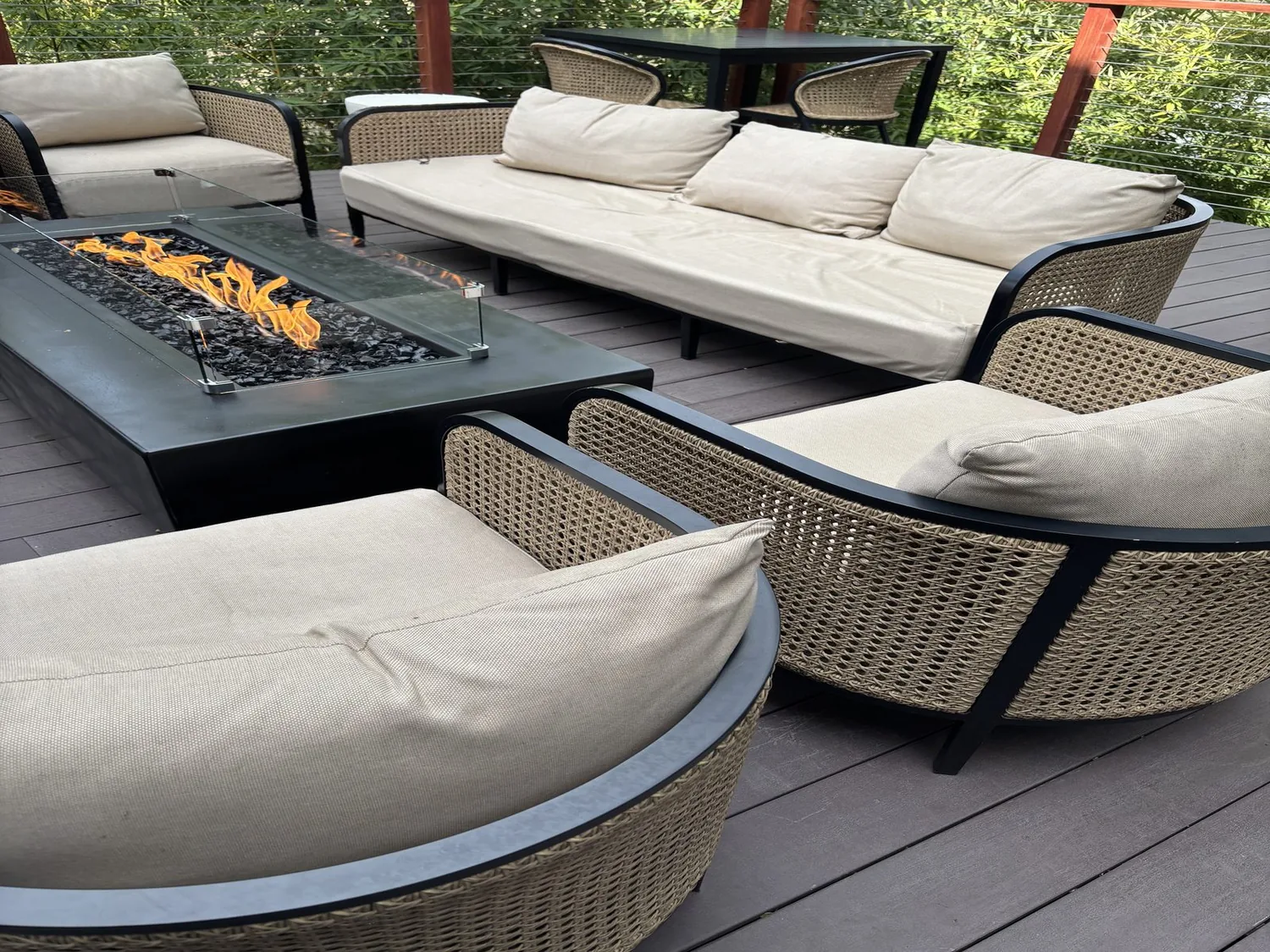
The real homeowner question is usually not whether contrast looks good. The contrast should still work after furniture is added and daylight changes. The first question we ask is: what should the eye notice first? If it's a fireplace or island, the opposition should highlight that focal point.
Choose one dominant contrast and let others recede. A dark island can oppose pale perimeter cabinetry while the backsplash stays quiet. A rounded sofa can oppose a square coffee table while the rug repeats one of the room's colors. This is why opposition is not the same as simply adding black, white, curves, brass, pattern, and vintage furniture all at once.
The National Kitchen and Bath Association's professional guidance places substantial attention on function, proportion, and coordinated kitchen planning. That principle applies here too. A visually exciting contrast that blocks circulation, creates awkward sightlines, or makes work surfaces difficult to read is not a successful design decision. The National Kitchen and Bath Association is a useful professional reference because the best contrast still has to operate as a room. Watch for opposition created only through decorative accessories.
How Do You Mix Modern and Traditional Without Making a Room Look Random?
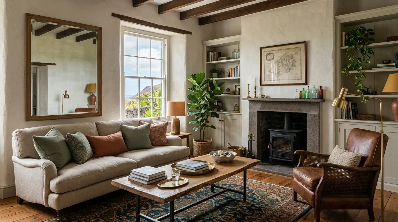
Start with architecture. In a Sacramento house with traditional casing and a pitched roof, I might keep the original trim and introduce a contemporary sofa, simple lighting, and a large-format stone table. The opposition works because the architecture supplies continuity. I would not then add a second historical furniture period and several decorative motifs just to prove the room is eclectic.
Scale is the bridge. A traditional console with delicate legs beside oversized contemporary seating can look accidental. A substantial oak console with clean proportions beside a modern sofa is easier to balance because both pieces occupy similar visual weight. Repeating one material helps too. Contemporary black steel elements can complement traditional decor. ASID highlights how design integrates aesthetics with functionality. That is especially relevant when mixing styles. The goal is not to make two periods look identical. It is to give them a shared proportion, color temperature, or material relationship so the disagreement feels deliberate. Avoid mixing historical periods without scale control.
How Should Opposing Shapes Be Arranged?
Circles and squares work well together when one shape clearly leads. Put a round coffee table inside a rectilinear seating arrangement and the table becomes the soft interruption. Put a curved sofa in a room full of round tables, arched openings, and circular lighting and the curve loses its job because there is no opposition left.
Position sightline first, then strongest counterpoint for visibility without blocking circulation. Round table softens boxy furniture; rectangle rug unifies the space. Shapes interrupt or organize. Rounded forms can echo planting, while squared designs keep architectural order. Curves should fit the room.
Which Contrasts Are Worth Paying For?
Invest in contrasts people touch and see up close. If the opposing elements are a rough stone fireplace and smooth oak cabinetry, the stone deserves careful selection because its surface, edge, and mineral variation will remain visible for years. If the opposition is simply a painted wall against existing furniture, paint is usually the smarter place to spend.
| Contrast | Worth Investing In | Why |
|---|---|---|
| Stone vs. wood | Natural stone and quality veneer | Real variation keeps the relationship convincing at close range. |
| Modern vs. traditional | One strong architectural or furniture piece | A single substantial contrast has more authority than many inexpensive accents. |
| Rough vs. smooth | Texture with natural variation | Authentic irregularity prevents tactile opposition from looking printed or synthetic. |
| Light vs. dark | Quality paint and appropriate lighting | Light levels determine whether the dark element reads as rich, muddy, or overly harsh. |
Harvard's Joint Center for Housing Studies tracks the broader economics of home remodeling, which is a useful reminder that homeowners should distinguish between a visual upgrade and a durable investment. Budget allocation makes opposition affordable and effective.
From our project debriefs and post-occupancy reviews, 2023-2026. When color, texture, shape, finish, and historical style all oppose each other at once, the room starts to feel nervous. The symptom is usually obvious after installation: you can name every interesting object, but nothing feels important. The cure is to rank the contrasts. Keep the strongest value shift, then let the material or shape opposition become quieter. This also protects the budget because you stop paying for specialty finishes that are competing for attention. A Sacramento living room with strong afternoon light rarely needs a dozen dramatic moves. Dark details, warm oak, and a simple fabric add depth without overwhelming the space. Absolute black is an easy shortcut for opposition, but it can become visually hard in rooms with intense daylight. The symptom is a dark element that looks detached from everything around it. The cure is often a warmer charcoal, brown-black, deep olive, or soapstone instead. These shades still create value contrast while retaining undertones that connect to oak, linen, stone, and landscape. This matters particularly in Northern California, where daylight and indoor-outdoor views can make a high-contrast surface appear substantially stronger than it did under showroom lighting. Putting a contemporary sofa next to a traditional cabinet does not automatically create sophisticated opposition. If furniture varies in scale, color, or weight, it looks haphazardly arranged. To unify a room, repeat wood tones, similar metals, equal proportions, or use rugs that blend both palettes. You don't need everything to match. It is to give them one shared characteristic strong enough to make the disagreement feel intentional. Rough stone, fluted wood, boucle, plaster, patterned tile, and heavily grained oak can each be beautiful. Together, they can become exhausting. The symptom is a room where every surface demands close inspection. The cure is to pair one tactile star with quieter supporting surfaces. A honed stone wall might need smooth painted cabinetry and simple upholstery. A grainy oak table works well with a subtle wool rug. Texture needs balance; the eye should have somewhere to relax. A curved sofa and square chairs may look excellent on a plan but create awkward gaps once people actually use the room. The cure is to prioritize circulation before geometric drama. Leave the major path clear, then place the strongest opposing shape where it interrupts the composition without interrupting movement. Furniture should create visual interest, not physical obstacles. In Sacramento's open floor plans, you often see through kitchen, dining, and exterior doors into one room.Common pitfalls in applying opposition that disrupt visual clarity and functionality
Overloading contrast with multiple competing elements
Using overly severe black without warm undertones
Lacking a unifying characteristic between modern and traditional elements
Creating visual noise from excessive texture variety
Opposing shapes that obstruct circulation
Cost ranges for opposition-focused interior design projects
2026 planning ranges by scope. They bracket a budget; they are not a quote for a specific house.
| Scope | Typical range |
|---|---|
| Refresh scope: paint, textiles, selected lighting, and furniture edits | $8K-$20K |
| Mid-tier scope: cabinetry or millwork changes, natural materials, furniture, and lighting | $40K-$100K |
| Estate-scale: whole-room or whole-home material, millwork, furnishings, and architectural contrast | $150K-$400K+ |
Sources & Professional References
This guide's positions on materials are grounded in published building-code, standards, and recognized design-authority sources, alongside Designed | Curated Interiors' verified credentials and active project files:
- American Society of Interior Designers (ASID): interior-design practice standards
- International Code Council (ICC): Chapter 8 Interior Finish Decorative Materials And Furnishings
- Associated General Contractors (AGC): Epa%20cons%20s%20insp%20pre
- NKBA, Amy Kunst Member Profile (verified credential, NKBA Committee Member)
- Featured in: Good Housekeeping (storage and space-planning expert quotes, July 2026) · Homes & Gardens (design expert quote, May 2026) · Sacramento Love (guest author, 2024)
Frequently Asked
What should I consider when blending modern and traditional styles in my Sacramento home?
Related reading
- Sacramento & Bay Area Interior Design Services How we scope, source, and deliver work end to end.
- Interior Designer Hub, Sacramento Where most of our Sacramento work lives, the regional fit explained.
- Modern Tudor Homes Heritage-architecture renovation patterns from our project files.
- Japandi Living Room Design The 2026 warm-neutral playbook applied to the living room.