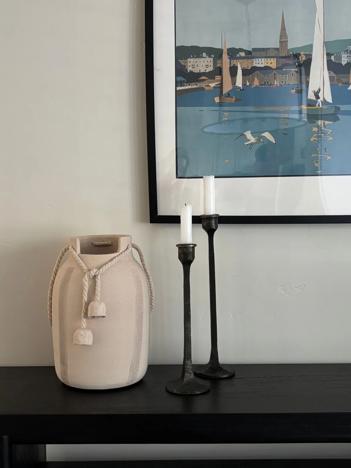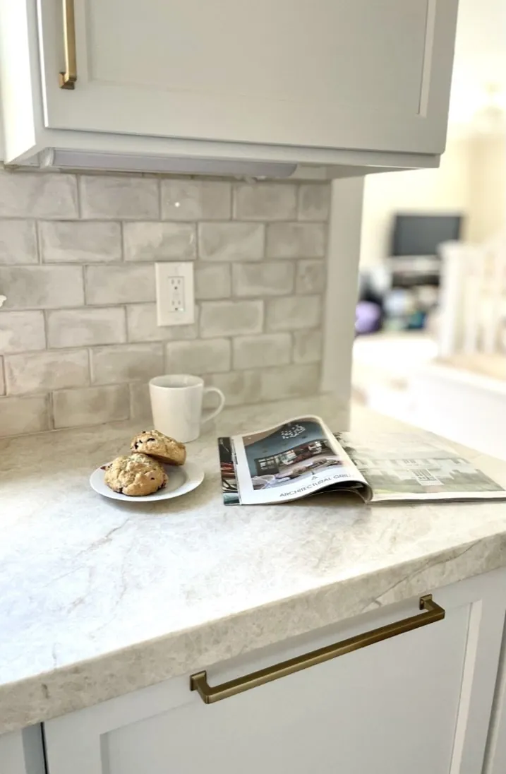
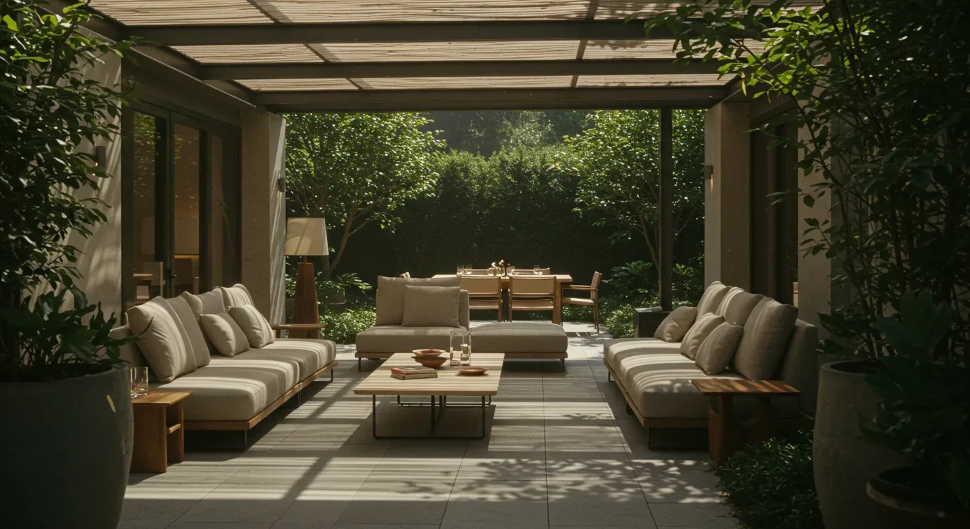
This guide explores opposition rhythm in furniture, color, pattern, materials, and layout from real project files. I am approaching it from the warm-restraint perspective we use in residential work: contrast should create movement, but the room should still feel easy to live in. The examples are grounded in projects and specifications from Sacramento and Northern California, with the same designer perspective we bring to our work around Mill Valley.
Direct Answers (Opposition Rhythm In Interior Design)
| What is the concept of opposition rhythm in interior design? | Opposition rhythm involves placing deliberate visual contrasts beside one another and repeating those contrasts to create a balanced room rather than chaos. |
| How can I apply opposition rhythm in Sacramento homes? | In Sacramento, you can use materials like warm oak or dark painted built-ins in older houses to make irregular geometry feel intentional, while contrasting furniture shapes can break up repetitive patterns in newer homes. |
| What are some examples of strong visual oppositions for interior design? | Think pale oak cabinets against dark gray walls. Horizontal sofas set off tall bookshelves nicely. These contrasts guide your eye back and forth. |
| Why is it important to measure openings before ordering materials in interior design projects? | Measure openings six times. Errors like doors being off by three quarters of an inch can cost big. |
Start With One Strong Visual Opposition
Opposition rhythm is the repeated use of contrasting visual elements so the eye moves back and forth across a room. Charcoal and pale oak. Looks sharp. A long horizontal sofa facing a pair of tall bookcases is another. The rhythm appears when that relationship is repeated elsewhere, not just next to each other. The strongest rooms usually establish one dominant opposition and then let smaller details reinforce it.
Across our active project specifications, I often use rift-sawn white oak against honed soapstone or dark-stained oak against warm plaster because the materials disagree in color and texture without looking theatrical. Polished brass from Waterworks complements the sleek finish of blackened steel, offering a sophisticated contrast in materials., while a boucle chair can interrupt the harder geometry of a wood-and-stone kitchen. The American Society of Interior Designers emphasizes the relationship between design decisions and how people experience a space, which is useful here: contrast should help organize attention, circulation, and use, not merely decorate a photograph. American Society of Interior Designers
Shape matters just as much as color. A rectangular coffee table beside a curved lounge chair creates a more useful opposition than adding another color simply because the room needs interest. In Northern California homes, where strong daylight can make pale surfaces read very differently from morning to afternoon, I prefer material contrast that remains legible as the light changes. Natural light changes in Sacramento, so maintaining rhythm keeps the space harmonious all day.
How we actually decide: match your situation to what we would specify, and the reasoning behind it.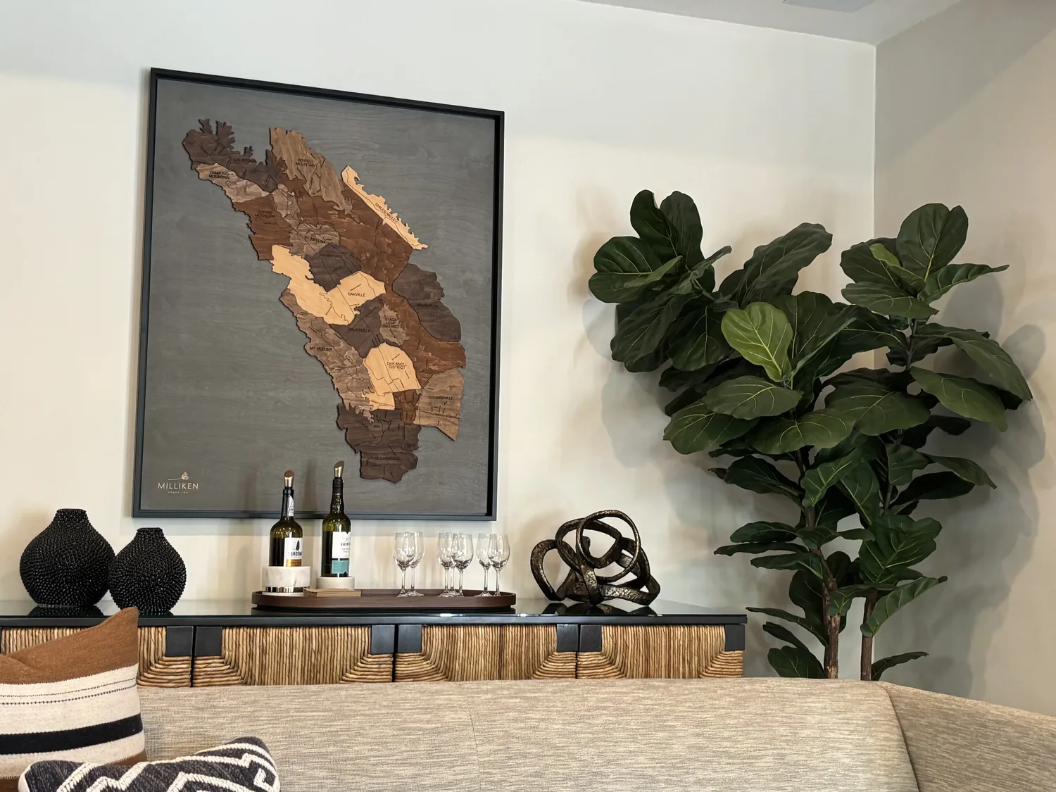
Designer Decision Matrix: Which Opposition Rhythm In Interior Design Approach Fits Your Home
Your Goal Best Solution Why We Recommend It Lowest-cost change Pair existing furniture with one contrasting textile and one directional accessory A rug, throw, or pair of pillows can introduce shape and tonal opposition without replacing sound furniture. Small room Use light-dark opposition with restrained geometry A strong tonal relationship gives the eye structure while avoiding the physical clutter that multiple furniture shapes can create. Open-plan home Repeat one contrast across adjoining zones Repeating a dark architectural line or warm wood note helps separate functions without making each zone look like a different room. Traditional Sacramento house Pair original millwork with one clean contemporary form The tension between older trim and simpler furniture preserves character while preventing the room from becoming period-themed. Modern look Oppose rounded furniture with strong linear architecture Curves interrupt the predictable grid of contemporary interiors and make circulation areas feel less rigid. High-contrast color lover Concentrate the strongest contrast at one focal zone Limiting intensity protects sightlines and keeps the room from becoming visually exhausting. Northern California indoor-outdoor room Use natural-material contrast rather than excessive color contrast Oak, stone, linen, plaster, and metal remain visually interesting as daylight changes and connect more naturally to the landscape outside. 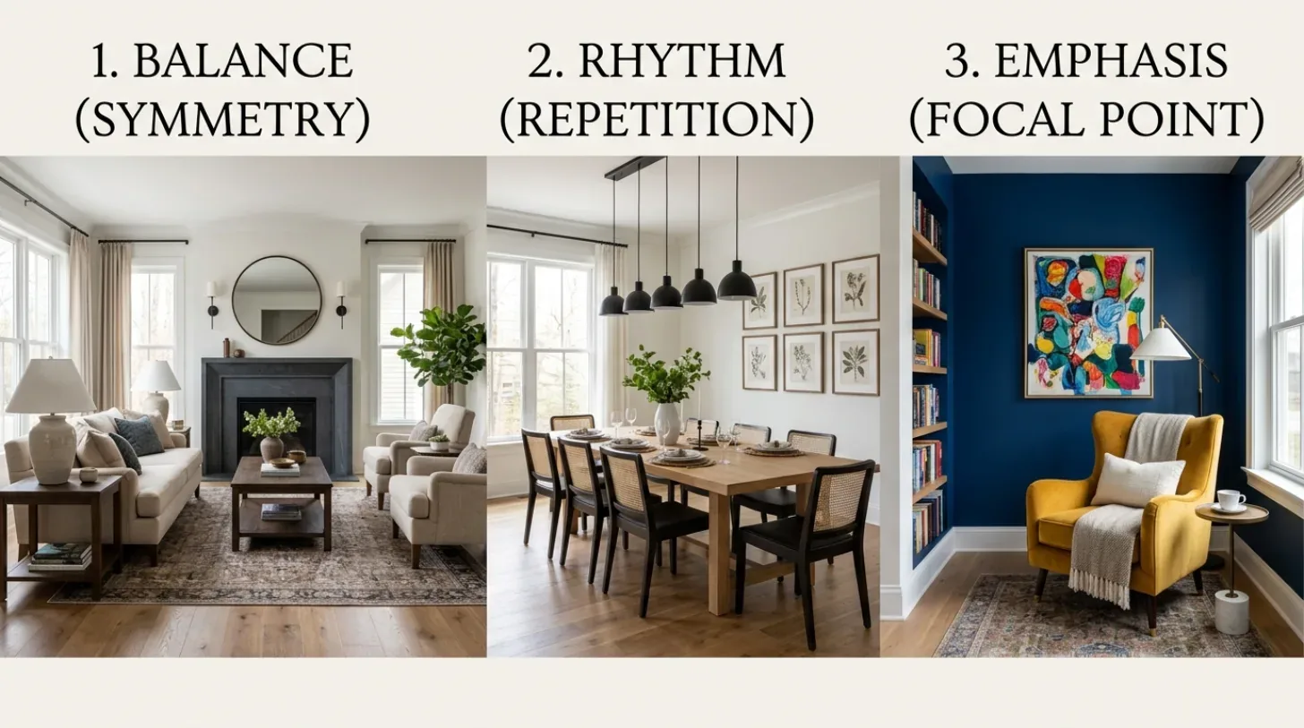
How Do I Know If the Contrast Is Balanced?
How much contrast is too much? It can overwhelm. Pick what draws attention in the room first. For a fireplace, island, table, or view, keep the rhythm focused there.Start with one big contrast and repeat it in smaller spots. A charcoal fireplace wall can be echoed by black chair legs and a dark picture frame. A curved sofa can be balanced by a round pendant and a circular side table, while the rest of the room stays linear. This isn't about making every object unusual. Opposition works because the surrounding elements give the contrast somewhere to land.
In Sacramento's older housing stock, I am especially careful with this. Uneven walls, deep trim, smaller openings, and varied ceiling heights already create visual movement. Adding strong pattern, multiple dark finishes, and sculptural furniture on top of that can produce visual noise rather than rhythm. The National Kitchen and Bath Association's focus on functional planning is a useful reminder that the visual composition has to leave room for doors, circulation, storage, and actual daily use.
Which Furniture Shapes Create the Best Opposition Rhythm?
Look at the silhouettes before looking at upholstery. A long rectangular sofa creates a strong horizontal. Place a rounded chair nearby and the eye moves from line to curve. A tall cabinet introduces vertical emphasis. A low coffee table pulls the composition back down. You can see opposition rhythm without buying strange furniture. Scale is what often gets overlooked. A petite curved chair beside a massive sectional may technically create contrast, but the chair can look accidental because its visual weight is too small. I generally want the opposing pieces to disagree in shape while remaining related in scale, height, or material. Walnut table, curved chairs, visually stable.
Natural wood and upholstery suit NorCal more than shiny pieces. The warmer palette works with abundant daylight and gives the contrast somewhere to soften. The American Society of Interior Designers' emphasis on human experience is relevant here: a chair still has to be comfortable, a table still has to function, and circulation still has to work even when the silhouettes are doing visual work.
How Should I Use Color Without Making the Room Look Harsh?
Use color opposition as a relationship, not a collection of isolated accents. A muted olive wall against warm white trim is gentler than pure complementary colors. Try a brown couch on pale oak floors. No black and white starkness. Combine blue-gray with terracotta. Add ochre. Charcoal and cream play well too.
For a calm room, let one side of the opposition carry more area and the other carry more visual weight. A pale wall works well in most rooms. A darker sofa can anchor the seating area. Echo that dark color with a lamp base or cabinet pull for cohesion. That repetition turns contrast into rhythm.
Do not choose paint from a tiny sample and assume the relationship will hold. Look at the color beside the actual flooring, countertop, upholstery, and window light. In Sacramento, strong afternoon light changes warm neutrals. What looks balanced in a showroom can look very different at home.
Will Opposition Rhythm Still Look Good in Five Years?
Yes, when the opposition comes from enduring relationships rather than a trend costume. Light wood against darker stone, curved furniture against linear architecture, old millwork against simple contemporary pieces, and smooth surfaces against tactile ones have staying power because they are based on visual fundamentals.
I would be cautious about building the entire room around a highly specific geometric pattern or a fashionable color pairing. Those elements can work but should be easy to replace if needed. Put the personality into a rug, artwork, chair, or painted surface rather than locking the whole composition into a difficult-to-change material.
The best test is simple: remove the trend-sensitive accessories mentally. If the room still has a clear relationship between its major forms, colors, and materials, the opposition rhythm is doing real design work. If everything collapses without the patterned pillows, the composition was probably never strong enough underneath.
Key mistakes in implementing opposition rhythm and their consequences
From our project debriefs and post-occupancy reviews, 2023-2026.
Overusing multiple competing contrasts without clear hierarchy
When every object is asked to be the opposing element, nothing feels important. Black and brass or bold patterns compete for attention. Pick one strong contrast. Subdue others. If the dark fireplace is the anchor, the black lamp base can support it, but a second dramatic black wall probably does not help. The same applies to shape. One large curved sofa can create plenty of movement without adding four more sculptural forms.
Ignoring circulation constraints when placing furniture with opposing shapes
A curved chair may look wonderful on a plan but become awkward when it projects into the walking path. This is particularly easy to miss in opposition-rhythm layouts because the designer is thinking about silhouette rather than clearance. The cure is to judge the furniture from the actual entry path and from seated eye level. Make contrast clear the layout up. A chair blocking flow? Wrong spot.
Over-reliance on black as the sole light-dark contrast element
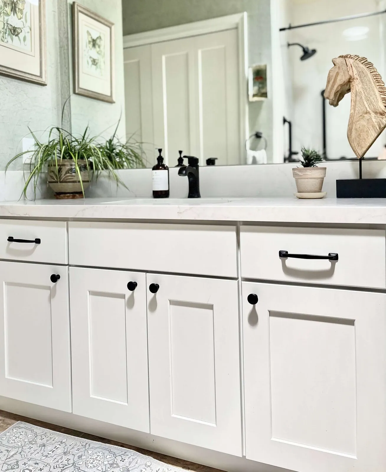
Black is an easy way to create light-dark opposition, which is exactly why it gets overused. Starting with black window frames and adding more black elements can make a room feel clipped. Deep walnut, dark bronze, charcoal paint, or soapstone offer warmth as counterweights. The money mistake is repainting or replacing otherwise good pieces because the first contrast was too severe.
Allowing pattern competition to overwhelm visual rhythm
Pattern can create opposition through scale and direction, but several loud patterns quickly cancel one another out. A large geometric rug against plain upholstery is easier to control than geometric rug, patterned sofa, patterned drapery, and busy artwork. Keep one pattern dominant and use others for texture. In open-plan homes, a pattern that works from the sofa might overwhelm when seen from all areas.
Ignoring architectural features when selecting opposition elements
Adding opposition without considering the house itself is a common way to make a renovation look pasted in. A 1930s Sacramento house? Check its trim and windows. A room full of aggressively contemporary contrasts can fight it. The cure is not to copy the historical style. It is to decide which architectural feature should remain dominant, then use modern opposition around it.
Choosing permanent contrasts without testing movable alternatives first
Some contrasts are cheap to change and others are not. Paint and rugs? Swap them out easily. Harder to change: millwork and tile. If you are unsure whether a bold opposition will age well, test the relationship with movable pieces first. A homeowner can learn a lot by living with a dark rug and light sofa before committing to a dark kitchen island. That small experiment can prevent a much larger replacement cost.
Project cost ranges for implementing opposition rhythm by scope level
2026 planning ranges by scope. They bracket a budget; they are not a quote for a specific house.
| Scope | Typical range |
|---|---|
| Refresh: paint, textiles, lighting, and furniture rearrangement | $5K-$18K |
| Mid-tier: new furniture, custom upholstery, lighting, rugs, and selected millwork | $25K-$70K |
| Estate-scale: architectural millwork, custom furniture, stone, lighting, and whole-room detailing | $100K-$300K+ |
Sources & Professional References
This guide's positions on materials are grounded in published building-code, standards, and recognized design-authority sources, alongside Designed | Curated Interiors' verified credentials and active project files:
- American Society of Interior Designers (ASID): interior-design practice standards
- International Code Council (ICC): Chapter 8 Interior Finish Decorative Materials And Furnishings
- NKBA, Amy Kunst Member Profile (verified credential, NKBA Committee Member)
- Featured in: Good Housekeeping (storage and space-planning expert quotes, July 2026) · Homes & Gardens (design expert quote, May 2026) · Sacramento Love (guest author, 2024)
Frequently Asked
How does light affect the use of opposition rhythm in Sacramento's homes?
What is a common mistake when implementing opposition rhythm?
How does opposition rhythm differ from other design rhythms?
Related reading
- Sacramento & Bay Area Interior Design Services How we scope, source, and deliver work end to end.
- Interior Designer Hub, Sacramento Where most of our Sacramento work lives, the regional fit explained.
- Modern Tudor Homes Heritage-architecture renovation patterns from our project files.
- Japandi Living Room Design The 2026 warm-neutral playbook applied to the living room.