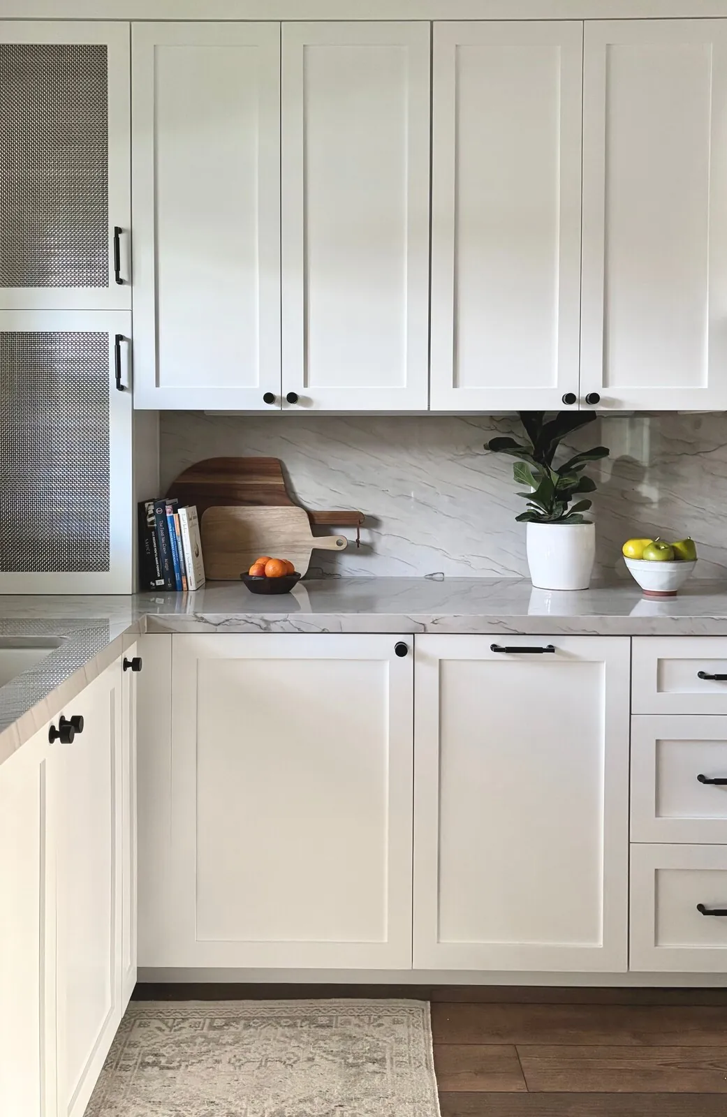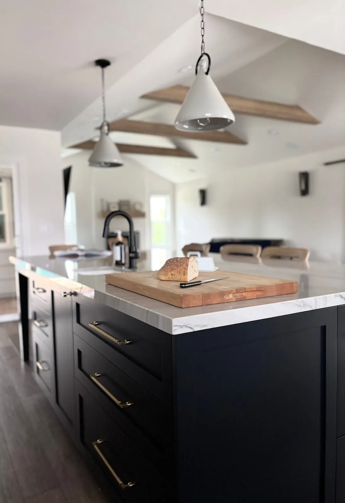
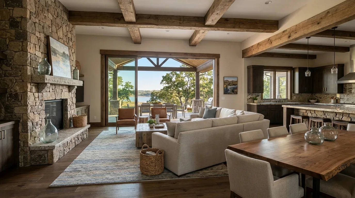
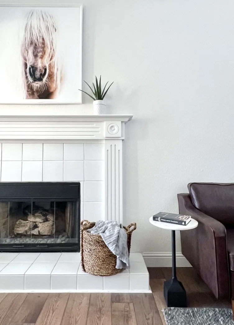
Based on current work, here are top taupes from big names. Their undertones and fit for different decor styles. We suggest rooms for different taupe tones and show examples to visualize them in real spaces. You'll choose paint confidently. Skip costly errors and design spaces that stay trendy.
Direct Answers (Taupe Paint)
| What is taupe paint and why is it popular in Sacramento? | Taupe's a flexible neutral, adding coziness and polish. Sacramento loves it for its light adaptability. |
| How do I choose the right taupe shade for my Sacramento home? | Check lighting in each room. Test taupe samples from morning to night. |
| What are some recommended taupe paint brands for interior walls? | Taupes from Sherwin-Williams or Farrow & Ball. Each with unique undertones. |
| How does lighting affect the appearance of taupe paint? | Light changes taupe undertones. Warm shades might look yellow in sunlight, cool ones stay grayish. |
First Major Design Move: Choosing the Right Taupe Shade
When selecting taupe paint, the first question we ask is: what’s the lighting environment? Sacramento homes get all kinds of natural light. From intense sun to gentle shadows. A south-facing room's taupe might not look the same in a north-facing one. From our work specs, Sherwin-Williams, Benjamin Moore, and Farrow & Ball show taupes from warm to cool.
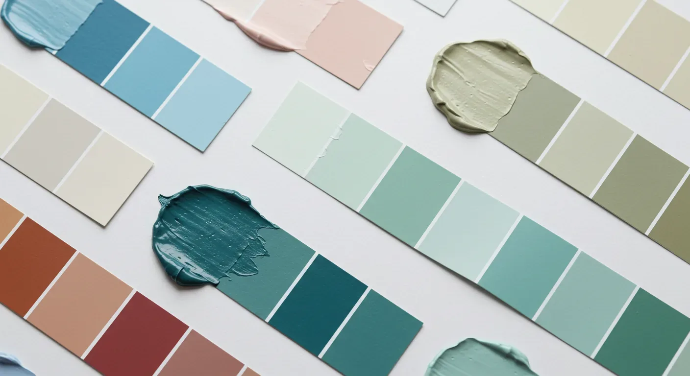
Picking taupe? Understand undertones, watch them change. Warm taupe? Try 'Accessible Beige' by Sherwin-Williams. Yellow hints, ideal for cozy living areas. Revere Pewter by Benjamin Moore. It has a cool taupe tone. Perfect for modern spaces. Try out paint samples at different times of day. Paint big swatches on each wall or use tester boards to see the changes. Notice how taupe shifts as sunlight changes. It keeps harmony with other choices. We aim for a lasting palette, especially important for long-term home value.
Designer Decision Matrix: Which Taupe Paint Approach Fits Your Home
How we actually decide: match your situation to what we would specify, and the reasoning behind it.
| Your Goal | Best Solution | Why We Recommend It |
|---|---|---|
| Create a warm, inviting living room in a traditional Sacramento home | Warm taupe with yellow undertones | This enhances the natural light and complements oak floors, making the space feel cozy and timeless. |
| Achieve a sleek, modern kitchen look | Cool greige taupe | It pairs well with stainless steel appliances and white cabinetry, creating a subtle, sophisticated backdrop. |
| Update a small bedroom without making it feel dark | Lighter taupe with beige undertones | It reflects light effectively and enlarges the space, especially important in older Sacramento homes with limited windows. |
| Match a rustic interior with natural materials | Earthy beige taupe | This reinforces the warm, organic vibe typical of Sacramento’s historic neighborhoods. |
| Create contrast in a transitional style | Soft greige taupe | It balances contemporary and traditional elements, ensuring longevity and style flexibility. |
How to Choose the Right Taupe Paint for Your Room
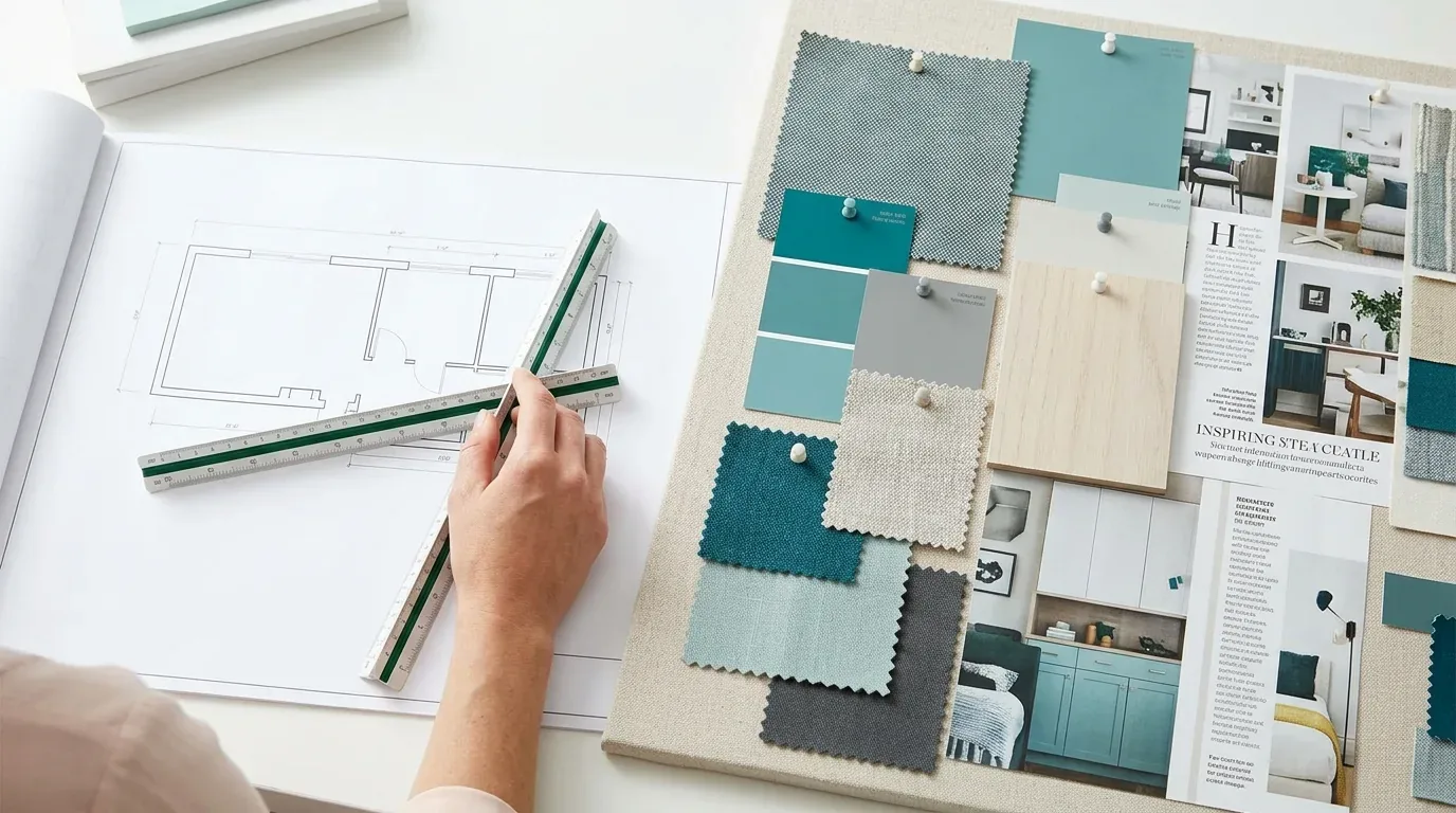
The core question is: how will the taupe look in your specific space? The first question we ask homeowners is about lighting, does the room face south, north, or east? Light changes taupe undertones all day long. In sunny Sacramento, 'Accessible Beige' can turn yellow. 'Revere Pewter' holds its hue. Test paint samples in various lights. Think about the room's use. Warm taupe suits cozy spaces. Pairs well with wood and soft fabrics. Cool taupe fits kitchens. Highlights art, modernizes space. Big swatches, every wall. Watch how color changes from morning to evening. Could stop a repaint. Picking taupe’s not just preference. It’s about fit with your space, long-term.
Selecting the Best Taupe Finish and Material
The finish you choose impacts how taupe appears and ages over time. Go with matte or eggshell. Best for cutting glare, adding depth. The American Society of Interior Designers emphasizes low-sheen paints for interior walls, citing their ability to hide imperfections and provide a sophisticated look. Go with low-VOC acrylic latex for cleaner air. Less odor and long-lasting. Good with indoor heating.
Use top-tier acrylic pigments. They resist fading. High-traffic or damp? Use satin or semi-gloss. They last longer. Older walls with layers of paint? Choose materials that won't distort taupe. Tiny tweaks matter.
Taupe Alternatives and How They Compare
While taupe remains a top neutral choice, some homeowners consider alternatives like soft gray or creamy white for specific effects. Modern gray works for sleek kitchens. It's a cool vibe. Beware though, it can be stark if used alone. Creamy white works in small, dark rooms. It can feel too cool compared to warm taupe though. Earthy beiges resonate with Sacramento's vibe: warm and grounded.
We check how each option handles light and wear. Warm taupe paired well with oak cabinets and brass, unlike a stark greige against traditional wood. Lighting and atmosphere steer the choice here. Taupe fits many styles. It's safe for most Sacramento homes.
How Sacramento’s Lighting and Undertones Can Cause Taupe Selection Errors
From our project debriefs and post-occupancy reviews, 2023-2026.
Choosing Taupe Without Testing in Sacramento’s Variable Lighting Leads to Repainting
Many homeowners pick a taupe based on a small sample or a digital screen, only to find it looks different once painted on the walls. Sacramento's light shift changes taupe completely, from bright to soft. Skipping color tests in varied lighting? Mistake. That's a sure way to regret and repaint. Paint big swatches on different walls. Watch them change all day. Do this to avoid taupe blunders that seem off in your space.
Overlooking Undertones Causes Color Clashes and Unintended Atmosphere Shifts
Some homeowners overlook undertones, assuming taupe is neutral. Taupe's undertones alter its interaction with light and color. Yellow or red undertones in taupe bring coziness, but watch for clashes with cool items. Blue or green undertones might chill the room down too much. Check your style first, then find taupes that work with your furniture and fittings. Avoid colors that fight with each other. Simpler is better.
Sources & Professional References
This guide's positions on materials are grounded in published building-code, standards, and recognized design-authority sources, alongside Designed | Curated Interiors' verified credentials and active project files:
- American Society of Interior Designers (ASID): interior-design practice standards
- International Code Council (ICC): Chapter 8 Interior Finish Decorative Materials And Furnishings
- NKBA, Amy Kunst Member Profile (verified credential, NKBA Committee Member)
- Featured in: Good Housekeeping (storage and space-planning expert quotes, July 2026) · Homes & Gardens (design expert quote, May 2026) · Sacramento Love (guest author, 2024)
Frequently Asked
Are there regional considerations for taupe paint in Sacramento?
What finishes should I consider when painting with taupe?
What common mistakes should I avoid when selecting taupe paint?
Related reading
- Sacramento & Bay Area Interior Design Services How we scope, source, and deliver work end to end.
- Interior Designer Hub, Sacramento Where most of our Sacramento work lives, the regional fit explained.
- Modern Tudor Homes Heritage-architecture renovation patterns from our project files.
- Japandi Living Room Design The 2026 warm-neutral playbook applied to the living room.