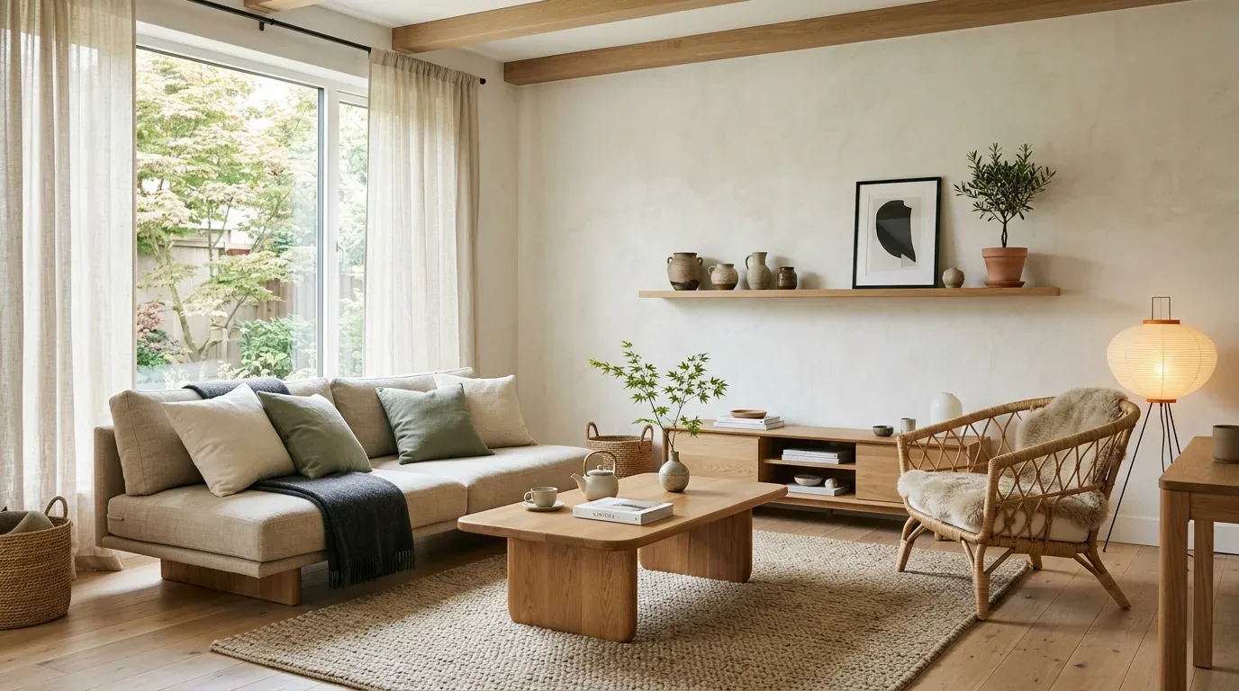
On the color wheel, green sits across from red. That's why a green with the right value can take some of the heat out of red. Don't mix them on the wall. Red paint won't simply vanish because you brush green over it. I’d test the green beside the red first. A dusty olive can settle a strong red tile; a bright green can make the red look louder. Brick is a good example. You may be dealing with red that lives in the material itself, so the green has to work around it.
This guide is built from our active project files and focuses on the decisions that matter once the color-wheel answer meets an actual Sacramento house: which green works, how lighting changes the result, what happens when complementary colors are mixed versus placed beside one another, and how to counter red-orange undertones in beige, brown, and wood finishes. The designer perspective is simple: use complementary color as a control, not a gimmick.
Direct Answers (What Color Cancels Out Red)
| What color cancels out red in an interior? | Look across the wheel from red and you'll land on green. That's the complementary relationship designers use to soften a strong red. |
| What shade of green works best to tone down red undertones? | I'd start quieter. Sage or olive usually sits more comfortably beside red than a clean, saturated green. |
| Does green paint actually remove red from a room? | No. |
| Why can the right green look different in a Sacramento room? | Lighting changes how both red and green are perceived. |
Use Green to Quiet Red, Not Erase It
The first distinction is between optical neutralization and physical color mixing. Green is complementary to red. Mix red and green as paint and both colors lose intensity. You end up with a muddier neutral. Place them next to each other. Your eye picks up the contrast immediately. A muted green can make a red-orange surface feel less dominant without changing the red material itself. That is usually the interior-design problem worth solving.
For paint, I would start with a restrained sage, moss, or olive rather than a clean, saturated green. Benjamin Moore's color guidance is useful here because the paint color cannot be separated from its undertone and surrounding colors. Sherwin-Williams makes the same basic point: a color chip doesn't tell you how a color will read in the room. Red oak already has plenty of warmth. The green wall can stay muted instead of calling attention to itself. A gray-green with enough warmth to sit beside the floor can do the quieter job.
Light changes the calculation. In Northern California homes, afternoon sun can push warm wood and terracotta toward orange-red, while a north-facing room can make the same green look grayer and cooler. I prefer testing large samples in the actual room because a green that looks neutral on a paint card can read distinctly blue-green or yellow-green once it is surrounded by red and hit by daylight. Coordinating undertones across the room's fixed materials and finishes supports treating color as part of the whole room, not as an isolated swatch.
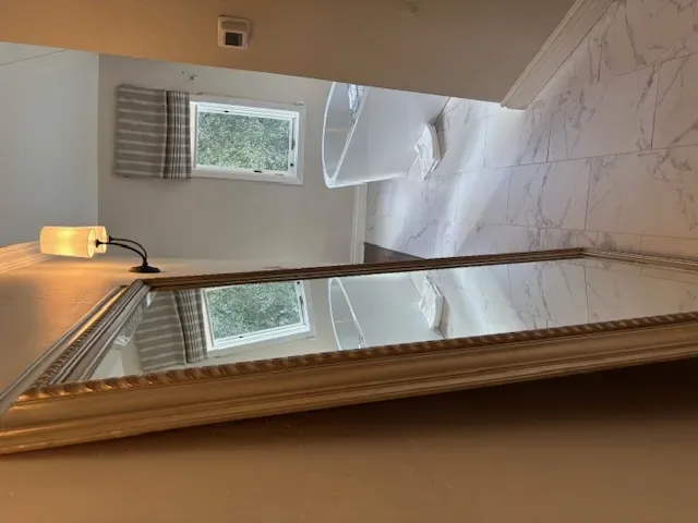
Material Specificity Matters More Than the Word Green
Authenticity-grade materials
- White oak, rift-sawn, useful when red-orange flooring needs a calmer companion because the straighter grain keeps the palette from becoming visually busy.
- Red oak, its naturally warm red undertone needs a green that is muted enough to quiet it without making the floor look more orange by contrast.
- Walnut, works with olive and gray-green because its deeper brown value can absorb stronger color without needing a saturated wall.
- Terracotta tile, pairs well with dusty olive or muted blue-green because both reduce the visual heat without pretending the tile is neutral.
- Honelimestone, its creamy warmth can bridge red tile and a restrained green because it keeps the complementary relationship from becoming stark.
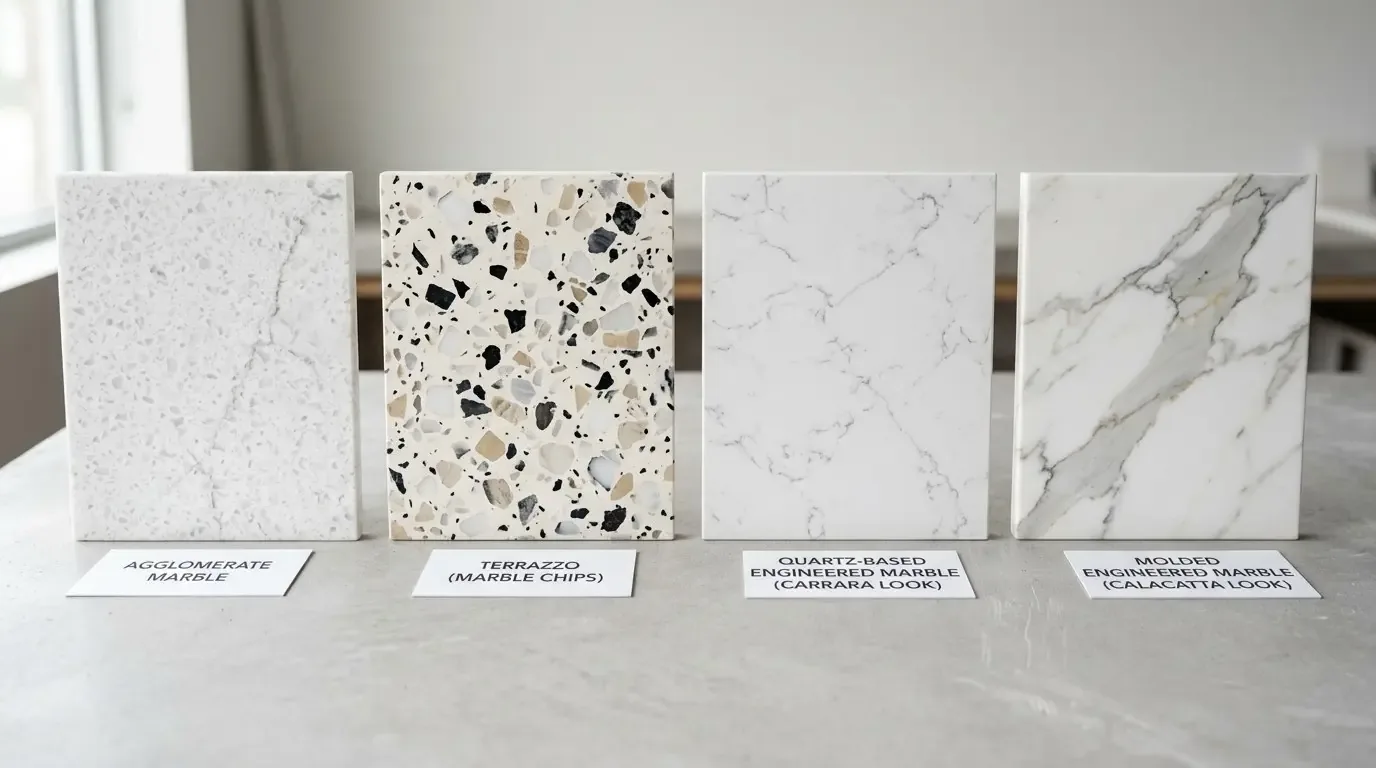
- Calacatta quartz, use carefully near strong red because cool veining can sharpen the red-green contrast instead of softening it.
- 16-gauge 304 stainless steel, a useful neutral in kitchens where red cabinetry or brick needs a non-color counterweight because its surface does not introduce another strong hue.
- Solid brass PVD, better with olive or warmer greens than icy blue-green when the room already contains red-brown wood because the metal keeps the palette grounded.
- Linen, a good upholstery or window-treatment buffer because its irregular surface softens the visual jump between red and green.
- Conversion varnish or catalyzed lacquer, finish sheen matters because a glossy red surface reflects surrounding green more aggressively than a low-sheen finish.
Generic-grade tells we refuse to spec
- Bright emerald paired with bright red just because they are complementary
- A tiny paint chip used as the only color test
- Calling every muted green sage
- Ignoring the red undertone in flooring
- Choosing green before checking fixed materials
- Treating gray as automatically neutral
- Using glossy finishes on both complementary colors
- Adding green accents without deciding what the red source is
Designer Decision Matrix: Which What Color Cancels Out Red Approach Fits Your Home
How we actually decide: match your situation to what we would specify, and the reasoning behind it.
| Your Goal | Best Solution | Why We Recommend It |
|---|---|---|
| Red-orange wood feels too strong | Muted olive | Its yellow-green base relates to warm wood without creating the sharp temperature contrast that a clean blue-green can produce. |
| A red wall dominates a small room | Soft sage on the remaining walls | Lower saturation reduces the competing visual weight, while the lighter value keeps the room from becoming a two-color box. |
| Red tile reads orange in afternoon sun | Dusty blue-green | The cooler complement can counter the orange shift created by strong western light without requiring the tile to be replaced. |
| 1960s Sacramento ranch with warm oak | Muted olive with warm off-white | The combination respects the period's natural-wood character while reducing the red-orange cast that can become exaggerated under modern white lighting. |
| Contemporary room with red furnishings | Gray-green | A restrained chroma keeps the complement subordinate, which prevents the room from looking like a literal complementary-color scheme. |
| Rental or no-permanent-change room | Sage or olive textiles | Large curtains or upholstery-scale pieces can change the perceived balance of red without committing the walls to a strong new color. |
| Historic or character-rich home | Earthy olive | Its connection to natural pigments and wood makes the red-green relationship feel integrated rather than newly imposed. |
What Color Actually Cancels Out Red in a Room?
The real homeowner question is usually not “What is opposite red?” It is “What can I put next to this red so it stops taking over the room?” First, find the source of the red. Red-orange brick reads differently from red oak. Burgundy fabric has its own depth, too, while a painted red wall can shift with the light and the finish.
I start across from red on the wheel. Then I check the green against the actual red material. Muted green is where I usually start. From there, I shift warmer or cooler until it sits properly beside the red. The less saturated the green, the less likely it is to become a second focal point. That matters in Sacramento rooms with strong daylight, where a saturated green can become surprisingly vivid beside warm flooring.
Putting two colors next to each other is a different thing from mixing the colors themselves. Mix red pigment with its complement and the red loses some of its chroma. You get a muddier color, not a clean green or red. Side by side, they stay separate. Your eye sees the red and green as two colors. That means a green wall does not literally remove red from a red floor. It changes the balance the eye perceives.
Which Green Should You Use Against Red Undertones?
If the red is warm and slightly orange, I usually test a blue-green first. Red oak or brick gives me a different starting point. I usually look at olive or moss before reaching for a bright green. In a small room, I'd keep the green quieter. Sage has less chroma, so it won't push back at a heavy red as hard.
Do not choose by the name on the paint can. “Sage” can mean anything from a yellowed gray-green to a much cooler blue-green. Place large boards beside the fixed finish and check them at use times and under artificial light. Northern California light makes this particularly important. A Sacramento west-facing room can push warm materials noticeably more orange late in the day, while a shaded room can drain a green of warmth.
Benjamin Moore's color overview and Sherwin-Williams' color-of-the-year guidance are useful references for understanding how manufacturers organize color families, but neither can tell you how one particular green will behave beside your particular red material. That answer belongs to the room.
How Much Green Is Enough Before It Looks Green?
The goal is not to reach a mathematical ratio between red and green. There's no one-to-one formula here. One part green doesn't simply cancel one part red once the colors are in a room. Look at the red itself first. A large saturated red wall needs a different amount of green than a small red accent tucked into a sightline. A small olive cushion can influence a red rug without turning the room green. A full green wall beside a red fireplace creates a much stronger relationship.
I start with the least amount of complementary color that changes the visual balance. Sometimes one large textile does the job. A painted wall or secondary finish can work better than a pile of small green accessories. One green object can look accidental. Repeat that color in another substantial spot and the connection starts to make sense.
With a red-orange floor, I'd put the green in one substantial piece. Warm off-white can handle the quieter areas without peppering the room with small green objects. The first approach changes the composition. The second can look like someone followed a color-wheel formula after the furniture was already chosen.
How Do You Neutralize Red Without Making the Room Look Dated?
The expensive mistake is treating the red as an isolated color problem. If the red comes from flooring or cabinetry, replacing it may be far more disruptive than changing the surrounding palette. Start by checking the fixed finishes, then the light, then the sightlines. A muted green that works from the sofa may fail when viewed from the kitchen because the red floor occupies a larger percentage of that angle.
In a Sacramento remodel, I would also consider the age and character of the house before choosing a fashionable green. Warm oak in a mid-century ranch can tolerate olive beautifully because the relationship feels connected to natural materials. The same olive can look heavy in a very bright contemporary room with pale stone and minimal wood.
The National Kitchen and Bath Association's guidance and professional focus on coordinated kitchens and baths reinforces the larger principle: color should be considered with materials, lighting, hardware, and use. I would rather make a small number of strong color decisions than add green everywhere simply because green is opposite red.
Common Mistakes We See
Biggest Waste: Repainting an entire room before testing the green beside the actual red material. A large sample costs little compared with repainting a room because a cool green made warm flooring look even more orange.
Biggest Regret: Choosing a saturated green to “cancel” a saturated red. The result is often not neutral. It is two strong colors competing for attention.
Hidden Cost: Ignoring fixed finishes and buying furniture, rugs, or artwork to compensate for a color problem that could have been solved with one correctly specified wall color. The money goes into accessories instead of correcting the dominant relationship.
Observed Failure Modes, How What Color Cancels Out Red Goes Wrong
From our project debriefs and post-occupancy reviews, 2023-2026.
Choosing the Pure Complement
The color wheel says green, so the homeowner buys a strong green. The symptom is immediate: the room has become red and green rather than calmer. The cure is to lower the green's saturation and choose its temperature based on the actual red. A muted olive beside red oak behaves very differently from a bright emerald beside the same floor because the olive shares some of the wood's earthy character instead of creating a high-energy contrast.
Trusting the Paint Chip
A small chip can make a green look quiet because there is very little surrounding color competing with it. Once that green covers a wall beside red flooring, its relationship changes. The cure is large-format sampling in the room at different times of day. Sacramento's strong afternoon sun makes this especially important because warm materials can shift visibly toward orange as daylight changes.
Ignoring the Red Source
Red paint and red oak are not the same design problem. A red-painted wall is highly saturated and uniform. Red oak contains grain, variation, brown, and orange. Matching the same green to both reds can look off. The undertones don't always agree. First, figure out what you're actually looking at. Painted red behaves differently from a stain, and a glossy finish reads differently from a matte one.
Adding Green Everywhere
Once the homeowner sees that green softens red, it is tempting to repeat it in pillows, art, curtains, rugs, cabinets, and accessories. The room then starts announcing the color strategy. The cure is scale. Put the green where your eye goes first. Then use warm white, wood, stone, or a quieter textile to settle the rest of the room.
Confusing Mixing With Pairing
Complementary colors can neutralize one another when physically mixed, but placing them beside each other does not produce the same result. The symptom is a homeowner expecting green paint to make a red floor look brown or gray. It will not. The cure is to think in terms of visual balance. The green changes what the eye notices; it does not chemically remove the red from the flooring.
Forgetting Finish and Sheen
A glossy red surface reflects surrounding colors more actively than a matte surface. Put a strong green opposite a glossy red cabinet and the contrast can become much harder-edged than expected. The cure is to evaluate sheen along with hue. Sometimes a quieter finish reduces the visual intensity more effectively than adding another color.
What's Going Out for 2026
- Bright red paired with bright emerald by formula
- Choosing green from a tiny paint chip
- Calling every green a neutral
- Ignoring red-orange wood undertones
- Mixing complementary colors as a literal room strategy
- Adding green accessories in every sightline
- Using the same green for every red material
- Testing color only under showroom lighting
- Assuming gray will always neutralize red
- Replacing warm materials before testing the surrounding palette
What What Color Cancels Out Red Costs in 2026
| Scope | Typical range |
|---|---|
| Refresh scope | Varies by room and finish scope |
| Mid-tier scope | Varies by materials and labor |
| Estate-scale | Project-specific |
Working Notes
What We Have Learned Doing This: what color cancels out red
“If a color is named in three magazines this year, it will date faster than its lifespan. Choose colors that have looked tasteful for twenty years.”
The safest paint decision is the one made last, against the finished floors and the real light, not first against a white wall.
A renovation is a dependency chain, not a list of tasks. A two-day cabinet delay quietly becomes a two-week slip by week sixteen because every trade downstream is holding a calendar. The unglamorous part matters here. Keep one decision from throwing the next one off schedule.
After enough work in houses, the boring problems get my attention first. A missed delivery can hold up cabinetry, and a bad sequence can leave moisture trapped behind a finished wall. The pretty part still matters. That's why you're doing the room in the first place. But the electrician, framing, and finish work determine whether the drawing becomes a real room.
Specify for the next ten years, not the next photo shoot. The work that holds its value is quiet, well made, and a little bit boring on the day it is installed.
These notes come from our own what color cancels out red project debriefs. Most were learned the expensive way the first time.
Sources & Professional References
This guide's positions on materials are grounded in published building-code, standards, and recognized design-authority sources, alongside Designed | Curated Interiors' verified credentials and active project files:
- American Society of Interior Designers (ASID): interior-design practice standards
- International Code Council (ICC): Chapter 8 Interior Finish Decorative Materials And Furnishings
- NKBA, Amy Kunst Member Profile (verified credential, NKBA Committee Member)
- Featured in: Good Housekeeping (storage and space-planning expert quotes, July 2026) · Homes & Gardens (design expert quote, May 2026) · Sacramento Love (guest author, 2024)
Frequently Asked
What color cancels out red in an interior?
What shade of green works best to tone down red undertones?
Does green paint actually remove red from a room?
Why can the right green look different in a Sacramento room?
How should I test a green paint color against red materials?
Can green tone down red-orange undertones in wood, brick, or tile?
From What Color Cancels Out Red to a Real Room
A trend piece is the briefing document, not the deliverable. The pages below show how we translate these principles into finished rooms across Sacramento and the rest of Northern California.
- Sacramento & Bay Area Interior Design Services How we scope, source, and deliver work end to end.
- Interior Designer Hub, Sacramento Where most of our Sacramento work lives, the regional fit explained.
- $500K+ Interior Designer Red Flags in Atherton: What High-Net-Worth Homeowners Learn Too Late NKBA Committee Member · Residential Design · Northern CA
- Atherton $500k Interior Designer Red-Flags in what Silicon Valley needs to know The primary key entity in this guide is an Interior Design Red Flag as applied to $500K+ residential work in Atherton: a repeatable, observa
- Designer Candle Trends 2024 to 2026: What Sacramento Interior Designers Are Specifying Now in Scent, Form, Color, and Holder Design Discover the latest designer candle trends for 2024, emphasizing sustainability and artisanal craftsmanship to elevate your Sacramento home.