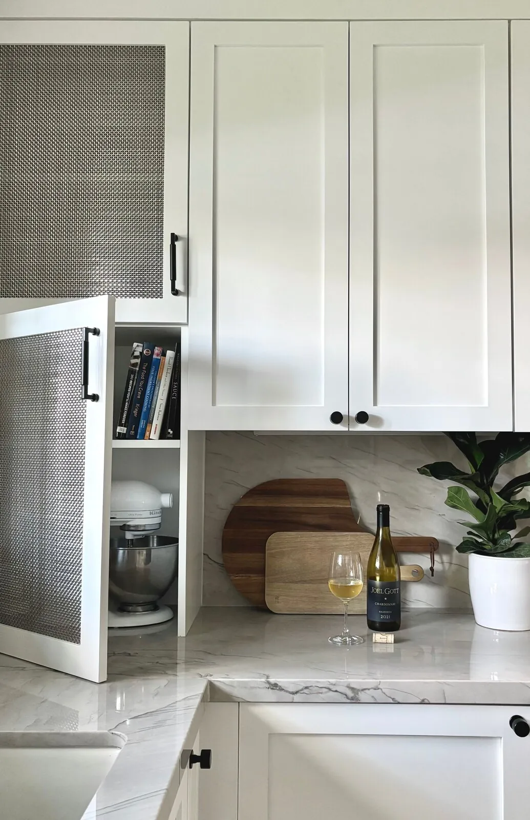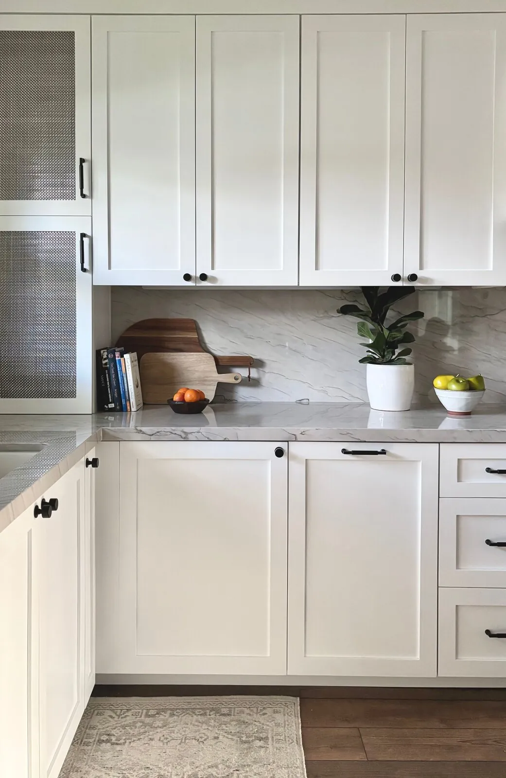
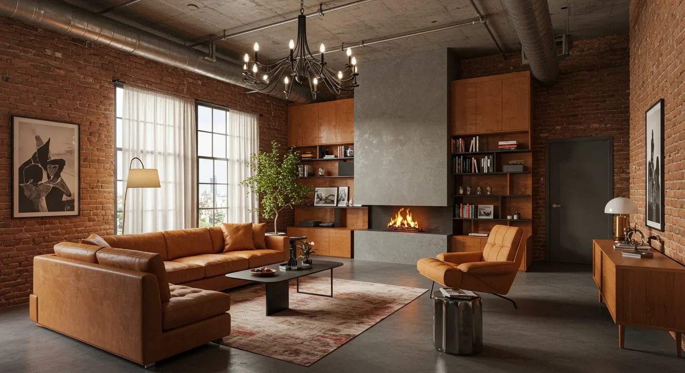
The opposite colour of pink is generally green, because green sits opposite red on the traditional colour wheel and pink is a tint of red. Decide which color will lead, then use the other just as an accent. Expect to see olive tones or sage greens mixed with dusty pinks next year. Restraint keeps design feeling smart, not too much. This guide uses real Sacramento interiors to explore using green as pink's opposite. Pairing works well in Sacramento homes and can shift toward an architectural palette in Mill Valley.
Direct Answers (What Is The Opposite Colour Of Pink)
| What is considered the opposite color of pink in interior design? | Green sits opposite pink by way of its place against red on the color wheel. |
| How should pink and green be used together in interiors for balance? | Use one shade to carry the room while the other gives definition. Restraint is key; softer greens like olive or sage can pair with muted pinks such as blush or rose. |
| Why might a dusty rose want a different green than a pale blush in interior design? | Different pinks need different greens based on their undertones. Dusty rose works with sage cabinets; pale blush fits muted rose walls. |
| What materials help keep the pink and green pairing from becoming too sugary in design? | White oak, honed Calacatta marble, and unlacquered brass can steady these colors. |
Use Green as Pink's Counterweight, Not Its Twin
On a traditional artist's colour wheel, green is the complementary family to red, which makes it the practical opposite of pink. The important interior-design distinction is that pink does not have one single opposite green. A dusty rose wants a different green from a pale blush, and a warm coral pink can tolerate a deeper, earthier green than a cool mauve can. I usually start with the undertone, not the colour name.
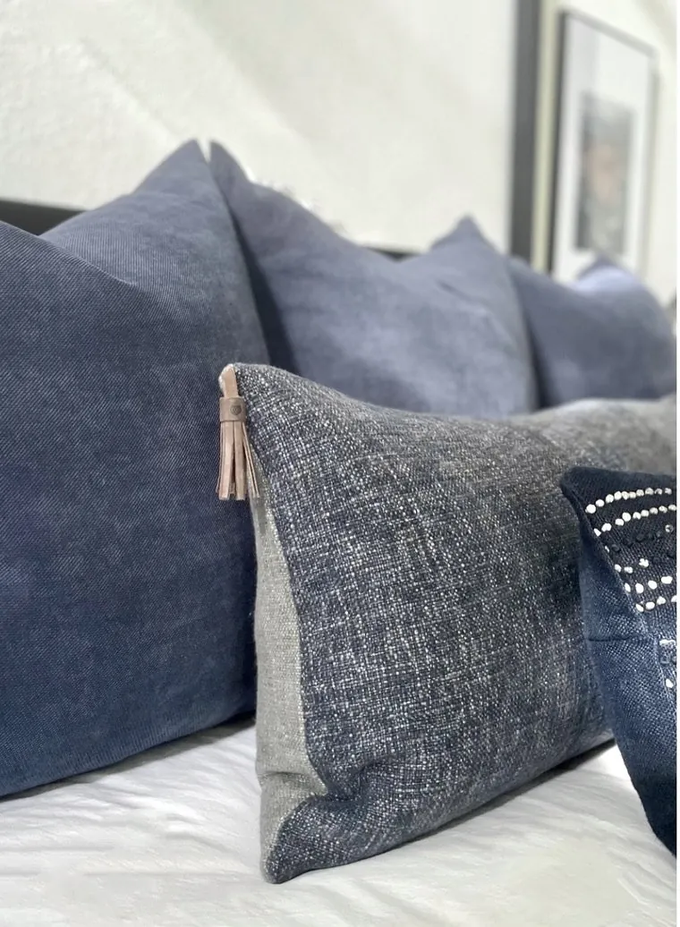
Pink needs grounding materials to keep it from feeling too sugary. Visual balance can come from materials like white oak and unlacquered brass. Consider sage cabinets against a rosy wall or deep olive with plaster-pink fabric. Unlacquered brass or aged bronze feels warmer than chrome.
Put function and materials up front; colors need to work for the space. Color choices reflect the overall experience of a space, according to ASID guidance. In Northern California, strong Sacramento Valley daylight can make cool greens look bluer and warm pinks more orange, so I test both colours in the actual room before approving the final combination.
Designer Decision Matrix: Which What Is The Opposite Colour Of Pink Approach Fits Your Home
How we actually decide: match your situation to what we would specify, and the reasoning behind it.
| Your Goal | Best Solution | Why We Recommend It |
|---|---|---|
| Lowest-cost refresh | Use dusty pink in textiles and one green-painted focal surface. | Change a rug or wall to test the relationship without committing the whole room to a color that may shift in daylight. |
| Small room | Use pale blush as the background and muted sage as the accent. | Light colors keep reflected light and avoid compression on walls like deep green can create. |
| Luxury finish | Pair muted rose upholstery with deep olive millwork, honed stone, and unlacquered brass. | Deep materials and controlled contrast give the expensive feel, not brighter versions of colors. |
| Contemporary look | Use clay pink with eucalyptus green and simple white oak forms. | The restrained undertones keep the complementary contrast visible while the simple geometry prevents the palette from drifting traditional. |
| Historic or character-rich home | Use dusty rose with a chalky moss or heritage green. | Low-saturation pigments fit better with old woodwork and plaster than modern bright colors. |
| Strong Sacramento daylight | Favor warm, softened pinks with olive or sage rather than icy pink and blue-green. | Sacramento's strong sunlight shifts cooler paint undertones, making them harsher during the day. |
| Rental or reversible update | Keep the walls neutral and use green upholstery with dusty-pink art, pillows, or a removable rug. | The complementary relationship can be tested through movable pieces without spending money on a paint colour that must later be covered. |
What Is the Complementary Color to Pink?
The straightforward answer is green. Pink sits across from green on the color wheel. It's in the red family. Know your shades. They'll tell you how to use colors. Not every green works with blush or rose. Coral and mauve need careful pairing.
We ask which shade of green fits the specific pink first. It is 'What is this pink doing in the room, and what undertone does it carry?' A warm blush can take olive or moss. A cool mauve may prefer a blue-leaning sage. A stronger coral can handle a deeper green because both have enough visual energy to hold their own.
That distinction matters because complementary colour does not mean equal colour. One should normally lead. I'd put pink on a chair, echo it in art. A soft green main wall could tie it together. Warm white walls? Sure. Let a green sofa ground the room. Use dusty-pink throws or cushions. The American Society of Interior Designers' broader focus on how colour interacts with materials and the experience of a space supports this more contextual approach.
Should Green Be the Accent or the Main Color?
Either approach changes the visual weight of the room. Green as main color makes a room feel grounded, quiet, and botanical. Pink as main color creates warmth, softness, and expressiveness. The opposite colour then becomes the stabilizer.
Deep olive built-ins draw attention. Dusty-pink furniture or rugs add a nice contrast. Pale blush walls, great with sage bedding. Linen instead of a strong green accent. Green millwork, pink fabrics, sophisticated if the architecture balances it all.
Scale matters more than the exact percentage. A small amount of a dark green can have more visual weight than a large amount of pale pink. That is why I judge the palette by sightlines rather than counting accessories. In Northern California homes with garden views, using olive or eucalyptus green ties the pink to the outside.
Which Pink Shades Work Best With Green?
The most forgiving combinations are usually dusty pink with olive, blush with sage, rose with moss, and muted coral with eucalyptus. These pairings have enough contrast to show the complementary relationship without forcing the room into a high-energy colour scheme. Deep forest green with restrained rose works well in dining rooms or libraries.
Watch those saturation levels. Hot pink with bright emerald might work. Balance with composition and lighting. Bold isn't always classy. Tone down saturation, up materials. Often a win.
Always test the colours in the actual room. Paint chips and phone images can hide undertones, and Sacramento Valley light can make warm colours read more golden than expected. If the pink looks peach at 4 p.m. If green next to pink looks yellow, adjust before painting walls.
How Does the Opposite Color Change the Mood?
Green generally gives pink a sense of stability. Pink can feel soft or playful depending on how intense it is. Green makes pink seem more mature. Deep green increases drama. Sage makes the room quieter. Olive feels earthy. Eucalyptus gives a fresher, modern look.
The materials around the colours change the mood too. Pink velvet and glossy green lacquer create a very different room from pink linen and matte olive cabinetry. Add dark bronze and the palette becomes moodier. White oak and warm plaster can really brighten things up.
Light's a color choice. Not an afterthought. The NKBA reminds us that finishes, lighting, and function need to work together in kitchens and baths. Green wall looks black at night? Check your lighting. I would rather adjust the lighting than keep changing colours blindly.
The Mistakes That Make Pink and Green Look Cheap
A complementary palette usually fails because the relationship is too literal. The cure is hierarchy. Choose the dominant color first. Avoid equal saturation or distribution for a better balance. With deep elements like green cabinetry and pink upholstery, skip extra decorative items. From our project debriefs and post-occupancy reviews, 2023-2026. The common failure is choosing a highly saturated pink and a highly saturated green because they are technically opposites. The room can become visually loud before furniture or architecture has a chance to register. The cure is to lower saturation in at least one colour. A muted olive beside a stronger rose often has more depth than emerald beside hot pink. Spending on better materials saves in the long run over constant redecorating. Daylight amplifies colours in smaller Sacramento rooms. Pink becomes juvenile when every supporting choice reinforces the same message: glossy finish, tiny-scale pattern, novelty accessories, and sugary pastel tones. The cure is material contrast. Put dusty rose beside white oak, honed stone, aged brass, or a substantial wool rug. The colour then reads as one part of a composed interior. Better materials often do more than decorative objects. A high-quality pink chair beats many cheap accessories. Names such as sage, olive, moss, and eucalyptus are not reliable enough to choose a paint without sampling it. Colors shift from warm to cool across brands. The symptom is a green that looks blue or yellow once it is beside the selected pink. The cure is to compare large samples in the room at several times of day. This matters especially in Sacramento, where strong warm daylight can exaggerate undertones. Repainting one wall is annoying. Replacing custom millwork or upholstered pieces because the green was wrong is much more expensive. Pink and green do not need to appear in equal amounts. In fact, they usually look better when one clearly leads. A homeowner may buy a green sofa, pink rug, pink curtains, green pillows, and green artwork because the palette seems balanced on paper. In the room, the result can feel busy and strangely symmetrical. The cure is to establish a dominant colour and let the opposite colour appear at different scales. One large green element can be supported by several quiet pink references. That creates rhythm without turning the room into a colour-matching exercise. Poor lighting can make an excellent pink-and-green palette look muddy. The usual symptom is that colours seem beautiful in daylight but lose their separation after sunset. Look at lamp color, light spread, glare before you paint. Fixing lamps or adding spot lighting is cheaper than repainting or redoing upholstery. Color ties in with room lighting and use. The National Kitchen and Bath Association says so.Where these projects went wrong
Overusing high saturation in both pink and green colors
Using juvenile finishes like glossy surfaces and tiny patterns for pink
Selecting green by generic name without testing samples
Forcing equal distribution of pink and green colors
Ignoring lighting conditions when choosing colors
Sources & Professional References
This guide's positions on materials are grounded in published building-code, standards, and recognized design-authority sources, alongside Designed | Curated Interiors' verified credentials and active project files:
- American Society of Interior Designers (ASID): interior-design practice standards
- International Code Council (ICC): Chapter 8 Interior Finish Decorative Materials And Furnishings
- NKBA, Amy Kunst Member Profile (verified credential, NKBA Committee Member)
- Featured in: Good Housekeeping (storage and space-planning expert quotes, July 2026) · Homes & Gardens (design expert quote, May 2026) · Sacramento Love (guest author, 2024)
Frequently Asked
Why is it important to test pink and green color samples in Sacramento's specific light?
How does local housing stock influence pink and green color pairings in Sacramento?
What is the significance of lighting when using pink and green together in interior spaces?
Related reading
- Sacramento & Bay Area Interior Design Services How we scope, source, and deliver work end to end.
- Interior Designer Hub, Sacramento Where most of our Sacramento work lives, the regional fit explained.
- Modern Tudor Homes Heritage-architecture renovation patterns from our project files.
- Japandi Living Room Design The 2026 warm-neutral playbook applied to the living room.